The new Adobe Fresco promises so much and lets get started on painting and drawing.
Finding our voice as an artist is perhaps the most difficult of feats.
And within this journey, digital painting has become an indispensable asset that expands our horizons like never before and perhaps better than in traditional means.
In this context, Adobe Fresco, finishes us in giving any kind of an artist regardless of his level a fund of creativity without the restraints of traditional art.
It’s perfect for everyone – this software makes every form of an artwork remarkably easy to create along with beautiful.
In this case, Immenga does a great job by examining and elaborating adobe frescos’ working that details the how and why along the internet and by facilitating the correct understanding of its core features and frameworks along the correct set up of the workspace.
You will also understand how to enhance your digital painting techniques with the right tools, brushes, and styles.
With accumulated knowledge and confidence that in the end, you will be able to paint amazing pieces that best fit your style.

Getting Started with Adobe Fresco
What is Adobe Fresco?
The Adobe Fresco app allows artists to draw and paint on their smartphones and tablets, providing a more casual way to create.
It is a reliable device that seamlessly incorporates both vector and raster facets, which makes it an excellent tool for every artist.
So dearly, I admire how Fresco seamlessly combines the worlds of traditional painting with the modern digital world.
Using Fresco, you can turn your devices into magic wands that will allow you to create beautiful pieces of art, be it finely detailed sketches or extravagant paintings with intense colors.
Features that make it a perfect tool for digital art and painting
If there is one area in which Adobe Fresco excels, it would have to be the availability of the brushes.
The assortment of materials offer boundless combinations, ranging from authentic looking watercolour brushes to actual oil paints.
Imagine being able to add a texture beneath a stroke and then paint over it, and if you don’t like what you did with colour you can simply go back without a bother; that is impressive to say the least.
When I first tried out the Live Brush, I literally felt that I am using water colours for the first time.
Unlike traditional paints, watercolors can blend together, producing vivid rich colours and shading which make the snapshot more appealing.
Another interesting addition to the app is having access to vector tools.
This implies that as an illustrator or designer, you can generate sharp lines and graphics even when resizing them.
It makes some sense as to why people go for Fresco when a combination of raster and vector capabilities is required for the project.
Shaping your workspace
Guidelines For Tailoring The Workspace in A Way That Supports Effective Painting
I remember when I first got to work with Adobe Fresco, I had to spend some time organizing my workspace.
Here’s what I learned:
Rearranging the Toolbar: Adobe allows for rearrangement of the toolbar with which they intend to work with and in the case of Fresco flow, makes sense in how the workflow will go.
I found that grouping my most frequently used brushes and tools handy minimized my need to scroll through menus while painting so I could just get straight to the action.
Changing Canvas Size: Upon a project deciding which canvas size to work on should not be a problem as long as its appropriate for the design.
In most cases, I would prefer to begin with a larger canvas scope that enables me to include intricate details and after that trim or resize it depending on the way it looks.
Altering your color Palette: Depending on what the project is, you can create a custom colour palette or even a synthetic one based on the colour wheel.
I have a habit of collecting my favorite colours and bookmarking them so I can retrieve them at a moment’s notice to make sure that my artwork fits the theme.
The Significance of Having the Right Setup that Relates to the Creative Process
Don’t forget about the significance of having a workspace that is accommodative and comfortable.
It’s important for me to have a setup that is suitable whenever I find myself painting for several hours.
Let’s look at some tips and advice for having the optimal setup when working out:
Device Placement: Ensure that your tablet or device is at a reasonable height to avoid any strain.
I normally have to reposition my chair and my table so that I am able to paint comfortably without the fear of pain.
Good Lighting: One will require good lighting to view colors and shades correctly.
What I’ve learned is to position myself close to natural light especially during the day or, if all else fails, use artificial light as a substitute.
Minimize the Distractions: Let the Surroundings do the Motivating.
Several activities require accompanying tools such as a cozy blanket that I prefer to use for longer painting sessions as well as several art pieces that are positioned around me.
Interacting and Working with the Tools in Adobe Fresco
Painting Tools: The Most Important Part of Digital Creation.
Finally, allow me to touch upon the brushes for they are perhaps the most exhilarating part when doing digital paint work in Fresco!
Using brush variations from pencil types to oil painting gives one the ability of digitally duplicating traditional techniques.
To give you an example, the first time I worked with the water color brush, I was totally astounded.
It captured and imitated the movement of real water colors perfectly.
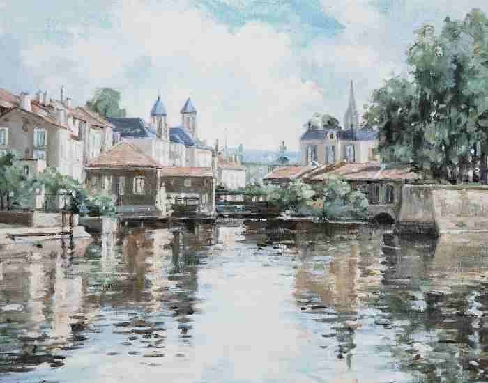
I created a basic landscape picture and the blending of the colors impressed me a lot. It was like every stroke I made added to the glamour of the painting, making it hard for me to believe that the painting was not created using actual paint!
Real-Life Example: Employing the Watercolor Paint Brush in a Landscape Painting
Let me elaborate as this is a classic example. It was a really bright day when I decided that I would start working on a peaceful sunset landscape.
The first thing I did to the sky was paint the clouds with luscious soft colors. I also was careful to allow the water color brush the paint to freely blend during the paint application.
The primary strategy was to stack the tones slowly and carefully and for each one to fully dry before the next was applied.
This painting was also different in the sense that during the course of the painting I was easily able to alter the opacity and flow which was something that was impossible with the use of conventional watercolors.
In conclusion, I was able to paint a very beautiful daring sunset reflecting how I was feeling at that time instant, I believe the moment was perfect for me to be able to express my creativity.
Layers: Classifying Your Painting to Avoid Chaos
Let’s change topics and start learning about layers now.
In case of digital painting to use layers has become a necessity for both order and creativity.
When I say layers would have where there’s a second sheet present the assumption would be more like ‘transparent sheets positioned one above the other to form a stack orderly’ which would then assist in building your artwork without affecting the primary layers in the lower levels.
After I started to use layers I had a different liberty in my paintings.
In the event I had made a mistake, it would have been rather simple for me to get rid of that layer, or hide it without damaging my whole work.
Using Layers in a Painting to Allow for Better Art
Heres how layering works for me:
Keeping Elements Separated: I prefer moving the elements of the artwork to different layers to be placed.
For instance, if I’m working with just a character, I would have a layer dedicated to the background and one for the character and will add separate layers for additional details such as shadows and highlights.
Managing Layer Visibility: There are times when I want to single out a specific area of my painting, so what I normally do is hide the other layers, which allows me to concentrate on one area without any other distractions.
This enables me to enhance the finer details in my artwork without distractions.
Add Some Layer Effects: Blending Modes as one of the layer effects is available in Adobe Fresco and, when applied, can significantly transform your art.
I like to use these effects because they have the potential to deepen and expand that.
Color Palettes: The Exclusivity of Your Style
Lastly, every art deserves a palette, and that serves as your identity for that art piece.
With Adobe Fresco, it is super easy to try out different colors to work towards developing an exclusive style.
How To Choose Suitable Color Palettes For Use In Adobe Fresco?
Look for ideas: Colors often come from either nature or pieces of art, and I always try to find ideas first from there.
Pinterest is particularly very beneficial when looking for color inspirations!
Use the Color Wheel: Fresco has a color wheel that can help you experiment with various hues and shades.
I love to combine colors with various shades, waiting to hit on the perfect combination while tinkering around.
Make Custom Palettes: When I find a few colors that I like, I create a palette by saving the color values that I am fond of.
This makes it possible for me to have the colors for upcoming projects and ensure that my artwork is consistent.
Example In Practice: Making A Color Palette For A Portrait
There is this one time I had to paint my friend’s portrait, and I wanted to do something special as her personality was so full of colors.
I decided to build a color palette based on bright pinks and soft green color hues of her favorite flower.
Then using the color wheel, I blended the shades to form a balanced out color palette which would articulate her energy.
Because I had those colors saved during most of the parts of the painting, it was easier to reproduce the image they helped to create, to guarantee I captured her in full semester.
Strategies for Participating in Digital Paintmaking in a More Creative Way
Blending Techniques
Blending is one of many techniques that are important in digital painting especially for achieving the best in your artwork.
Blending modes are the antidote to creativity, allowing for various color interactions.
If you want to add some depth and darkness to your design, for example, you can employ the “Multiply” option, while the “Screen” setting would illuminate your colors for a more ethereal feel to your design.
In fact, switching to blending modes changed everything in my art as simply switching from one mode to another allowed me to achieve depth that was astonishing to say the least.
Step by Step Towards Color Blending in a Seamless Manner
In Fresco, the following procedure appears to be the most efficient when seeking to achieve smooth color blending:
Choosing the Blending Colors: The first step is to choose one or more colors to blend into one.
If I were composing a sunset, for example, I would choose warm oranges and baby pinks.
Stroke Color Layers: Apply a base color to the canvas as your initial step.
Your base color can be applied with a soft edging brush such as the Round Brush.
Adding Another Color: Now you’re gonna have to take the second color and apply it over the base color however don’t cover it completely.
This is the point at which colors blending settings become relevant!
To make a gentle smooth transition, I frequently switch to “soft light” mode.
Smudge Tool Usage: This tool is essentially a life savior.
Smudging and mixing the colors with this tool after applying them is highly effective.
I usually prefer the low strength setting since it creates a subtle blend which enhances the gradient effect.
Refine the Blend: Return back and add the required amount of both colors in appropriate areas.
You can always adjust the blending modes or the opacity until it seems suitable to you.
Vector and Raster Graphics
It is important to understand the difference between raster and vector graphics when working with Adobe Fresco so that you make the right decisions as regards your artwork.
Vector graphics are a collection of objects made with path using mathematical equations.
It implies that they can be magnified without any distortion and this is perfect for producing crisp edges and surfaces.
I usually employ vector tools fully when creating logos or images which need scaling both upward and downward.
Raster graphics are graphics which consists of pixels.
This implies that they do capture high detail and texture which is perfect for any image but this comes at a price of loss of resolution when magnified.
As a rule of thumb, when I am painting, I find myself gravitating towards raster graphics because of their versatility and volume.
The textures and nuances that can be built with brushes in rasters can be in fact harder to create while in vector mode compared to the latter.
When it Comes to Your Projects, When To Use Each Type
While selecting the type to utilize for your projects, keep the following in mind:
Employ vector graphics for logos, typography, and illustrations which require frequent resizing, since this will guarantee a perfect fit every time.
This guarantees that your designs are not distorted due to enlargement.
Employ Raster Graphics for: intricate illustrations, paintings, or images where depth and texture are crucial.
I almost always employ raster graphics for making landscapes or portrait settings, where the subtle details really do matter.
Textures and effects in addition
Textures and effects, when applied to your images, can aid in moving your digital paintings to greater heights.
Textures help to provide dimension and make your artwork more lifelike.
In Adobe Photoshop, there are different ways of applying textures to a project such as Paint Brushes or Images that have been imported.
To Create a Sense of Depth in a Digital Landscape, Use the Texture Real Life Example
I created a digital landscape painting of a forest some time ago.
To spark some life into the piece, I wanted to include textures in it as well.
I began applying rough brush strokes on the trees in order to paint the trees as a Bark.
Next, I searched the Internet for texture overlays such as crumpled paper or canvas textures and added them to my project.
Modifying the blending modes helped me put these textures to my painting making it feel organic and rather deep in nature.
What did I get out of that? A forest painting with shadows and highlights that made it feel more three dimensional.
Ways to Better Your Digital Painting Skills
Let’s now look at some aspects that can help sharpen your skills in digital painting.
Practice Gets You There
You can’t get better at something unless you actually put the time and effort into it on a regular basis.
There has been many times when I’ve blocked out time to do some casual painting without the idea of having to work on a specific project.
Artistic pressure has resulted in me creating some pieces which I cherish to this day.
Overall: A Personal Shoutout to the Power of Creative and Uninflated Digital Art
When I first started digital painting, I remember how I got a headache at first with all the brushes and painting techniques.
To be blunt, I didn’t make a lot of progress at first as I was simply confused with everything.
But I did set a rule that there will be certain hours of the day on the weekend that will be solely used to trying out new brushes and styles.
There was one particular weekend where I set out to learn color blending for a few hours.
I did get frustrated in the beginning, but after several attempts of close to wanting to give up, I suddenly felt excited.
The colors that I struggled with before started to look stunning all because of the combination of colors that I used.
That breakthrough moment led me to remember that sometimes, one has to wait patiently and strive harder in the field of art.
Finding Inspiration
Inspiration can be found anywhere, the only thing one has to do is to ensure that he or she stays creative.
Sometimes, when I am unable to think creatively, I visit art communities like Behance or Art Station.
Such places are packed with the most amazing creatives who give new ideas that will help me brainstorm.
How Would Art Community Accelerate My Growth
Being an artist, being part of an art community can also help you with your growth very well.
I have joined various online challenges and forums where various artists exchange techniques and ideas.
It is incredible the distance you can go by learning from others!
Collaborating with other artists has also motivated me to experiment with other styles and challenge myself.
Adobe Fresco and Digital Painting Most Common Questions
Which devices support Adobe Fresco?
Adobe Fresco provides great ease since it can be used on a variety of devices, and that is one of the features it has.
Fresco can be used on:
iPads: If you are an owner of an iPad, know that you are lucky! You can now use Fresco since it has been modified to work with iPadOS which utilizes the Apple Pencil for drawing with an exact precision.
Windows Devices: I am delighted with how perfectly Fresco works on my Windows devices with touch screens and stylus accessories. I really enjoy using Fresco on my Surface Pro, I feel like I’m painting on paper, great experience!
iPhones: There is more: iPhones also have their personalized version.
It’s not as elaborate when using it on an iPhone but is a perfect tool for sketching while traveling.
Desktop: Adobe has also been working for a while already on making the Edison Popper available on desktops, making us also able to work from the laptop within software.
But in general, most of the most preferred devices can be used for painting giving you a multitude of different choices in scenarios that will allow you get into painting digitally with ease.
Can I use Adobe Fresco for professional work?
Definitely yes!
A lot of artist and illustrator professionals are now usign Adobe Photoshop including myself.
Because their performances made an indelible impression and here’s the reason why I am impressed:
Wide Range of Brushes: Live brushes that are intended to be used in conjunction with media such as oil or watercolor are among the many brushes that Fresco provides.
Using an oil paint brush for a commission piece once yielded incredible outcomes.
I wowed my customer with the richness and texture I was able to create.
Layering Options: To achieve a complex composition, having several layers is an absolute must.
Your creativity is not stifled by your past ideas since you can edit and rearrange your drawings however you want without concern.
Export Options: With Fresco’s support for several file formats, your work can be exported for printing, posting on social media, or use on the web without any hassles.
It is obvious how well Fresco integrates with the Adobe Creative Cloud suite when I exported a piece recently so that I can later work on it in Photoshop by saving it in the PSD format.
Collaboration Features: You can send files to other employees for their feedback and make any adjustments if you’re in a team, thanks to the collaboration features.
Even though Fresco can easily be used by new users, the application can be used with precision making stunning digital paintings for the professional artists.
What are some common mistakes to avoid?
For Adobe Fresco examples, there are a few learnable errors that I can point out to you because I have also been a novice fresh into using Adobe products.
Ignoring the Importance of Layers: The New users usually end up cramming everything and anything onto the first page in the first layer.
Trust me, this makes it challenging to make changes later. Always use multiple layers for different elements of your painting.
Overusing Effects: It is easy to go wild with textures and blending modes.
When topography settings are overdone, it may take away the simplicity of a piece.
On one of my first digital landscapes, I came to realize how important setting parameters were – some things just need to be dialed back!
In admiring the fresco art style, however, people have not used the provided brush settings to their fullest.
You are most likely ignoring those and their fabulous effects if you do not give them a shot every so often.
You’re doing it right by checking every finicky detail on the brush—I endorse doing that for a couple of minutes too because it works wonders.
Digital painting, like all the other things, is a set of skills one can cultivate over time—it’s important not to forget your day-to-day skill-building exercises aka practice.
Art, sketching or literally anything creative that keeps on evolving, should never be kept on the waiting list – that’s what I tell myself every day but even more when I am trying to learn something new.
Having the frank affirmation regarding these mistakes allows people to make better judgment calls while painting with full confidence.
Now tell me, was this disappointing?
To sum it all up as we finish the deepest adventure for the day, let us go over some parts from where we picked up.
What more can you ask for when you have everything combined into Decor and powerful software such as Adobe Photoshop FREE for beginners to professional artists!
It has various kinds of brushes, many ways to layer and many user-friendly features that make it a perfect option for producing beautiful digital art.
Fresco delivers an utterly flawless painting experience no matter if you’re working on an iPad, a Windows device or a desktop.
Scenes like this can be difficult and you may mess up from time to time and that is fine!
Every failure is a learning lesson and the most productive thing you can do is to continue experimenting and perfecting your techniques.
So, I urge you to jump into Adobe Fresco, fiddle with the tools that are available, and just do your best to enjoy your artwork. Also, feel free to reach me!
Let me know in the comments section below if you have any suggestions for me and if you have done any artwork lately.
Let’s motivate each other and develop as one huge family of artists!


