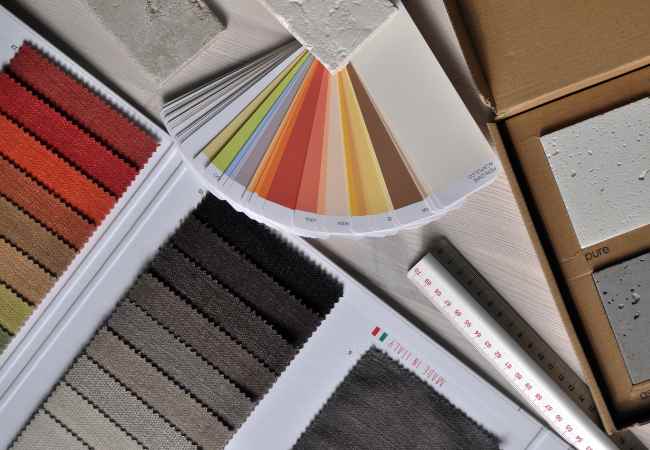
There’s no denying that color goes deeper than just design elements. It is an experience by itself that enhances user engagement with the website. There was this local bakery I had been working on, at that time i understood how crucial color was for web projects.
I still recall my first approach. With soft pastels as my first selection, I had hoped for a slightly brighter and cozier theme but that quickly changed when I decided to place fun colors instead, the pastel colors were best replaced with warm pinks and sunny yellows that truly reflected the bakery’s character and best of all made the website pop!
It was a game-changing shift! The focus went from the sheer usability of the bakery’s website to having an absolutely interesting engaging experience on the website itself. The website’s visibility on social media increased, resulting in a surge in customers visiting the store. At that moment, in the kitchen of ideas, it became obvious just how important color choices are for web design.
Colors can stir emotions, and those emotions can shape not only how we feel, but how we act. For example, upon landing on a certain website, the first aspect that a user may observe is the color scheme used on the home page. Depending upon the kind of feelings that the colors give off, this can highly affect how the user feels about the interface, be it elated or apprehensive. Hence, the relationship between color and emotion is crucial for every web designer striving for an impressive effect.

Why Color Matters in Web Design
The Psychology of Color
Let’s examine the meaning of colors from a psychological perspective and how such meanings can be used to influence user behaviour and understanding.
As it turns out, colors have meaning and can invoke emotions and actions pre-determined by society. One prime example is blue; which invokes feelings of trustworthiness thus making it a common branding choice by a majority of banks and financial companies. Take Chase and PayPal for example, they utilize Blue to foster a feeling of safety in their users.
On the other end of the spectrum we have the color red, a color that is often used to represent alarm. You will likely see it on clearance sale banners and on buttons like “Buy Now!” This is the reason behind the use of red on e-commerce platforms as it inspires the consumer to think and act fast.
Such associations between colors and their meanings have a clear cut cultural context to them and serve a specific purpose when it comes to interaction with users. As designers we are able to draw from this psychology and develop color schemes that are pleasing to see while also encouraging users to take the actions we want them to.
Inclusivity and Accessibility
It is important to know and understand the significance of the color you want to use but it is also equally important that you do not forget about accessibility.
Making color palettes that cater to all users, especially users who struggle to perceive colors, is not an option; rather, it is a requirement. Imagine a user wanting to use your website that has been beautifully designed and advanced but for some reason has difficulty distinguishing between a few colors.
Therefore, it is important to always make sure that everyone is able to fully utilize the design rendered to them regardless of their eye sight.
There are great tools that allow designers to assess the deficit in color choices they have made. For instance, Contrast Checker and Color Oracle enable the designer to see how their palette would look to a person that is suffering from different types of color blindness.
Utilizing these tools allows one to design for a broader audience using inclusive designs, ensuring that everyone is included and represented when transitioning into the digital world.
Playing Around with New Color Schemes
Color Schemes for 2025 That Are Going to be Popular
As we head into the year 2024, the field of web designing is about to adopt some of the most exhilarating color schemes and palettes.
One palette that I am a huge fan of is the mixture of gentle lavender and dark emerald green. This palette is grounded in the appropriate mix of serenity and elegance which suits well for lifestyle and wellness brands.
For instance, the color scheme that Everlane employs, muted soft colors with greens, is in line with their core principles of transparency and sustainability. The combination appeals to the company’s clientele base.
The fusion of coral and teal is also making waves. It has been observed in other creative fields as well. Check out Airbnb’s website. The colors are used to emphasize the feeling of action and journeys; after all, it is all about traveling and wanderlust.
Designers are able to display solutions in color that could improve their work and are relevant to the market.
Earthy Color Palettes
In the last couple of years, nature has started to pop up in new color designs.
Designers are starting to take a peek into the outside world and incorporate colors from nature such as landscapes, sunsets, and materials.
I remember a website we built for an environmental organization dealing with green living. The whole idea was based on devotion to nature, which is why we chose dark green, brownish, and blue colors of the sky.
It was a nice mix of free and warm colors that would persuade the audience to understand their goal.
Patagonia is one of those myriad brands that walks this talk. Their site has earthy textures and colors, indicative of the design breathing the sustainability ethos which the company lives by. The moment users sign into the website, it intertwines the users into the warm pores of the wilderness, and the experience seems more real, rather than fake.
When it comes to deciding the color commonly used, designers find themselves arguing on the best color combination to use; monochromatic or complementary.
Monochrome palettes tend to combine one color in various shades and tones. Easy as it may sound, it gives a bit of an elegance which is a good fit for any brand which intends to look stylish and minimalistic.
Consider the example of the Dropbox website. They tend to use dark tones and bright shades of blue. It ensures a sufficiently cleaned up and elegant appearance that works for users looking for trustworthy cloud providers.
As for complementary palettes, they employ those colors that are situated opposite to each other on the color wheel which makes great differences while employing a clash of colors and textures. This method is definitely ideal for brands that are looking for creating a strong impression and are focused on creating a buzz.
Take for instance the Spotify website. The contrast between the green and black colors is stunning and lively and actually captures the spirit of music which is quite effective in visually endorsing the brand as well as in engagement.
Every palette has its weaknesses and strength however the use depends on the emotions that the brand desires and the brand itself.
Developing Your Very Own Color Palette
Useful Tools and Resources for Designers
After seeing some examples, let’s now get to what you have been waiting for, a way to make your very own colour palette.
There are amazing tools available like Adobe Color and Coolors which are great for the designers. Such tools allow you to mix and match colours, see which colours complement the other and also see what the latest trends are.
Anyone who started out with Coolors would know the convenience and utility they offer through their simple interface. To make palettes, all you need to do is click a custom button and then use the lock button on the colours you wish to keep while searching for new different colours.
Most importantly, don’t be afraid to experiment! You can mix and match from different palettes, maybe even take inspiration from elements out of your comfort zone – ensuring that you gather responses and feedback from people; how do they react to your decisions?
Case Study: A Particular Colour Palette that Works
Let’s look at a study to understand the significance of using a colour palette effectively with an example.
Slack, the business communication app that integrates with tes slack, is currently my favourite app.
During their latest redesign, they updated their color scheme to incorporate more subtle, friendly colors while still giving it a professional feel.
The redesign made significant changes especially in the change of the color scheme from bright to pastel which changed the interface completely and made it much more user-friendly.Pink Slack witnessed a heightened surge in user engagement and appreciation after the redesign.
Soaring conditions of team collaboration, and communication engagement in Slack were some of the benefits that were witnessed after the addition of an inclusive color change that the team decided to implement as it made the Platform look less Corporative.
Such a case study highlights that color matters a lot during brand design or coloration and that changing their palette can greatly change their perception.
Frequently asked questions
What are innovative color palettes?
Essentially, innovative color palettes when web designing is used refers to colors that are not classic or common, meaning that they are unique and imaginitive.
It is worth noting the fact that palette choice does resonate with the intended audience, is in line with the times, and correlates with acceptable parameters of modern design.
Consider how many brands simply use blue and gray for their websites. Although these colors signify professionalism, incorporating unusual colors like bright pink or deep earth tones would set a brand apart from the competition.
In terms of colors, there is more to it than just what looks good. The choice of colors that are used must represent the brand and its beliefs in a deeper story. It is about being bold and being able to use the color to elicit some required feelings in movement with what you want to achieve.
Which Color should I go for my website?
Determining the color scheme of your website should be the center of attention and in order to begin, you must understand what your brand stands for and what its target audience will be.
Think about these questions: How do I want my target audience to perceive my brand? If it is playful, then bold, bright colors can do wonders, however if a financial service is being offered, then toned down and applicable colors that represents trust can be a better choice.
Heed these tips to aid you in the selection:
- Define what your business is about: How would you like the world to see your brand? What your ideology be built of? Art, environmentally friendly or premium goods? This will narrow down your color palette.
- Analyze who the target audience is: Having an update on who your target audience is will specifically help you pick the color palette. They say, ‘different strokes for different folks,’ so bear that in mind.
- Create Mood Boards: A mood board combines all the imagery, color palettes and textures appealing to your brand and audience. It will serve as an excellent visual marker of your strategy.
- Test Your Variants: Once you have a couple of ideas, make some mockups or prototypes to test them out. Receiving comments is always highly recommended.
When I was working on her website (a local artist), we were able to try out different color palettes but ultimately decided on such warm tones that complemented her works of art. It was a perfect fit for her brand and her audience received it well.
Are There Any Programs That Can Help With Color Palettes?
Of course! There are tons of programs designed to help you create the best color palette for you. Among my favorite ones are:
- Adobe Color: This tool offers creation of color schemes based on the color wheel with the ability to view trends or community palettes for inspiration.
- Coolors: This toll allows you to create various color palettes with a push of a button, it’s very simple to use. While trying to mix new colors, color switch can be enabled.
- Paletton: This helpful tool allows you to see how colors will look together which is ideal for a first try of the monochrome and complementary palettes.
- Color Hunt: This is a community-source platform where color palettes are available, which is very good for getting inspiration from other people’s works10.
Back then when I started out with designing, Coolors was one of the best discoveries. It was and still is such an easy way to get the right combination of colors!
How do I make certain that my color palette is usable for everyone?
Color blindness and other forms of visual deficiencies can make navigating a website difficult so choosing a suitable color palette while creating a website is of utmost importance to web designers. It becomes important to make sure that the color selected can be easily distinguished for all the users of the site.
Note that the following recommendations are the best practices to observe:
- Be Mindful About the Use of Art: When designing or drafting graphics and images, remember not to over expose any specific color that by itself represents a particular symbol relevance. Always use different textures, characters, patterns and color combinations which can mean different things.
- Follow Guidelines: Familiarize yourself with the Web Content Accessibility Guidelines (WCAG) to understand the standards for color contrast and accessibility.
Whan i performed a job for a charity organization, I made sure that the website was free from accessibility issues. Therefore, through usability testing, we were able to tailor some of our color choices which enhanced usability and proved that we are committed to embracing diversity.
Conclusion
To recap, unusual color palettes go beyond being a modern web design fad; they are a prerequisite element that can pave user experience and brand identity.
As we have seen, colors have meanings, they narrate a drama, and when correctly selected, they can serve as an additional support tool for people with disabilities.
I suggest that you try to combine colors in different ways, consider flowers as a source of identity, and do not forget about what is fashionable today.
Your custom developed color palette can improve your web projects and help you stand out in the competitive digital arena.
As you begin this hue-filled journey, I would love you to comment anything related to your best color palettes or your web design projects. Let’s continue blowing each other’s minds and building stunning and captivating digital worlds!;


