Painting techniques can significantly improve simply by implementing basic color theory in the artwork.
When starting out as an artist many aspiring painters have an apprehension with the prominent aspect of color.
Color theory is defined as the analysis of color combinations with respect to their application in a piece of work and how it influences the perception of the viewer.
It is more than a method of transferring graphic elements into color; it’s about breathing life into a conceptual idea.
An artist can see their work reach greatly by having a good grasp over the principles of color theory, regardless of their experience.
Last time you saw a remarkable painting tell me how you felt.
Rather the use of colors single handedly caused that emotional reaction if I do say so myself.
Anything can be induced from colors such as a painting of a sunset can create an enticing red whereas an ocean can create a calm serene blue shade.
Creating art isn’t merely about crafting a painting but rather constructing an idea with a message to it, using basic color theory and its principles an artist can transform the painting in their unique way and share that interpretation with their viewers.
The Basics of Color Theory
What is Color Theory?
So, what really is color theory?
It is a mix of various parameters that explain how colors combine or contrast with each other or how they can blend perfectly into an art.
Historically, artists and theorists have devoted years to studying color.
For instance, Johann Wolfgang von Goethe, a German writer and philosopher, wrote a book called Theorie der Farben in which he discusses the effects of colors upon man.G.
He claimed that the experience of seeing colors is much more than an act of vision as it is deeply connected with the mankind’s emotions and its surroundings.
Then of course, Thorough Itten a Romanian painter and artist educator has also been regard with great merit in the contemporary development of the concept of the color wheel, which is so familiar and so often referred to in today’s discussions.
His work on color contrasts, harmonies, and combinations is indispensable for artists who wish to have a more sophisticated knowledge of colors.
The Color Wheel: Your Artistic Compass
The foundational aspect in understanding color theory is the color wheel, it is simply a graphic representation of the relationships between colors.
You begin with the three primary colors – red blue and yellow.
These serve as the foundation for all colors.
Thereafter, you mix these to get the secondary which are Green Orange and Purple.
Then you can take it even further to tertiary which is which is achieved by the blending of primary colours with the secondary colou
The artistic compass that leads you through the boundless realm of color is exactly how the full color spectrum works.
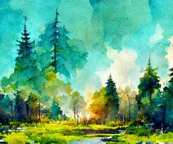
Now try to remember how Vincent Van Gogh incorporated this concept in his painting Starry Night, for he was one of the greatest masters of all time.
If you observe the night sky full of swirls, you would realize how Van Gogh amalgamates the night’s blue composition with other strong contrasting colors which include yellow and white for the stars.
These colors were not just simply mixed in a random manner, he had an understanding of the color wheel and knew how to blend them together to achieve a certain set of colors.
The stark contrasts are sufficient to get your attention and add a slight sense of motion in the painting which leaves an after taste in your mind after you detach yourself from the painting.
When I think about my experience with color theory and everything I have discovered through, I remember feeling a rush of excitement when I first learned about that wheel.
It’s as if a world full of creativity is unlocked by this special set of numbers that we all refer to as a hidden language.
You gradually begin to use that power in your own paintings, portraying colors that demonstrate how colors work together which triggers your imagination.
Now, let’s go deeper into this world of color and figure out how to use it to our advantage.
Color Harmonies: Going For The Right Vibes
Complementary Colors
Let’s explore complementary colors, which is quite a basic phenomenon but at the same time can take your work to a whole new level.
Colors that are directly opposite one another on the color wheel are called complementary colors such as red and green or blue and orange.
When they are placed next to one, another they produce a vivid contrast that has the potential to enhance your centerpiece.
For instance, you may think of a red flower against a green backdrop.
The combination of these two colors makes the image striking while introducing a complex tension that enhances the focus of the scene.
I think now it would be appropriate to give you a brief review from my self-portrait series.
There was a time when I was working on a piece that focused on the duality of emotions: happiness and sadness.
To express this contrast, I chose to factor in the use of complementary colors.
A sun possessing the colors bright yellow and orange (to depict joy) was painted and surrounded by deep blue and purple (to depict sadness, of the coming storm).
The contrast of hues was striking not only for its ability to enhance the visual appeal of an artwork, but for its ability to make Michael Jackson keep tilting it in the works of art with unenhanced emotions.
Using shades that complement each other taught me how to paint not just a picture but always an image that appeals to anyone who sees it.
Complementary Colors Color Combination
But now, let’s look at analogous colors.
Like blue, blue-green and green sit on the color wheel exactly next to each other.
The combination of these colors works particularly well as often when combined they present feelings of balance within a painting making it cohesive and pleasing to look at. Such as: a family portrait where the artist used green, yellow-green and yellow of a sunlit field.
These colors’ close proximity enables them to create a perspective and slight motion thus conveying to the audience the intended idea of the painting.
In particular, one of my favorite landscape painters, who’s work I admire most of all, paints wonderful landscapes from time to time using rather similar colors.
For example, In one of those pieces, the blue sky blends in with yellow as the sun set at the horizon thereby blending the sky and hills that follow the horizon line resting against the sun.
As such using such colors works as a sculpting tool whereby the viewer is placed in an exact moment of the twilight hours and the soothing calmness within evokes such images enhances realism.
Purple Green Composition
Equally balanced apart from each other brings us to triadic color schemes. As the name suggest involves picking three colors which is what we are now going to discuss.
To demonstrate, let us say you have chosen red, yellow, and blue.
This method results in a lively toned work that definitely has a lot of movement.
I remember how thrilling it was to decide on my colors when I first begun working with triadic color schemes.
To develop an eye-grabbing abstract art, I went with red, green, and purple.
Every color splashed onto the canvas clamored to be seen but ultimately aided in forming a great composition.
In order to make an art piece that aims to please the eye, I developed a method that involved careful judgement of color positioning and relations.
Art involves Color Psychology
Emotional Response Involving Color
Color is neither unnatural nor only a matter of beauty; it does have considerable and deep psychiatric effects.
Select the hues to use carefully as they will not only influence how the viewer interprets your work but will also help in color coordination.
Warm hues, such as reds and oranges, tend to trigger some sort of excitement, warmth or even anger while cool hues blues or greens to relax and not be so tense.
I still recall the artist’s work the other week at an art exhibition in which they painted blue colored portraits.
All pieces included pinks as the main color, which lent them a tone of bitter sadness but also showed a different form of beauty.
I am never forgetting how color better expresses feelings that emotions sometimes are even unable to put into words.
That fun experience of mine further reinforced the fact that color in art is a vital element and has a relevant emotional context associated with it.
Cultural Scopes of Color
And if that wasn’t enough, colors also possess different meanings in other cultures which brings us back to the complexity of color theory.
For example, when considering Western cultures, the color white usually stands for purity and peace amongst most, while in Eastern cultures it is used as an expression of mourning.
While traveling, I got a chance to meet different types of artists who talked about how color as a subject is understood in different regions of the world.
One of the Indian artists described how red is revered in their culture, for it represents love and passion, and how the color can symbolize danger in their culture as well.
I remember the first time I heard the talk about colors as such, I instantly understood the importance of context in art, and how in art color perspectives are so rich.
Such stories bring into focus the very essence of being an artist, and that is the fact that we also have an obligation when it comes to the selection of colors in our works.
Actionable Advice for Applying Color Theory in Paintings
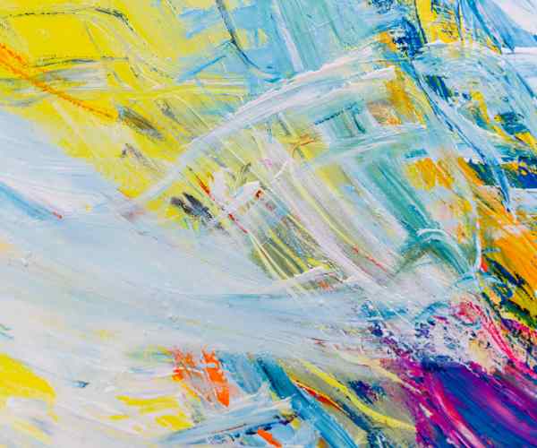
Mixing Color Theories – A True Refreshing Approach
When you start mixing colors, a new world of possibilities becomes available for you to discover.
Consider your palette to be a place for fun whereby you can play around forming new colors and hues.
Let’s simplify it into a broken down stepwise procedure.
Get Started by Understanding the Basics: Start with the three primary colors, red, blue, and yellow.
These are the basic ingredients.
Merging Individual Colors to Form Secondary Colors: To produce a secondary color, use an equal amount of the two primary colors.
For example, if blue and yellow are combined the result is green.
Creating Tertiary Colors: Mix a primary color with yellow-orange and the final result will be red-orange and varying hues.
Play around with colors: Do not be afraid to tweak the ratios to achieve the desired result since sometimes the color may changed.
If a more muted color is desired, mix in a little white or black to obtain tints and shades.
Always Test on Paper: Before applying the colors to the canvas, always test them on the pieces of scrap paper.
This way, you can see how they appear when dried not when wet therefore will ensure the desired purpose is achieved.
Color mixing on a rainy afternoon is one of the best memories I have as an artist.
I arranged a little desk near the window where sun rays would shine through the clouds to start mixing dark and light shades of green. After a while, I had made a range of colors from a dark forest green to a light mint green. The sheer activity of mixing the colors brought me happiness and also made me realize the vast world colors have. Things to Do to Retain Color Living Now, let’s talk about how to avoid making your colors less colorful during the art process. Use High-Quality Paints: Better quality paints often contain extra pigments which in turn prevent achieving vibrancy, however, cheap substitutes are not worth it. So, Restrict Mixing: More amounts of mixing lead your colors to be softer. If a specific color is your favorite, you should attempt to take it straight from the tube instead of combining too much. Go for Thin Layers: Instead of too much liquid, start gradually building colors in very thin layers. When you use thin layers, it allows the colors beneath the surface to peek out which then improves the overall vibrancy. Make Sure to Clean Your Palettes: Messy colors mixed with dull colors would restrict your art from being vibrant so cleaning your palettes regularly is recommended. Trust the process; a tidy workspace could be very helpful! Using Color Palettes Another important technique to implement the color theory effectively is to build and use color palettes.
A carefully planned out color palette can bring a painting together while also providing some more depth to the emotions the painting evokes.
Here is a step by step guide towards creating your own unique color palette:
Seek Inspiration: Take a look at distinct pieces from nature, photographs or even artworks that pique your interest.
Color Dominance: Decide upon a color that you wish to dominate your composition and make it the focal point.
Select Complementary Colors: Prior to your complementary colors that will serve to contrast your dominant color and add extra colors that go well with the focal point.
Don’t Overdo Your Colors: Aim to stick to five or six colors at most.
This allows the audience to easily focus and gain a clear understanding your piece with ease.
I vividly recall speaking to an artist at a gallery who had a distinct color palette which consisted of shades varying between Coral, Gold and Teal.
This was the color scheme they were known for since it defined the core principles with which their art was made and constantly sought to use.
Utilizing this scheme allowed them to come across as warm and serene due the ease people have with the palette they seek to use, this is one of the most basic yet effective techniques one can adopt.
Invoking Depth with Colors
Utilizing colors properly allows for one to add depth and various dimensions to their artwork.
Here are a few approaches to help you on how best to make use of colors:
Layering: Start shifting about by building your paintings in layers.
Using deep hues in the background allows you to make the mid-ground and fore-ground colors appear vivid when applied.
Warming them up with the usage of warm hues in the forground giving a more nose-on perception as the cool hues are used in the background further elevating the depth.
Including darker tones and lighter ones extends colorful variations.
Using this method, the perception of form and space is assimilated into the viewer’s mind.
I recall observing a stunning piece created by a talented artist who applied layering techniques to enhance the depth of a landscape.
As an illustrative example, it began with deep tones of blue and purple for the hills along the horizon before applying pastel greens and yellow for the mid-ground and front sections.
All these melded perfectly producing a stunning look further making one feel alive and welcoming being stood in the center of the imagery.
Based on observations of many artists in this blog, the art world is quite distorted giving examples of emotions that arise in the viewers mind and how they react.
Let us discuss a few of the frequently asked questions revolving color theory.
While painting, what’s the role of a color theory?
Color theory is important since it aids painters in understanding how colors function together and how they work together to produce exceptional and engaging pieces art.
How do you select colors that will suit your artwork?
Try to let a color wheel direct you and decide what feelings you are trying to portray. Try out different color harmonies to see what fits your thoughts best.
Does color theory allow me to show certain feelings through my paintings?
Of course! This is especially applicable when talking about warm or cold colors – they invoke varying emotions when used. In other words, cozy colors can be used to demonstrate energy whilst colder colors will calm the audience down.
What are common mistakes that people make while applying color theory?
A mistake that is observed frequently is people attempting to mix in too many colors to create a new shade, Doing so will lead to a dirty color. Moreover, not utilizing color’s power when attempting to portray a message can ruin the intention.
How do I make the colors for my art?
Begin with one color that you want to be your prominent one, After that you can select complementary and more colors, However, do keep restrictions in place to ensure all the colors blend nicely. Keep experimenting until you find a color palette that you like.
Conclusion
Before finishing off, It’s apparent that even when painting, understanding the application of color theory and other ideas can help elevate the paint significantly.
Feel free to, Explore, Mix, work with colors, and try to find what fits you so that you can make art that reflects your voice.
You have a distinct relationship with colors, and I’m excited to hear your narrative.
Which color palette or mixing methods do you find most fascinating?
Let’s exchange experiences and keep making this journey colorful!