Try to picture entering a room where every color can be compared to a language, together forming paragraphs with each hue forming a different phrase. For example, a light whisper of pastel pink diffes from the profound depth of midnight blue. This is the force of appreciating the subtle distinctions that exist between tints, tones, shades, and hues in the broad realm of colour theory. Each of these terms carries a lock and this lock can be used to understand the significance of color in our lives, emotionally or psychologically.
In the simplest terms, a tone is said to be the purest color, representing the raw band that the spectrum shows, such as the bright red and calm blue. Further, saturation explains the concentration and vividness of these colors while lightness sees the amount of black or white present in a color.
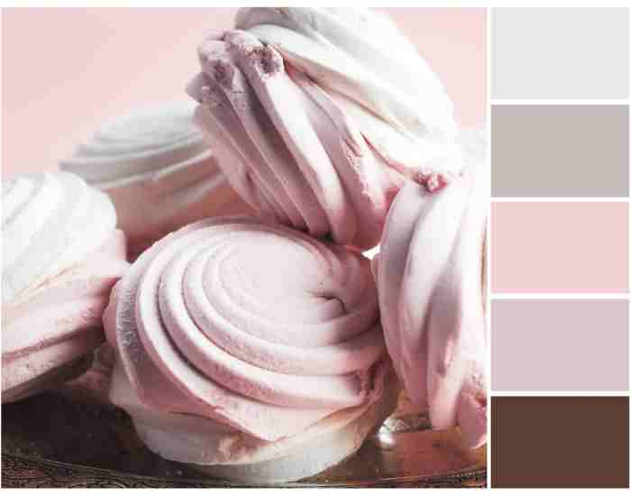
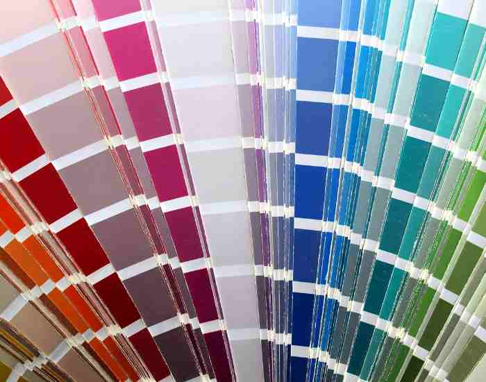
Tints are said to be hues mixed with white, making them look more fresh and airy and therefore making the space more open. While, Shades are hues mixed with black which only turns the air darker, moodier and more sophisticated. Lastly, tones which are the most subtle of the three are hues mixed with gray which only brings an understated sophistication.
Knowing the difference between these shades is not just of theoretical importance; It is a practical tool not only for artists and designers, marketeers but also for people who want to dress in style or furnish their houses in a fashionable way. The color wheel is transformed into a tool, or even a compass which facilitates both artistic and design’s and life choices. The color as a base pulsation becomes a principle colour supplemented by the knowledge of how to combine and mix other colors into color palettes as the brush with which we create new realities.
What is a hue?
In Color Theory, a **hue** can be defined as a pure color that can be regarded as the truly fundamental color, and this can be represented by the color wheel. And depending on the positioning, this hue spans to a red hue all the way at the top and a blue hue at the bottom. The part of the color wheel contains pure hues which includes: Violet, Yellow and Red and warm and cool colors of the spectrum of pure hues.
Think of blue skies on a sunny day. That entire color scheme you see is a hue; a tone or a shade color. Or, a perfectly trimmed Jonesist lawn represents a tone of green perfectly cut and cared for, without any tone change. This case emphasizes the importance of the hue, as it dominates the base color of any design in existence.
Examining Tints: Softness of Colors
Tints add white to the truer hues and add a lighter and softer touch to it. This also means that the base hue is under stress and it is a light form of its self capture and takes the shape of pastel colors that are feathery and pastel as well. Tints have an amazing ability of making areas look smaller than they are and also give an impression of calmness and peace.
For Fashion and interior design sectors, Tints have an important effect in changing people’s perceptions and even their choice of aesthetics. For instance, spring collection pastel shades bring an aspect of change and freshness most people, actual bring a tender slant of sunshine and hope. Likewise, tints bring about a different feel in interior setting, for instance, they tend to make the room feel spacious, well lit and comfortable.
Obtaining Colors: When All Else Fails and Black is the Answer
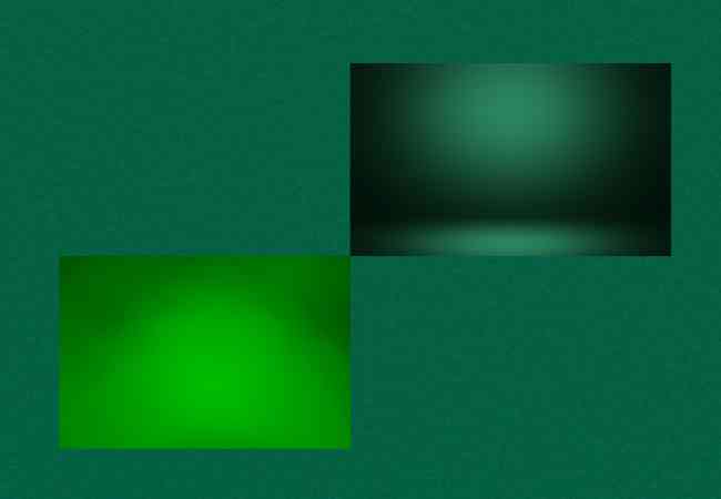
Shades are color at its most intense as they are pure shades obtained from different colors but contains black as a core component. This process brings the color deeper into its original state but elevating its self and gives the color a lot of praise. Shades in design are important as they help balance the visual comprehensiveness of a complex and seemingly chaotic nature.
Colors help to set the mood and establish contrast in all artworks particularly photography. For instance, in photography, when you take a snapshot of a sunset and there are dark tones of purple or blue, that highlights the beauty of the sky. Another painting in art where the shadowed edges of an object are shown using dark tones which gives it volume and perspective. These uses of shades profoundly affect the overall composition, assisting in realism, depth, and emotion.
Because of the appropriate use of shades, the storyline created in a piece of art can completely alter as the guidance of the viewer is directed to whatever the piece is aiming to portray, or simply make a person feel something. The combination of light and dark through shades adds a whole new dimension to the piece and can appeal to the viewer on a more personal level.
Understanding Tones: The Complicated Simplicity
What exactly is a tone? Tones are created when grey is mixed with a color, and its vibrancy is pruned down. Such a combination rings down the other aspects of the color, which dispalys the original color in the elegancy it needs. The very combination of two colors provides an element of tone to the color itself whilst nullifying the visual noise inside.
In graphics designing, Tone acts as the backbone which is always there but and goes unnoticed in blending the images nicely to form a picture. Just think of how a luxury brand’s website looks. The elegance of the completely toned down colors on the website is enough to tell you that this is a high worth product. Or take a mobile app as an example. The app uses tones for its background so that it does not mess with the text color and renders the app useless to read. The above examples are proof that tones are an element of design that are small but a powerful design modifier.
In the kaleidoscopic world of design, it is the combination of the myriad depths of color, from the striking to the faint, that helps in designing spaces and digital canvases. The designer necessarily requires to comprehend the interplay between colors, the color palettes, and the color wheel… this equips them in providing the right atmosphere, depicting meaning without speaking, and most importantly designing spaces that appeals to the target audiences.
Let’s take a hypothetical situation which shows how color theory when put into practice works effectively. Think of a living room where its potential was not realized because of the dull monotonous shades composed of the constituents of the color family. When principles of color theory are applied, for example, the use of complementary colors and different shades for textures, that very same space is transformed. It goes to a place. A place that is characterized by balance and peace of constructive time where each color used was very well chosen, giving dimensionality and accentuating the size of the room. Such a before and after event, is not just a recoloring of the space, but in essence an exorcism of the space, which has now been absolved of irrelevant color choices which break the rules set by color theory.
Color Psychology: Digging Deeper
Color psychology is at the heart of understanding the core of color’s essence. It’s crucial in understanding how a person’s mood or perception can be altered through the use of tints, tones, shades, and hues. As can be inferred from the name, different colors have an affiliation with the thoughts, feelings, and behaviors of people. This is important especially for marketers, whose aim is to create strong impressions on the minds of their target audiences.
For instance, in the palettes of brands with a target towards emotions or strong feelings such as trust, stability, and calmness, blue becomes a required color since it will create a wash of those emotions in the customers. And vice-versa, if a brand targets arousal, passion, and stimulation, the inclusion of red is necessary, as a brand’s power comes through call-to-action such as buttons or sale announcements.
A branding example that illustrates this well is the connection between being organic or eco-friendly and the color green. Brands that offer those type of products often opt to represent them with green, highlighting their importance to nature and sustainability. Such decision not only connects the brand with the set identity but also evokes feelings or values associated with it in the desired audience thereby providing a strong consideration for the brand.
Strategies for Selecting the Ideal Color Mixes
When it comes to designing, color is an essential skill to acquire one has to manipulate and combine colors to come up with something amazing and emotional. For there to be a distilled application of color there has to be an understanding of the fundamentals of the color wheel and color theory. By following these guidelines, one can understand a robust color logic whereby colors can blend, interact and even clash to create a masterpiece.
When trying to create tints, tones, shades, and hues, one must first think about what message or emotion the design will convey. For example, using a palette of soft tints and bold hues together can offer a feeling of vibrancy and balance, perfect for designs meant to engage and stimulate. Usually when there is too much saturation, the design entails a focus on balance producing a refined look.
There are different color palette selection applications and tools which assist the designer to select the most suitable and appealing color references. Designers are aided in selection by software applications like Adobe Color, Coolors, and Canva’s Color Palette Generator since these enable users to modify saturation or lightness or chromatic intensity of colorsat will and therefore the combinations of colors are endless with just a click. This facilitates even easy generation of palette but also invites diversification in terms of relationships between the colors based on color theory such as analogues, complementary and triadic relationships.
What Color to Use and Why
It is possible to succeed and fail in overcoming the challenge of colors in a design. Color application can make great impact on the design. The use of various cultures and practices can be effective but here are some best practices:
Using contrast to improve text and element comprehension. If there is a combination of black letters on a white background, the text can be spotted with a great ease.
Consider how and why colors are used across a range of cultures. One cultural understanding may not be the case in particular reason, which, if ignored, can affect how one perceives a design.
Do the same – but only the room done consisting of crossword or fill in the blank styles of activities.
Avoid using a large number of colors within one design. Limit your palette to two to four primary colors, it will help to create visual uniformity and harmony.
Try to consider color usage in designs in terms of what and how places the majority of focus. Color broadcasts a message that one person wants to another.
Do not ignore the use of whites. A balance between light and dark enhances the effectiveness of one’s color scheme from getting too loud or busy.
FAQs
What do the different terms tints, tones, shades, and hues mean?
Hues are the bottom of all other colors, the most basic primary colors on the color wheel without any addition of black, gray or white. Tints are graduated colors which are pale tints of the color hues, by being mixed with white, they are softer. Shades are colors which have the hues shaded with black, therefore increasing the depth of that color. Tones are almost like shades however these are tones which have their hues “washed” with gray, this can create a more refined form of the colors.
In what ways should I use these color variations in my projects and everyday decisions?
In order to use these variations properly, think of the emotion and feelings you want to express. Use tints if you want to create a calm atmosphere and have it feel fresh and inviting, shades if you want it to have a sense of seriousness and depth, and tones if you want to create elegance and class to the work. Play around with the combinations as you may get different emotions and visuals.
How color selection and color schemes are impacted by color theory?
Color theory provides a scientific and artistic backdrop for showing how colors work or steps to pick the color that will enhance the mood during the design process. It helps narrow down colors to be used in a design to those ranges which may either blend well or enhance the contrast.
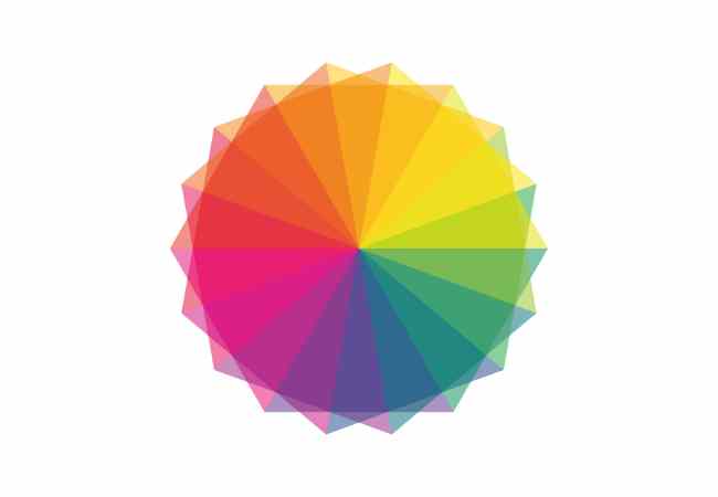
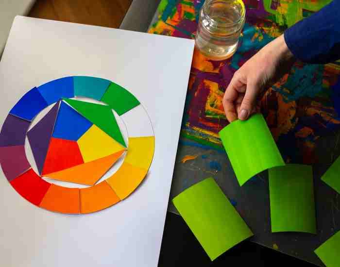
What is a color wheel and what colors does the color wheel contain?
The color wheel is indicative of the chromatic relationships of various colors arranged in the circular format. It is used to find colors that are opposite one another, those that are next to one another around the wheel and spaced equally around the wheel in a triangular fashion to come up with appealing color mixtures.
What are the techniques and processes towards picking different colors for my color palettes and designs?
First determine the audience or the mood that your design seeks to achieve. You can then look at the color wheel and pick colors that go well with the Primary color and create a harmonious and aesthetically pleasing result. Do not forget about the significance of colors in other regions. Search for and use programs and apps that let you change to various colors until you find one that pleases your eye.
Conclusion
This exploration of tints, tones, shades, and hues has also allowed us to appreciate the role of color in design and art. Learning these basic aspects of color theory opens up opportunities for creativity and expression because then it is possible to create designs that are appealing to the eyes and also invoke the desired feelings.
The exploration of the color wheel has shown the endless possibilities that effective color application can bring to the design process. Starting on the subtle hints of tints, through the understated elegance of tones, and to the bold intensity of shades, every single hue is important to the mouth of a designer, artist or a color decision maker in their day to day life.
All the people who are reading these lines of the text are encouraged to get more into colors by mixing different hues to their works and spaces they live in. Use the perspective you have gained through reading this article to help you become an informed user of color and enhance the language of your designs with color.
More Post