Have you ever considered how geometric shapes can enhance the beauty of a visual?
One could argue that a shape such as a triangle or circle alone can single handedly elevate a basic design into a breath taking one!- And I agree!
Geometric shapes are so much more than just lines and angles; they are the basic components of art and design which aid in providing stability, harmony and a feeling.
I still remember my early days of graphic designing when I had to work on a promotional poster for my university’s art exhibition. At that time, I was swirling in a sea of colors and images without any concrete direction.
Then, Epiphany struck: geometric shapes!
Adding shapes of different sizes and colors made the poster dynamic and visually arresting, which in turn helped my audience to focus on what was most significant.
My understanding of the enormous influence geometric shapes have on our environment was profoundly altered by that experience.
What Are Geometric Shapes?
So, what in clear words is geometric shape?
Geometric shapes are these designs that consist of certain angles, lines and forms which acts as building blocks.
These shapes can range from simple ones like circles and squares to more complex ones like polygons.
Geometric shapes in visual arts have multiple purposes why they exist: they fulfill the need for structure, they generate patterns, and most importantly they express feelings even.
For a case, a circle might represent togetherness and oneness, in contrast a square is likely to represent order and organized nature.
It is this versatility that renders geometric shapes so important in design and art.
Classification of Geometric Shapes
Now, let’s look into the various geometric shapes.
Circles: Such shapes are often viewed in a different perspective, a more holistic view because they project motion and continuity. Countries use them in their logos like the Olympic uses its rings to promote a nation’s unity.
Squares: If you see many corporate logos using these types of shapes, there is a reason as these shapes tends to evoke trust and stability for those brands.
Triangles: They depict movement, direction, and action. While designing a flyer for a music festival, I used triangles in the design to create an illusion of movement, so the flyer looked like it pulsated with life.
Polygons: These are shapes with multiple sides that can enhance and spice up a design. Ranging from basic pentagons to advanced hexagons, these are frequently used in Graphic designing and modern building architecture.
The Psychology of Geometric Shapes
Shapes do have some level of emotional attachment associated to them, let’s examine the emotions behind shapes.
As an illustration, circles are seen to give off feelings associated with warmth, which is one of the reasons why brands that wish to come across as inviting frequently utilize them.
But on the other hand, when someone sees a triangle, it depicts strong angulated edges which create tension or suspense, which is the reason they are depicted in vibrant and action driven designs.
Brand Strategies with Shapes
Geometric shapes have proven to be a key aspect in the efficient communication of brand messages in many brands.
For instance, the logo of the tech giant Apple skillfully depicts a metaphorical rounded shape accompanied by soft edges which feel innovative and approachable, rather than aggressive.
Unlike Adobe, whose logo consists of clean edges, means to reflect ample attention to detail while marketing their software.
The marketing takes it a step further to ensure that the shapes that were selected for the brand are much more than mere additions to the overall look of the package design as they evoke specific feelings themselves.
How to Cut and Use Geometric Shapes in Design
1. Poles: Integrating Balance and Harmony
While being tasked with designing something, a specific focus should be placed on balance and harmony as they are the deciding factors that will ensure a design’s success or failure.
In achieving balance geometric shapes are key elements.
Take, for instance, layouts that incorporate squares along one side and circles on the other, incorporating circles on one end and squares on the opposing end, sits in the center.
By doing this, the design becomes visually pleasing which naturally leads the viewers eyes across the design’s surface.
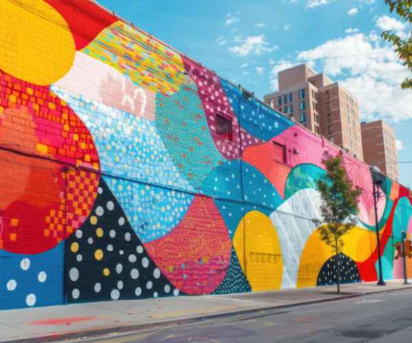
These cunning designs pair well with colorful palettes and one of the few community events designs managed to capture balance by properly overlapping the shapes.
The end result was a design that serves its purpose without being too attention absorbing.
Such balanced designs are commonly seen in brand logos, on billboards or even posters.
Very specially recall the logo of Coca-Cola? Classic design of the logo integrates rigid lines of the container with fluid curves. Retro aesthetic.
2. Controlling the Viewer’s Focus
Lets not forget how geometric shapes can allow the viewer’s eye to travel around the design.
The compositional layout of shapes can serve as a trail that leads one’s gaze to the most critical aspects of the design.
One of my graphic design course included a project in which we were tasked with preparing an infographic.
So I thought it’d be interesting to utilize os a series of pointing triangles.
In this way, a smooth flow of information was accomplished as these shapes helped guide the viewers’ eyes from the top end of the infographic to the essential data sitting at the bottom end up.
An excellent and practical example that portrays this theory is the Spotify Wrapped Concept.
In this case, they employ round diagonal shapes to navigate the users through their customization of data.
The combination of shapes makes the journey interesting, encouraging consumers to investigate their listening habits further.
3. Enhancing Thickness and Volume
Including thickness and volume has the ability to allow a design to be more appealing and interesting.
This is where geometric shapes come in handy as well!
One of the ways is layering of shapes like triangling a transparent triangle over a solid square.
This can make for some pretty interesting layering styles that give off an illusion of a three dimensional perspective of the design.
I recall a case where I was tasked with overhauling the design of a website for a local artist.
So, as a result of using geometric shapes of different opacity and shadow effects on the design, there was a clear distinction in the outcome because the initial outcome was just an ordinary two dimensional piece, however, the final outcome appeared more colorful and three dimensional.
To me, the website looked a bit bleak and lifeless before getting a facelift.
After we performed these techniques, I think that the website became much more entertaining and the art got more exposure.
Such examples are a good representation of how much of an impact geometric shapes and patterns can have in a movement.
Notice the patterns that add gradients or shadows to the designs the 3D effect a sphere achieves in turning a 2D flat design into something entirely new one is a often a fantastic one!
4. Focal Points
Geometric shapes can also be all powerful when it comes to providing focal points to the various elements of a design.
A specific shape, if used properly, has the power to focus on important areas’ of the design layout.
A big headline on the poster could be redirected from the corner of the poster to the center as long as there is a big triangle there to take the place of attention and obliviously this triangle does not have to colored in with a light shade only dark red color is needed.
While I was working on the branding of a tech start up, one of the circles in some color I remember was huge and made me feel like it is off focus from the logo.
And this technique ensured that the logo is noticed while the background stays faint.
For instance, consider the logo of Nike, it has a swoosh shaped logo which is basically a geometric shape and is the nitty gritty of the brand.
The design is quite simple yet effective because it is the combination of effective shapes and the simple ones.
5. Furthering Patterns In And Textures
Now, let’s delve into how geometric forms are integral in matters of pattern making alongside making textures.
Visual appeal can be added through any design by incorporating different shapes and making geometric ones into more patterns.
I once worked on a textile design project that focused on creating patterns using hexagons.
The end product was a great fabric that was structured yet had an organic vibe to it.
The wallpapers, branding materials and overt branding tools are some also ways of incorporating geometric patterns that can enhance the visual look making it intricate.
Working on projects that involve these patterns like modern walls, wallpapers and even packaging showcase the fact that geometric shapes can add texture packing an effective punch line.
Observe how companies, especially textile ones including furniture’s patterns have geometric patterns which makes their items blended and interesting.
How to Embed Geometric Shapes in your Designs
Therefore, here are some tips to help you incorporate geometric shapes in design if you still want to use them in any form:
Begin with Simplicity – The golden rule to remember when incorporating shapes is to keep it simple. Don’t fill your design with a haphazard array of shapes, instead pick a few focus ones and then expand upon that.
- Adjust the Size – You can adjust the shapes scale and achieve a unique visual aspect to your design while creating a sense of hierarchy within it.
- Color Difference – Use color strategically to make some shapes stand out, visually contrasting some colors can aid in drawing one’s attention to specific areas.
- Use Software Tools – Geometric shapes can be easily created using software tools such as Adobe Illustrator and Canva, which can also provide you with designtemplates for inspiration.
- Find Inspiration – Explore the works of other designers you admire and study the shapes they employed and their rationale behind them, for help.
Following the aforementioned tips, you will be able to incorporate geometric shapes and use them optimally in your designs.
Use shapes liberally and enjoy the process of designing. Using shapes should be an integral part of your creativity as every design should speak for you.
What are some common geometric shapes used in design?
Let’s face it – every design has a limited set of basic geometric shapes that are guaranteed to be employed.
Let us take a closer look at some of the most commonly cited cases:
- Circles: A very versatile shape, circles are found in f logos, buttons or even icons. Target has its logo in the shape of a bull’s eye that is surrounded by concentric circles to give a feeling of solidarity.
- Squares: Squares donot move. Consequently, balance is brought about by these four sided shapes and as a result of this, they are found in interior designs a lot. For instance, square logos are used for a being orderly sense. Only recently did i create a portfolio website and as expected, i used a lot of squares in its layout to give it a more orderly and neat look.
Web Analytics & Tableau
- Triangles: They are quite dynamic three-dimensional objects and often suggest movement or a change in orientation. In psycholinguistics, triangles can be found anywhere from arrows ti advertisements and even in the background to suggest motion. I tend to use triangles a lot in my work as i believe they can add life into a design. For example, an advert I designed for some local tourism together with my friend featured a local music festival.
JTO Biological Science 10: ‘How to Spot a Rotting Mass of Cell in Cat’s Tongue’ - Polygons: These are shaped with four sides or more and can be interesting and complex. Hexagons in particular have made a reemergence and have started being used in product design alongside web design.
Then interlacing polygons of color emphasized without difficulty the regularities with decorative swirls all around.
These shapes serve functional roles in restructuring the viewers experience.
How do the shapes which are Geometric affect user experience of any web design?
Geometric shapes in web designing can greatly change the user experience ux.
Shapes are crucial in determining how effective you and your content are when used effectively.
Smooth edges tend to be more warm and welcoming while sharp ones tend to be very strict.
One of the clients that I was working with asked me to redesign a blog into something much more friendly and inviting.
To Solve this problem, I employed rounded shapes into the buttons and section dividers which allowed me to create a warm atmosphere that encouraged readers to further investigate the content.
But that is not all, shapes can also be used to improve the usability of the website.
Using shapes in a logical manner will help the user in remembering the layout and the different CTAs present in the website.
Using geometric shapes wisely in web design is likely to result in a good impression on the visitors and then achieving the goal of them spending a longer duration on a single page.
Is it possible for me to include geometric shapes in my logo designing process?
Definitely!
Brand identity can be achieved through the use of geometric shapes in logo designing as it is clean and memorable.
Almost all brands and companies nowadays have some kind of geometric shape in their logo which helps them express the core value of the brand.
One such example is BMW, their logo consists of a circle split into 4 sections and it gives the impression of precise movement.
When I was creating my personal brands logo, I used triangles and circles as they are an excellent representation of innovation and creativity.
While the geometric logos were kept modern, they were still able to maintain an aesthetic which fits many backgrounds and surfaces.
So yes, I am ordering you to please utilize geometric forms while designing your logos – you will be surprised!
When I want to apply two–dimensional geometric shapes to my designs, what factors do I need to consider?
There are several principles that you need to consider when you want to use two-dimensional shapes:
- Alignment: Shapes need to be aligned, which brings a certain level of organization. If they are not aligned then the image will feel cluttered.
- Contrast: To properly define or highlight visuals, use shapes or colors with stark differences. This aids in focusing on crucial information.
- Hierarchy: The size and position of specific shapes should be adjusted to create a hierarchy in visuals. Bigger shapes can mean bigger premises, thus guiding the eyes more.
- Simplicity: It is much more effective to get your point across using a small number of shapes then going all out and overstating everything so keep it simple.
- Consistency: Your image or design will appear much more cohesive if you stay in the same shape style, for example, if you use rounded shapes.
These principles will allow you to leverage the effectiveness of geometric shapes while designing and aid in improving the viewer’s engagement visually.
Summary
In conclusion, it is evident that geometric shapes are an important design element that can add interest, direct the audience, add perspective or depth as well as serve as a point of interest.
As I have seen, the incorporation of shapes within a design spec can result in such a drastic shift that the design becomes interactive and efficacious.
Do make use of these geometric shapes in your tasks and do not hesitate to test their potential.
You could be astonished by just what wonders these basic geometric figures can do to designs!
Looking back on the design community, it was on the occasions that I had recently started working with geometric shapes and manipulating static designs into dynamic layouts.
It’s like the entire world realized the importance of these facets when it needed to make association – I definitely did.
Yes, you can most certainly do that in your next project, which includes circles, triangles and even squares and see the outcome.
When you utilize the characteristic of geometric shapes, the boundaries become limitless, as does your imagination!;
