Consider your favorite pieces of digital painting. It could be an artistic picture turned soft under the sunset or a smooth portrait with a bright beam of light directed towards the face. Now imagine these without realistic lighting. From good to great, lighting can completely overhaul the piece and when you think about it, it is what genuinely brings out the place and breathes life into it. It’s not only color or subject, it’s how the light comes to play and interacts with all those factors that pull the viewer in. Every art piece retells a story.
There is always the time we became enlightened as an artist and work of art started to seem 3D, more beautiful and more alive, and reality came crashing in! I still remember the day when I figuratively met with lighting, While working on a digital portrait and expecting to add more depth on the structure started to realize how lighting could play a role during shading. After living with the portrait for quite some time, I took it outside, I observed the sunlight glancing off the poured leaves, and the stage’s direction changing as the sun’s position changed. What tends to goes unnoticed is the shadow, and in this sketch I finally learned how to blend in light and shadows from the right angles which made the structure alive and beautiful. It really made me understand how controlling light gives birth to new art and breaks other images and brings life into reality. From there onwards, I knew how important lighting was from here onwards, lighting truly had the ability to control every aspect of the art.
The lighting of the structure is in some artists words way too practical and might bundle you up in one skill for eternity, I want to assure you although Shawl has been working with portraits of structures for as better you said as decades he surely tends to forget about where he last kept one of his portrayals. But here is the good part, along with lighting, blending can change up a whole lot even if one’s a beginner at painting! Don’t assume such concepts would only make sense when you have spent ages painting, blending and lighting can make your life way easy from the start.
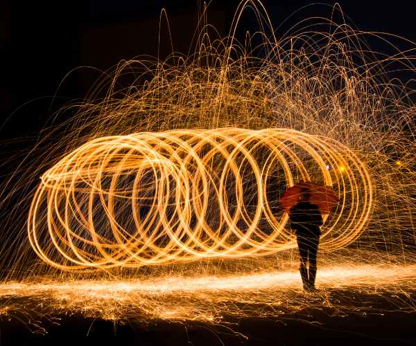
The Role of Light in Digital Paintings
Indeed, everything that I know right now about light arises from my personal experience. The way how light shapes the world around us seems to differ from physics. However, It depends on materials, the location of the light source and, the surrounding atmosphere. A proper understanding of how light and shade interact will enhance one’s ability to paint realistically.
You can imagine a summer’s day when the light is incredibly bright and the shadows are very dark. Remember a chilly and foggy morning when the sun is relatively weak? The settings you can use to enhance your digital painting are limitless, don’t just paint the objects, paint the atmosphere, remember, you’re creating the weather too.
Consider the renowned digital artists like Craig Mullins once again for instance. Craig Mullins is an expert in lighting when it comes to landscapes and epic scenes. Art critics frequently compliment his Sunset and City painting for its vibrant lighting in electronic urban areas, as well. The light breathes life into any and every scene, whether it’s a sunny delightful exterior or a gloomy, dark building.
Instruments of Light
The ability to distinguish between direct and indirect forms of light is an important element to consider in achieving authenticity in lighting for pieces in digital art. Direct light is characterized as light that directly strikes an object. For example, sunlight or a lamp can be examples of direct light. Direct light creates sharp darkness and strongly highlights the brightest parts of a scene. Indirect light is light that has been reflected from other surfaces before reaching the object. Because the light is diffused and less concentrated, it is more even and softer. As a result, the corners that would otherwise be black are fully illuminated.
For instance, assume that you are working on a painting of an outdoor scene in which you need a window to let in some daylight. Sunlight pouring in through the window would be the strong light source, which will produce hard shadows. The light that hits the walls or floor and reflects off them to fill the shadows with softer colors is your indirect light source. These types of light are indispensable when it comes to achieving a harmonious and realistic image.
Watching light in real-life scenarios is an effective technique for grasping the concept. Think about the items on the desk in front of you right now. Direct light from a lamp creates extreme hot spots and black shadows, while indirect light gases in the area help blend those blacks sufficiently to show them a little bit of depth. Now begin to implement all of these into your digital works and determine what outcome they yield in terms of making your lighting more realistic.
Specular, Diffuse, and Ambient Lighting
Specular, diffuse, and ambient are the three main lighting types used frequently in the realm of digital art.
Diffused light refers to light that has a gentle intensity evenly distributed throughout the surface. In other words, it has an absence of both harsh light and deep shadows. Rather, it has a smooth effect between bright and dark. Diffused light can be seen on cloudy days or on indirect warm light indoors. While editing digital portraits this type of light is most often used since it gives a realistic touch without being over the top.
The concept of specular lights is in stark opposition to diffuse lights as these are used for highlights because they are harsh and extremely bright. Moreover, specular lights are reflected off glossy surfaces including metals and glasses. In the case of digital images, specular lights are used to bring shine and make objects look glossy. Stepping into pavement and then turning around or looking at a rounded table top can be envisioned to look realistic with the use of specular light.
Ambient light can be explained as the universal light that is present in any room, or the light that shines throughout the room without a source. The presence of ambient lights reduces sharp contrast. In short, They are the most helpful types of lighting devices because they prevent shadows from being darker than the darkest point in the picture making it look more smooth. It works as a balance for direct and specular lights.
For example, if you’re painting the nighttime view of a city, you will most likely use all three types of light. There is diffuse light from street lamps around the place, specular light from the reflections found on the wet surfaces or windows, and ambient lighting used to shade darker areas and prevent the scene from being too harsh.
Understanding the significance of light direction
Let’s discuss light direction next. The position of the light source in a painting will greatly influence the shadows, highlights, and the entire atmosphere of your painting. Shadows, highlights, and colors in your composition are all governed by the orientation of the light source.
For example, consider a bright sunny day around noon when the light is coming from overhead causing very short shadows directly below the objects. It’s coming from the side, like during a sunset, so you will see very dramatic long shadows across the scene. And this change in the direction of light changes the temperament quite a lot too; noon light is cooler and more neutral than when it is at a deep sunset which is warm and strong.
To take this idea one step further, a good exercise idea is to take a simple shape such as a ball and place it under a spotlight and observe how the shadows and the highlights change. First, turn on a lamp and set it right above the shape, then try putting it to the side. Now, these setups that you have made can also be done with the digital painting software that you have. This will assist in formulating an understanding of how the eye can identify light direction in more intricate setups.
Steps on Enhancing Realistic Lightning in Your Digital Pieces
Creating realistic lightning may seem like a hard task however, this becomes an easy approach once it is divided into shorter parts. Coming back to when I starting practicing my lightning skills, I was doing it all wrong. Trying to add in shadows and highlights without much strategizing made everything dull and un ideally flat. But then it came to my notice how important it was to begin planning for the ideal lightning early on and the difference that it made, and I believe it can do the same for you as well. So let us take steps together and guide each other through the complex aspect of digital painting.
Establishing A Light Source
As a guide before jumping on your tablet or clicking on your mouse, think of the position of the light source in your painting as it will determine where the shadows fall and how the colors appear. Your light source is fundamentally the most important element in your painting because everything else is determined by it, to include the color palettes that you decide to use.
Never forget that your lighting needs to be done in the beginning stages of your painting, as it is critical. Once I was doing a painting that needed the light source to be planned, I completely went ahead without planning that only to notice after reaching halfway that the shadows I had made were poorly placed and hence I had to change almost the entire painting. It is similar to trying to bake a cake only to remember halfway that you haven’t turned on the oven, it’s quite a brutal situation to deal with.
As an example, while doing a digital painting of a forest scene, I opted to use light coming through the trees as my only source of light. That additional time to think about how the sunlight would hit the trees was well spent in terms of preventing effort from being wasted while simultaneously making the piece seem more natural and aesthetically pleasing.
A good starting tip? Try to position your light source to the side or above this will provide you with some interesting shadows and give your painting some depth. And if you are employing some software like Photoshop and Procreate, you can also do a quick sketch of a light source marker in a different layer to remind yourself where the light is as you paint.
Use Reference Images For Lighting Accuracy For Beginners
In all of the things that I have lost in my lifetime, the one thing I miss the most is how I wish I knew early in my journey the value that reference images would provide especially in getting the lighting right. We can all envision what a light is in our heads, but the details in which researchers outlined light could be much easier once you are aided with picture. I think it is essential to make sure that you have reference images especially when trying to achieve some hard lighting effects like oil painting.
For instance, if you are rendering dowel inserts into an animated building skimming over a streetlamp photos that have it lit at night can be very helpful to see how the light actually appears. The kinds of shadows a streetlamp casts against the night sky and how those shadows contain slight dimples is enough to provide an ideal disability for your own work.
There was a time I began painting a cityscape at night and thought I had a grasp on how the streetlights would look against the building but later when I got hold of a few reference pictures of actual streets, I realized I was wrong. The lights were softer and the shadows were not as rough as I had pictured them. With the adjustments, it was so much more realistic.
I usually approach Google Image searches for good reference photos but it is also quite alright to use your own photographs, or browse through platforms such as Unsplash. Just ensure that the images you are trying to use as a reference suit the lighting orientation you wish to set, and don’t hesitate to use multiple sources so you can have a better idea on how the light works.
Construct shadows and highlights step by step.
One of the biggest fantasies I used to have (and I see a lot of beginners have this fantasy too) is attempting to add shadows and highlights too soon. There is always the urge to add some dark areas and label them as shadow, but this doesn’t help the painting at all. Shadows and highlights need to be built up in layers, slowly, I repeat, slowly so they are rich in shadow volume.
For instance, shadows are not merely cast in black. In fact, shadows in real life are full of subtle colors influenced by the objects present around the shaded area. I understood this principle of painting while working on one of the beach scene paintings. At first, I would just place black shadow beneath the objects, painting the shadows to be rather basic, but these black primitives tend to look out of context. Because light reflects off the sand; and that light softens the black shadows while giving warmth to them. Shadows are so much more convincing with slight orange and yellow blends. All of a sudden the picture is extraordinarily lifelike.
Highlights also are not singularly white in color. They too can have a tint, especially when the light used has a certain temperature or a color (more on that in a second). The way you can concentrate on building your shadows and highlights is in different layers with a low opacity and blending them into the environment quite slowly. This method will give more life to your painting by giving it contours. Color and Temperature in Lighting Any color with a certain temperature would have a certain impact on the lighting one uses on one’s painting and therefore mood. The light that is used in paintings is not only usually dull white, it can also be slightly warm such as a light orange color when the sun is setting or slightly cooler or even bluish as in when the moon is out. The use of light in terms of color ans temperature makes a huge difference when used in an art work as it will change the mood and feel.
There was a time I was creating a painting with a campfire and thought to myself that the main shadow and light aspects within the artwork were dull and bland. I realized that the main feature which would provide warmth factor within the scene, the camp fire, automatically adds depth to a character. My solution was simple, I added a soft gradient mix of dark orange and yellow across the characters face. This small adjustment greatly improved the feel of the scene.
And on the other hand, if the scene is winter or night, and you want it to feel chilly than try using cool blues and purple lighting as it would surely enhance the chilly effect. Make sure to change the color temperature of your light because it can drastically change the feel of your artwork. In my opinion don’t shy away from adjusting it significantly.
FAQs
How do I decide on a light source while I am doing my digital painting?
While deciding on a light source, it’s important to consider the feeling, environment, and the elements within the setting. When I try to create a new painting I always question myself, “What is the mood of the painting supposed to be?” Strong directional lights coming from one angle can help me create an illusion of a high shadow which will ultimately make the scene feel tense and dramatic. However, if I want the painting to feel soft and tranquil, then cloudy and diffused lights can create the soothing feeling that I am aiming for.
When I was trying to draw an image that involves an aesthetic of a closed room, I used soft lights coming from the windows. By doing this, I was able to create a warm and inviting room which had the soft gentle shadows that I was looking for all along. If the light source I had used was stronger, it would have created a completely different feeling which would be the opposite of what I wanted. It’s always vital to think about the source of the light because it greatly changes the environment that you’re trying to set.
How can I improve my ability to paint objects that are realistic for the environments they are set in?
You can practice real lighting by applying simple techniques. The first technique is to consistently and continuously paint the same object with various still objects. As you paint, use a single piece to simulate it in multiple light conditions. For painting an apple, you can change the position of the light source and observe the progression. Painting with the cube enables you to change the position of the lights directly on top, or from the side, and even from behind. Focusing on a single object makes it easier to analyze how shapes and light interact without getting crowded by other elements on the scene.
While learning how light works, I painted in basic shapes with intricate and complex angles whilst leaving different lamps on for hours on specific parts of my desk. This can help one get an understanding of important factors including light direction and shadow softness. For an important understanding of lighting direction, set your lamp next to an object and position the cup over the light. As you draw closer to the cup, rotate the light and study the shadow. With this knowledge it is sufficient to set aside time to practice through painting.
How can I obtain realistic light settings in my digital paintings?
Achieving natural light is more of a matter of looking closely and accurately, one great piece of advice which I can offer is putting into consideration images, this applies whether it is a scene or painting or even an indoor image and space. There’s absolutely no requirement to make rough water when real examples are there to help. Whenever I get out of ideas regarding lighting, I will pull a few pictures of the kind of scene I’m painting, and see what a couple of different objects would look like under lighting.
But the goal is not only to provide that image as a reference, as you can begin comprehending the principles of lights as well as illumination. Is the shadow constantly shadowed by another light source? Are there reflective materials present that are channeling light? Being able to spend time understanding your references is something that allows you to create more realistic lighting. Additionally, try using differentbulb arrangements, don’t be frightened to move the bulb around or change the color to discover which looks best for your artwork.
What are the recommended digital art tools in creating realistic light in art?
Photoshop and procreate are the tools I can recommend for realistic lighting as they have a wide variety of blending modes and lighting brushes.
If the project we’re working on requires complex lighting then photoshop is the best tool available as Procreate lacks in that department. The soft focus and overlay are my most loved tools as they help in gradually building color, and layering adds onto the texture beautifully. You can easily create separate layers to build lighting by adding highlights and mid tones.
If tablets are your preferred devices then Procreate should be your go to tool. It is very user friendly with a variety of shadow blending and lighting texture brushes. If you are designing realistic light then multi layered projects are a must as it enables you to change certain aspects without messing up the painting.
Conclusion
It might appear difficult to create realistic lighting in your digital painting at first, but it only requires observation, time, and practice to achieve. Make it a point to consider the type of light you want to paint while creating your artwork, instead of nearly commencing it. Always reference images and try to improvise with light setups.
Remember that trying out different techniques is a necessity! Lighting has the ability to change the mood and feel of your painting, and so it is worth it to get it done correctly. Practicing will ensure that lighting looks more realistic whether it is a sunset, a candle lit room or an abstract idea that you’re trying to paint.
Most importantly let me know how your experiments go. I would like to view your paintings or experiments with light and let’s post them in the comments so that we can all learn from the remarkable creations. Lighting in art is challenging for painting but it does wonders as with a bit of experimentation one can simply come to realize countless ways in which art can be animated.

