When I saw the first sunset as I looked at the sun sinking the sky filled with orange, red, and yellows it was not just a visual phenomenon alone but one which prompted me to feel deep pleasure and love. This is a clear illustration of the evocative power warm colors can hold for an individual. In this article, we focus on the warm colors of the color wheel, their meaning, their effects on the mind and their usages in arts and designing. An example would be red, yellow and orange such warm colors have a high color temperature and therefore they have a marked effect on one’s sight and feelings. The experience of this subject is complemented by original research, knowledge of practitioners as well as a story based on real experience, the target is simple, and the prose is entertaining and easy to read.
What are warm colors?
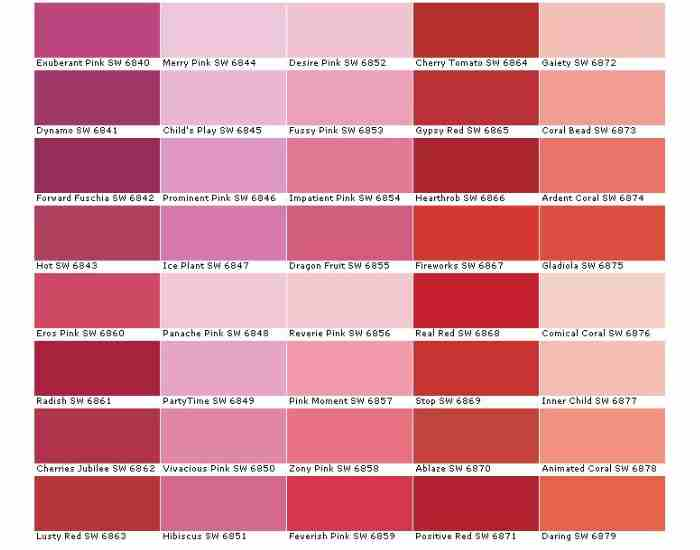
Warming or warm color according to some artist is the color derived from sun or fire and some of the examples a primary red, yellow and orange as well. The warm colors are positioned on one part of the color wheel where blue and green, known as cool or cold colors, are placed at the opposing side.
Color Temperature and Perception
Color temperature can be described as an important concept in most color theories that aim to explain what the general population considers a warm color. This is not about the warm sensation provided by certain objects, it is more about the respective effects and impressions these colors generate. One major reason as to where the term warm color comes from is because warm colors are reminiscent of the Sun and Fire.
This effect was illustrated in a study by the University of Georgia. Participants in the study, who were put into rooms painted in warm color reported feeling warmer than those put in cool color rooms irrespective of the temperature attained set in the room. This illustrates the extent color can alter our perception.
The Switch with Cool Tones
The only difference between warm and cool colors is not merely their shade, it is the feeling and ambience they evoke. Blue and green fall on the cooler end as they resemble water and trees, thus giving a soothing effect. However, warm colors tie to fire and sun, hence they evoke energy and heat. The yin and yang of the color wheel is why color theory is applied in various fields such as interior design and branding.
For instance, warm colors are frequently combined in the interior design of the living spaces as they encourage a welcoming atmosphere. Such hues could be used in restaurants to increase appetites and provide warmth. Warm colors are useful in advertising strategies because they exude enthusiasm and instinct, thus making them appropriate for a firm looking to capture attention.
The Importance of Warm Tones in Art and Overall Design
The stunning influence of color has been recognized by artists for centuries. Renaissance painters for example, placed warm colors on certain elements to make them pop out in the painting creating an illusion of space, and focus. Current designers deploy warm colors since their purpose is to capture attention and allow the audience to feel certain emotions.
The Psychology Behind Warm Colors Stage
The ache of warm colors in humans is deep and well known. Such colors include red, orange, yellow among others, these colors are not only eye pleasing but they can make heart filled with a wide range of emotions including comfort, warmth, energy and excitement. This section of the paper explains the clear psychological impacts of warm colors with reference done to some scientific works and professional opinions to give a picture of how these colors make one to feel and behave.
According to experts, yellow is the brightest color a human is able to see, It symbolizes joy, While some may beg to differ. A study conducted by the Color Association of the United States shows that the use of the right yellow shade is significant because light yellow can bring happiness but using other tones like bright yellow might cause trouble and violence.
Color Psychology in Application
Color is a big player in marketing and its well researched use can even change how a consumer acts or thinks for example most fast food chains tend to use red and yellow in their logos and interior decoration mainly because those colors attract attention while also getting the customer hungry and creating the environment of a quick and easy meal.
In nursing, lighter shades of orange and yellow work best because they provide warmth and comfort which greatly improves the patient’s experience, The Journal of Environmental Psychology published a study that focused on this idea and the use of color about its potential of changing physiological behavior, heart rate and blood pressure.
Warm Colors in Nature and Cultures.
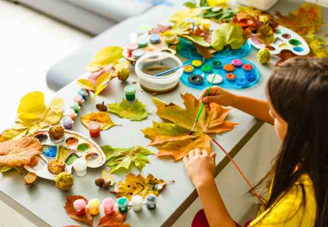
We emphasize on the fact that warm colors are not only important in the perception of people but also in nature and cultural depiction as well. These colors are everywhere in nature from a glowing sunset sky to the reddish color of autumn leaves. These widespread aspects and perhaps the presence in the surrounding atmosphere has to some extent determined their importance in traditions in different societies over the world.
Warm colors in nature
About the most admired natural phenomena the National Geographic Society mentions sunsets among the most admired places. The reds and oranges of the sun at dusk suggests calmness and equally time for self contemplation, in a way marking the end of one cycle- day… and the beginning of another – night. Many belief systems in various cultures consider the autumnal season symbolical of maturity due to the colors it displays, not to forget that its a cyclic process.
Cultural Significance
In China, red is believed to bring a man good luck and success and is quite widely embraced by people during festivals and even accompanied to weddings. In India, saffron color as in one worn by monks in robes denotes purity as well as spiritual advancement. Such associations with culture reaffirm the deep feeling and attachment that people in various nations exhibit towards warm colors.
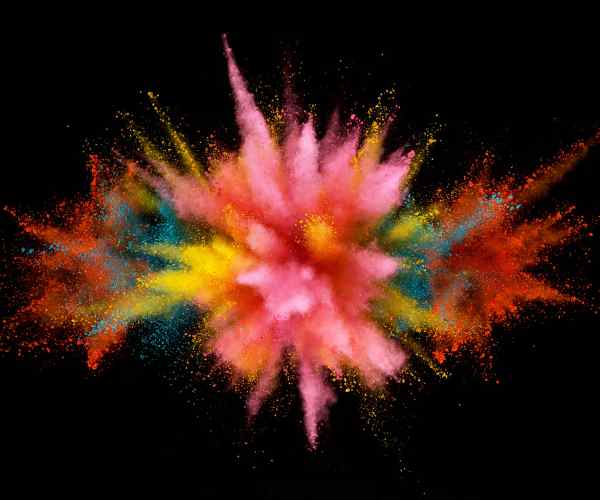
Bright and vivid colors have significance in a number of festivals and customs across the globe. In India, during the Holi Festival, vibrant red and orange colors come into play to commemorate goodness that prevails evil and also the onset of spring.
The Impact of Warm Colors in Indoor Design and Art
Warm colors influence greatly how we perceive and interpret several facets of life from how warm and welcoming our sitting rooms are, the types of brands we like, and even the artwork that captures our attention. Let us now move on to the effects of warm colours in interior decoration, branding, and art with some research, examples and color theory principles to back them.
Warm Colors in Interior Design
The application of warm colors within a given space enhances its inviting nature and makes it a more warm and welcoming place. Research conducted by the American Society of Interior Designers suggests that a room filled with colors red, orange and yellow is not only appealing but also warmer and cozier. These hues are effective in imitating light, thus photographs make places appear brighter and more attractive too.
Examples and Effects:
- Red in particular can enhance the level of warmth in a room and also drama but should be applied in moderation since too much can be too overwhelming.
- The color orange is optimal for the living and dining areas as it combines socialization with the appreciation of food.
- In yellow’s case, its neutral colors can ease the harshness of spaces as the color could be useful in north facing dim areas.
Some Design Practices:
Harmonize with Neutrals: People consider warm colors to be a bit much that is why gray, beige or white are perfect for mixing it up. This method is beneficial in making sure that a particular setting is warm and comfortable without being too constricting.
- Lighting: Utilizing sunlight is a good way of ensuring that these colors maintain their warmth. Warm light can also come in quite useful in marriage of artificial colour tones, especially at sunset.
- Textures: Textiles of different designs and patterns will work perfectly well for adding more character and intricacies. Throwing in warm colored cushions in a space could also help warm it up a bit.
Warm Colors in Branding and Marketing
Warm colors, when used in branding and marketing, have great potential in stirring one’s emotions and altering their thoughts about purchasing. As per the review in the journal of marketing research, it is quite apparent that people are more interested in brands that are associated with warm colors.
Brand Examples:
- A perfect example would be mcdonalds, they have used yellow and red which instantly creates a sense of comfort and warmth ensuring individuals make decisions quickly.
- Coca-Cola’s red color makes it stand out due to the energy and passion it depicts, thus aiding in making it known all over the world.
Consumer Behavior:
Red can enhance one’s appetite and create comfort while also making a person feel urgent. This is the reason as to why red is often used in clearance sales as it brings out the meaning of urgency and great discounts.
Strategies:
Use red or other warm colors for a sale announcement or a CTA button as it will make customers want to push it.
Mix the red with duller or cooler colors for the background so that it is easy on the eyes and readable.
Warm Colors in Art
Warm colors can mean a wide variety of emotions for example it can mean comfort, heat or even passion among other things. Because warm shades can potentially be dominating they can change the complete mood of the painting.
Famous Artworks:
Warm shades are the primary basis of “The Starry Night Over the Rhône” by Vincent van Gogh as it has a blue background which creates a significant contrast with the warm colors which sparks an emotion of wonder.
Intense reds and oranges in Georgia O’Keeffe’s “Red Canna” paintings magnify the beauty of the flower and add a sense of passion to it.
Artistic Techniques:
Using color harmonies: Warm shades used with cooler colors always creates a perfect artwork that is vibrant and appealing to the eyes.
Layering and Mixing: The carefully approached and crossed, blending of warm colors creates a rich and deep palette full of emotion and intellect of the artist.
How to Use Warm Colors Effectively
Colors tend to have an irreplaceable essence to warm the heart or an entire space, A design, And a wardrobe for that matter because so does the lighter shades and the tones of reds and yellows. How to use these colors efficiently is a pivotal question which each designer must know and be capable of answering first themselves. Further from below, A warm color palette is absolutely delved into how warm colors can be balanced within designs for a keen centered approach.
Choosing the Right Warm Color Palette
To the contrary of common belief, choosing a warm color palette does not start and end with loving yellow, red, or orange. It goes farther with the aim of producing an appealing mix that furthers the goals of a particular design, A website for instance, Or a living space and even how a person dresses up.
Color Scheme Examples:
Home Decor: A living room might use a warm color palette consisting of deep shades of red with accents of cream and gold for a rich warm feel.
Website Design: An active orange could be the base color used for CTAs, while white and yellow could be used for embellishments ensuring a fresh feel.
PPEs: Pairing burnt orange with neutral browns and tans can render a sophisticated yet warm in style appropriate for autumn season.
Types of Colors:
Dominant Colors: The warm color scheme is built on red and yellow as its primary or dominant colors.
Intermediate Colors: Being a mixture of red and yellow, orange is a very prominent color on any color palette.
Composite Colors: Red orange on the other hand and yellow orange not only provide depth and a hue to the warm color scheme texture but also add proportion to it.
Visual Aids: Always use color boards for swatches to see how different color combinations will look, to ensure the palette fits the desired design. There are online tools that can show how the colors will be used in settings, such as in painting a room and a backdrop for a website.
Warm Colors Interaction With Other Elements
Warm colors can be inviting and stimulating but also at times can turn out to be overpowering when not balanced out hence why moderation is key. This balance can be achieved by combinations of cool colors, its tones, and the integration of textures more specifically where there is a need for diversity.
Suggestions for balance:
Introduce Blues And Greens: The key to achieving balance here is to introduce cooler tones and colors to warm neutral shades to blue, for example, sleeves and jeans where sleeves are red and jeans are orange. This will keep the blues off balance.
Integraate Sufficient Grays: Strategically incorporating beige and white where needed can assist in balancing out all the shades.
Experiment with Textures: Different textures, warm colors in particular do not always look too flat if combined with for example matte finish with soft plush fabrics and the like.
Role of Light:
Natural Light: All warm colours are enhanced under natural light including direct sun light during dawn and dusk.
Artificial Light: The warm light bulbs create similar effects on warm colors making them appear the same even at night time.
For instance, interior design would suggest that a cool toned incoming light in a north facing room decorated with warmer wall paint and decor would make the room appear warmer in terms of light quality.
FAQs
Which colors are referred to as warm colors?
Warm colors can be defined as reds, yellows, and oranges. These shades are situated on the color wheel between red and yellow green, which are opposite shades on the wheel to blue and green which are classified as cool colors. Warm colors are predominantly used in design to invoke emotions such as comfort, warmth, and energy. Designing aspects including branding and interior decorating can incorporate warm colors since they can demand focus and spark particular emotions in people.
What attracts you to warm colors in designing or making art pieces?
Fundamentally warm colors are all around, common reasons warm colors are associated with heat are the sun and flames which all radiate warmth. Warm colors don’t fail to grab the audience’s attention since they have a high energetic level. Warm colors can also be very effective in getting the emphasis on key areas in a piece or composition. Using warm colors can be quite effective in changing the ambiance and mood of a space or work of art.
Do warm Colors have an Impact on one’s Emotions?
Warm colors such as yellow, orange and red can greatly affect one’s mood and behavior. People in warmer environments are set to be hungrier and talkative. This was discovered through color psychology where it was found out that red alone could lead to increased physiological arousal. One also has to keep in mind, that the overuse of these warmer colors can lead to negative emotions such as anger and irritation.
Do you have recommendations for decorating with warm colors?
When talking about warm colors in interior design and home decor, one has to keep in mind that using such colors can create a sense of openness and also add engagement to a room. Knowing this, a set of tips may prove to be beneficial:
- Using Warm Colors on Sole Walls: Going for an accent wall that depicts a warm tone can inject a whole new level of depth to an already existing room.
- Add Warm-Hued Art: Artwork featuring warm hues can infuse energy into neutral spaces, hence enhancing the place without making it feel stuffed.
- Examine the Size and Ligth Without My Room: If the room you are in is small, try using warm colors to brighten up the area and create the illusion of a bigger space.
- Balance Out With Neutrals: For everyone who loves the warm tones, try pairing it with neutral colors to reduce the effect of distortion that they cause.
What are the winter colors? Some warm colors to use during this season.
The failure to neglect evenness, where a bustling space is uncomfortably over warm. Or saturation where the room is just completely bland, to an uncomfortable degree. To escape these problems: To some degree, saturation of room is inevitably required, just like don’t go crazy with bold marine shades. Applying strong warm colors and colors with similar temperature is discouraged.
Apply Similarly Colored Cool Shades for Partitioning Warmth: Ensure that warm hues and neutral colors mix and are applied too such that they do balance each other out through layering.
To Conclude
The three primary colors – Red, blue, and yellow such that each one has its own energy, also has its own temperature. Warm colors are also capable of influencing design, art, mood, and behavior which makes the aspect of understanding color theory, temperature, and psychology greatly important. By understanding usage of warm hues, one can foam up areas, bring feelings such as serenity, and make our daily lives more interesting.
This delving into warm colors brings us to know their importance and gives tips as how to use these colors on ourselves, reminding us once again of the importance of color. Parsons School of Design adds that the principles can be learnt and used as a guide whereby we are able to appreciate and live in a colorful world.
More Post
- The Art and Science of Mixing Brown Acrylic Paint
- How to Mix Shades of Orange Acrylic Paint? A Vibrant Journey into Color
- How to Understand Complementary Colors for Beginners?The Ultimate Guide to Color Theory for Absolute Beginners
- How Do You Understand Warm and Cool Colors? How to Tell the Difference
;