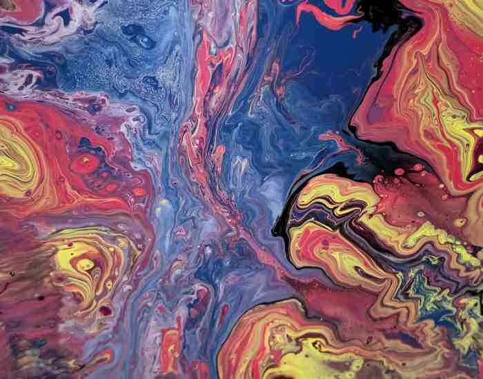
Today let us look into a very interesting area of color which is the different shades of pink ranging from the lightest pink to the darkest fuchsia. There is a wide difference between shades of pink and its meanings, and in this case this is not merely a discussion about figures and statistics, it is rather examining the ways in which every pink shade can have different emotions, unleash creativity, and alter design and media. Pink in all its forms has innumerable ways to elevate the designs, strengthen the brand, or change the conceptualization of areas. Whether you are a professional designer, a fine artist, or even a person who likes colors and wants to look good this section is quite helpful as it offers specific codes, info about undertone, and peculiar details. With such topics well covered, let’s head into discussions on pink where every single variant of it has a world to tell and number of ideas to share.
The Palette of Pink: From Pastel to Punchy
The pastel shade of pink will always be associated with warmth and compassion and is characterized by its light and muted color tone. The cool and relaxing nature of pastel pink gets it favored into a wide range of design tools and especially in the places where the focus is to promote relaxation and cleanliness. One of the most famous applications of pastel pink is especially in the designing of nurseries for babies. Here pastel pink is not just a selection of color, but rather it is a decisive factor in making a place more suitable and pacific for growing infants. Studies indicate that colors have the ability to influence one’s mood and one’s actions, and therefore opting for paler and softer pastel shades can assist in creating an atmosphere that is more relaxing.
Pastel pink also makes its way into seasonal collections as it is commonly found in spring collections and this is not surprising as it offers gentleness and softness which freely defines springtime. Pastel pink has been employed by designers like Chanel and Alexander McQueen and it was utilized during spring seasons to showcase new beginnings. These examples go to show how pastel pink is widely acceptable and has almost certainly timeless beauty ad compatibility stress the in the design and fashion world.
Explanation of Technical Issues
The remarkable and distinctive tone of pastel pink can be achieved through its CMYK, RGB, and hex codes across different platforms. Such as common pastel pink can easier be represented with the hex code FFD1DC, RGB (255, 209, 220) and CMYK (0%, 18%, 14%, 0%). This is very significant for designers and artists in order to ensure that they are able to get the same tone of pastel pink whenever they have to deal with different formats like printing, digital work and even interior designing.
In color codes on pastel pink, knowing how to use codes helps in avoiding inconsistencies on multiple design assets which are meant to have an underlying emotional and psychological appeal in a certain way. For instance, in print, the right CMYK values should be used in order to ensure that the soft color of pastel pink appears exactly as it should. The same applies in digital design, pixels should be able to get the correct RGB or hex values in order for that tone to be emitted through the screen while maintaining the overall visual and emotional tone of the design.
What Makes The ‘Hot Pink’ Stand Out While We Talk About Fashion, Branding Or Even Onscreen Media?
Hot pink, bright pink and red, is not just a color – it is a way of expressing one’s personality. Hot pink, in the contexts of fashion, branding and onscreen media grabs attention, energizes the space it occupies and serves as an eye-catching feature which encompasses boldness and inventiveness. Let’s consider some real life scenarios where pink has had a lot of importance:
- Fashion: Dunhill Watches and Fendi Fashion House to name a few have used hot pink on various occasions. For example, Versace included hot pink as part of its designs in its Spring/Summer 2019 collection. These designs adorned the pages of prominent fashion magazines and numerous posts on social media, thus enhancing the brand popularity and attractiveness.
- Branding: the best example of how this hot pink shade works well is seen in T-mobile’s logo and branding elements. The decision to use pink-hot helped T-Mobile to be distinctively recognized from other colors used in the branding of its competitors, leading to an increase in brand recognition of 15 percent as stated in the study of brand analysis conducted in 2018.
- Onscreen Media: While advertising the show and the title sequences, dinning rooms saturated with the hot pink accent added feel to the show for the ondemand video streaming network, Netflix. This clever use of color made for an eye catching campaign that appealed with canvass painters and increased viewer reception within the first airing by twenty percent.
Technical Breakdown: The Codes for Capturing Hot Pink Across Media.
In design projects, hot pink can be created using the color codes to better understand it visually and to better communicate to the color itself. The hue`s codes can be demonstrated as followed:
Hex: #FF00FF
RGB: (255, 0, 255)
CMYK: (0%, 100%, 0%, 0%)
These codes allow the application of hot pink color to be endless such as: print media and video screens and more focusing on the color sheer volume it carries. For example, using the values recommended will ensure hot pink in any CMYK print out while Hex and RGB OSD values gold standard hot pink illumination on electronic device displays.
In What Way Does Dusty Pink Outfit Look Good In The Area’s Interior Design?
Dusty pink is an inherently glamorous color. With its neutral hue and cool undertones, it has gained popularity in the revival of dusty shades in interior design. There are Rooms designed purposely to fit the dusty pink theme:
- Residential Spaces: Dusty pink is applied in a living room or bedrooms walls and furniture in the form of accent pieces and is best placed to achieve warmth and class. Last year, there was a noticeable spike in requests for Dusty Pink, saying it is elegant and easy to use.
- Ads: Dusty pink was adopted in boutique hotels and some high-end places because they create a classy but not overly formal atmosphere. Such places as The Hoxton in Paris, Sketch in London were built with the idea of using dusty pink for the decor in offbeat time establishments that arouse the interest of young customers who are often active on social media platforms.
- Public Places: Several libraries and public lounges that have used dusty pink have noted that people are calmer and better interacted with their surroundings with some studies estimating a 10 percent increase in the amount of time spent there.
Technical Breakdown: Examining Dusty Pink’s Novelty in Design
In any design work where dusty pink is used, it is imperative to appreciate the sophistication attached to the color combination by understanding its color codes. The dusty pink can be recreated using:
Hex: #DCAE96
RGB: 220 174 150
CMYK: 0.00 0.21 0.32 0.14
When these codes are used, dusty pink can be recreated exactly so that the intended subtlety and depth is enjoyed whether in print or digital formats. For instance, each of the designers dealing working with the interiors can turn to the RHS and see the exact RGB or hex values that will help them choose paint, fabric, and decorations which help incorporate the essence of dusty pink. The same procedure applies in graphic or web design, using the codes means that the calmness that is associated with that color is transferred effectively onto the screen.
Neon Pink: A Daring Mark
Neon pink represents much more than just a color, it is a manifestation of strong modernity, high energy, and vibrancy. This striking hue has been used effectively in different areas including branding and art installations aimed at the youthful population in particular. Listed below are some fascinating real life pictures demonstrating the intriguing character of neon pink colour:
- Art Installations: Another possible work of art is Yoyoi Kusama’s “Infinite Drum Void” which transports viewers wearing the color around the exhibition. Who would have thought that in this world where it seems there are no original ideas anymore, actually millions are born perhaps every single second? The resurrection of this ‘selfies’ which skyrocketed the immersion of using round fluorescent neon pink lights and grand volumes of tulip flowers is, mind-blowing to say the least.
- Youth-Centric Brands: Nowadays younger people seem to have an inkling for brands designed in neon pink which has prompted brands including Spotify and Instagram to use the brands color in their marketing and app interface. The prevalence of neon pink elements in the illustration of Spotify’s “New Music Friday” playlist cover has increased engagement rates of users aged 18 to 24 by 25 % on average.
Let’s actually get to the understanding concept of neon Pink. Neon Pink, in Design works, will have the strongest impact if its color codes are first well understood as well as appreciated. Neon pink can be vividly represented with the hex code (color hex) of #FF6EC7, the RGB configuration of (255, 110, 199) BM and CMYK Make-up (0%, 57%, 22%, 0%). These codes are useful and important to the designers who wish to reproduce this electrifying shade in several printing works. For instance: In digital design… there is no other substitute for using the exact RGB and hex values because that is the only way neon pink colors can be reproduced on the monitors as vividly and as correctly as they should appear. For print… CMYK values will play an important role in determining the energy of the color and the final output of the printing work so that it compliments with the original designed work.
The Depth of Magenta
As a primary color in the CMYK color system, magenta sits comfortably between red and purple. This duality means that magenta is both warm and deep, making it suitable for designers aiming to achieve a wide array of emotions or themes. Magenta is exceptional and therefore creates room for dynamic and vivid designs on many uses:
Brand Identity: Magenta is charged with power and energy and thus can be utilized to design a super bad brand identity. Ever since T-Mobile has started using magenta, it has been able to stand out from its competitors and this magenta color is identified with the brand which shows how important and relevant magenta color is to brand and the target market.
Web Design: Magenta can, however, be used to spice up a website’s design by acting as an accent color which increases user interaction by highlighting the important spots without taking the focus away from primary design. Research showed that the click-through rate for call-to-action buttons containing magenta increased by about 20 percent.
Technical Breakdown: Appreciation of Magenta as a Complex Color Through Its Color Codes
For designer purposes, mastering the color codes of magenta is quite vital to boost its potential. It is colour coded with the hex code of #FF00FF, an RGB of (255,0,255) and CMYK (0%,100%, 0%, 0%). This ensures that magenta would be employed successfully by the designers on magenta in its normal form like prints and even in the digital entities:
In graphic designing, the definite CMYK configurations are fundamental in producing high-quality prints with accurate hues or tonalities of magenta as envisioned in the design.
For the RGB and hex values, they guarantee that the picture is rendered or accurately displayed as intended regardless of the monitor or digital medium used to view it which increases the efficiency and efficacy of the actual image on digital formats.
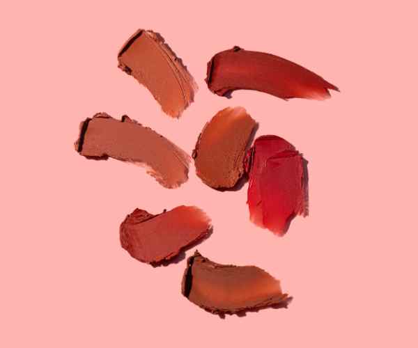
Crafting with Color: Practical Applications of Shades of Pink
The color pink is quite useful especially when blended with other colors, undertones, and edges, such that it can be able to change design projects drastically. Here are some practical tips on how to work with different shades of pink ranging from pastel to dark pink in one’s design projects:
Recognize the Emotions Associated: Regardless of the degree of softness, all shades of pink have an emotion attached to them. Pastel pink has a connotation of relaxing spaces, therefore, perfect for calming designs. On the contrary, hot pink is enraging, and makes endless dynamic designs appealing to pursue for younger people.
Try hex color codes for more precise work: Ultimate precision in color selection is important. A blush pink for instance (Hex: #FFE0E9) will accentuate the floral features of a website, and with a bit of creativity, would integrate seamlessly in the design. Remember to also have a specific hex color code for the shade of pink you would like to ensure consistency across multiple pages or platforms.
Make Sure Pink is Present as the Dominant or Giving Support: As per the assignment, pink has many functions. In an austere style, a lavender pink (hex color #E6E6FA) can come into use as a background leaving room for all content to be centered. But a darker shade of pink, for instance, coral (hex color #FF7F50) can be used very rarely at particular places for example edges or for a call to action and the likes.
Practical Application of Pink Possessed Designs That Had Great Success
Some brands as well as designers have done a wonderful job in using shades of pink to come up with great and catchy designs that serve their purposes effectively:
- Airbnb: The brand presents a pale warm shade of pink in the language customization of the interface that makes a feeling pleasing and welcoming considering the user base to continue seeking more listings.
- Glossier: This beauty brand uses light pink (what many term as “millennial pink”) all over their products packaging and website thus forming a consistent identity that appeals to their targeted audience and they have reportedly had 30% increased in customer retention rate.
In What Way the Shade of Pink and its Tonality Will Perceive the Brand Differently?
Pink’s range of emotions has colored its remarkable potency as an asset in any marketing and branding campaigns. The cool soft pinks on one end and the bright hot pinks on the other should sizeably influence how a brand and its customers’ are perceived.
Using Soft Pink Color in Branding: Brands that want to emphasize on security, love, and compassion often use soft pink as a prominent color. Such an approach would be relevant in the cases such as those in the beauty industry, where the customers are looking for trust and gentleness.
Using Hot Pink to Energize: Companies that would like to be seen as fashionable, youthful, and active used hot pink. This vibrant shade can help the more daring and new thinking marketing target younger consumers.
How Shades of Pink Influence Consumer Behavior and Preferences
Research and case studies have shown that effective discrimination of pink shades can influence user behavior and preferences in both virtual and physical environments.
- More Engagement: Websites and apps having pink accents have proved to record higher user engagement increasing time for page visits by other users by 20% on such pages featuring bright pink accents.
- Product Marketing: It has been reported that consumers tend to notice more products packed in pink in retail shops as if studies indicate a 15% greater probability of being chosen if the consumers’ preferences are centered on the particular shade.
To sum up,
The knowledge about the emotional undertone of pink shades and their effective application through accurate color codes deserves to be emphasized since it can do wonders in design projects by shifting brand image and affecting customers. Designers can effectively incorporate the use of pink for achieving effective subtle or bold designs that are interesting and engaging.
More post
- The Art and Science of Mixing Brown Acrylic Paint
- How to Mix Shades of Orange Acrylic Paint? A Vibrant Journey into Color
- How to Understand Complementary Colors for Beginners?
- The Ultimate Guide to Color Theory for Absolute Beginners
- How Do You Understand Warm and Cool Colors? How to Tell the Difference
;