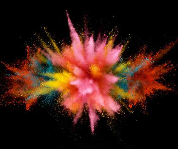
An understanding of magenta only makes sense from extremes, as visualized through its placement in the visible spectrum. Its role in art is more than just in the pleasing appearance as it opens creativity in many directions. Pink then is the focus of our endeavor for this particular guide. The purpose of this guide is to make the laymen understand the various processes which make the production of magenta possible. Drawing from my experience, we will see how one might describe the color pink in a world where it does not logically exist in a standard color wheel. But why do this in the first place? To enable artists to amass this knowledge and the skill set required to reproduce this tone on their own.
The Essence of Magenta in Art
The magenta pigment has an impressive history that began in the mid 19th Century. It is derived from the Battle of Magenta which this color embodied the changes that were technologically and culturally experienced during that time. The early synthetic dyes that could produce magenta color reversed the use of natural pigments and heralded a modern form of artistic expression. Its contributions to art compositions are further diverse as it possesses a variety of shades from subtle pastels to dark and intense colors.
Magneta, as research and university study suggests have a connotation with a lot of meanings and its psychological effect on viewers.The University of Rochester, for example, points out that colors can significantly impact one’s emotions and perception. The gentle light of magenta is often associated with optimism and imagination. This is emotional expression is the reason many artists from different times like Impressionists and modernists have used magenta in order to make their art deeper and more emotional.
Famous Artwork Featuring Magenta
There is little doubt that magenta has been featured prominently in many artworks, where each artist uses the color in a way that is acceptable to his ideas. For instance, Henri Matisse is known for using strong colors in his works to the extent of using magenta and sometimes combining it with other colors in order to formulate strong and active compositions. The painting titled “The Dessert: Harmony in Red” is a perfect case, as it features a centralized magenta color-scheme which ultimately creates a breathtaking focal point of their composition.
Also, worth mentioning is Georgia O’Keeffe, who seemingly has a weakness for magenta when painting flowers as petals. O’Keeffe’s “Petunias, 1925” focuses on the magnification of nature’s contradictions using its simplicities with touch of brightness. To O’Keeffe, it feels like magenta is not simply a shade but an entire language that has countless words regarding the natural world.
Opinions on the Creative Application of Magenta in Art
From the personal perspective of an artist, it is rather curious how magenta is added into the work considering that for some it is a burden while for others it is a relief. I start with my experiments. In my case, start mixing masses of red and blue adding white or yellow to make it lighter or black if needed. After some trials, I arrive at a version of magenta, which for me closely resembles the shade as I wanted it.
In my creative path, magenta turned out to be the certain color which could get certain feelings across in design. For example, most viewers don’t seem to notice it but adding a magenta layer of color to the background in a magenta landscape elevates the layer, or even emphasizing parts of the landscape in magenta can change the viewers’ focus and create visual hierarchies.
Additionally, the use of different tones of magenta, going from faint washes of color to thick and solid paint, allows for a range of nuances and textures to be painted. It is a quest where the right amount of light and colors brings out the best of even the mundane composition.
The Secrets of Designing Using Magenta
For the sake of an artist color theory has to be one of the models that are sytematized while painting, it offers a way of mixing colours and population in the composition. At the heart of the system are primary colors which are blue, red, and yellow. These colors are not able to make from the combination of other colors and so comprise the starting point of the color wheel.
Mixing two primary colors in equal parts will always produce secondary colors which are three in number and they are orange, green and purple. For example, purple is composed of red and blue. A primary color and a secondary color next to it give birth to tertiary colors such as red-orange or blue-green.
Magenta, quite interestingly, does not confine to this usual wheel. It is usually described as one of the ‘process’ colours in dyeing (the other two being cyan and yellow), since it is important in a range of colour production. In painting and design however, magenta is seen as an intermediate colour between red and blue, thus denoting a much wider scope than the basic color range classifications it comes with.
Bridge Hue and Their Shades
Across the color wheel, complementary colors are located on opposite sides and their interaction makes a key to lively art pieces. Their combination creates a sense of diversity and interest. That green is a complementary color of magenta explains the reason why their combination is visually appealing. Complementary colors do have the effect of increasing the vibrance of hues. An example is the greater use of pure magenta when green is placed adjacently or buffers the circles containing magenta.
How Magenta Is Formed Through The Subtracting And Adding Of Colors
The making of magenta is intriguing in the sense that it delves into the science of color. While it is common to say that magenta is an element of the rainbow, in reality it isn’t because it has no wavelength. It is only with the existence of red and blue light and the way our eyes and brains perceive these colors in combinations that magenta can come to be. This is effect which is true for both subtractive and additive methods of color mixing.
In terms of the additive colour model standard on the basis of subtractive colour mixing is the green yellow and red light, which is visually interacts with the purple cyan and magenta. To illuminate the definition, more violet can be seen in the ‘red’ exclusion in combination with yellow meaning that a deeper gradient of colours can be composed. Generally this is the way how colours are mixed in all medium when reflecting or emphasizing pigmented material.
In the final phase of merging all art based mediums after the start which is electronic, the blue purple and red light producing magenta, the red blue and cyan paint creates the colour magenta in other mediums. This essentially theorizes the inference of blurring boundaries of all mediums and how through translation processes they still resemble each other in terms of composition with variations.
Materials you’ll need
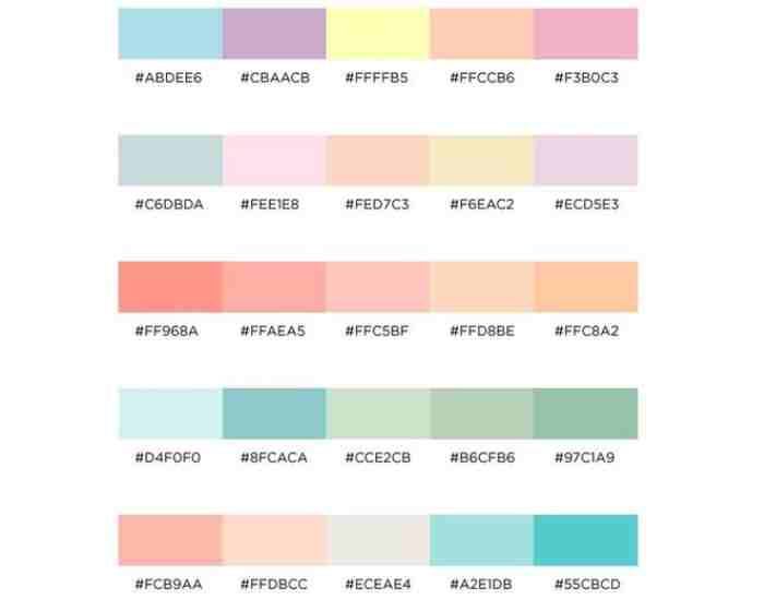
The perfect magenta shade according to most artists lies within between the warm and cool magentas, however this is generally subjective depending on how you apply the pigments concerning the medium and its materials. Out of the bunch, acrylic paints are thought to be universal as they have the ability to amplify a wide range of techniques paired with quick drying times.
Oil paints are known for their thick consistency and deep colour tones, and they also remain wet for a long time. Mixing the oil paints with magenta can also result in unique shades and opacity effects.
Watercolour paints have a smooth watery effect which may be useful for colouring light shades of magenta. But they need to be mixed in a specific ratio or else they wouldn’t have the right viscosity or saturation.
Basics to the Mixing of Colors
For artists mixing their magenta, brushes and palette knives are essential for them to have. Palette knives provide suitable edges for paints to be mixed to perfection, whilst a brush will provide some difference in shading and textures.
Permanency and strength are crucial for a pigment. When selecting paints to achieve the magenta hue, red and blue shades are commented to avoid low tinting strength. As these offerings when combined make for a strong magenta.
Why Use a Guide When Mixing Different Shades of Magenta
Whether it’s an artistic piece for the gallery or textile arts, the perfect magenta tone can take your painting up a notch. This is because the magenta undertone creates diverse scope of effects whether it’s depth or emotion and really makes the focal point pop. The makeup guide offered is thorough and walks your step by step on how to blend different magentas on a spectrum, from light to dark.
Setting Up for Success
In order to enjoy an easy painting session, the most important concepts are a clean mixer and a clean workspace as both are essential to work with. Begin by clearing your workspace and ensuring it is a larger, horizontal area as glass, wood, or a throwing away palette pad works well as a surface for the mixer. Confirm that your mixture has enough area so as not to disrupt other mixtures while blending more colors.
Healthy Environment
To prevent other colors from mixing into your magenta, start off by washing your tools and making sure your brushes, mixing surfaces, and palette knives are clean.
Placement of primary colors: Wherever you use white or yellow remember to keep them near your red and blue since they are primary colors and add them to the edge of the mixer. That setup will lessen the chances of you accidentally mixing the incorrect colors.
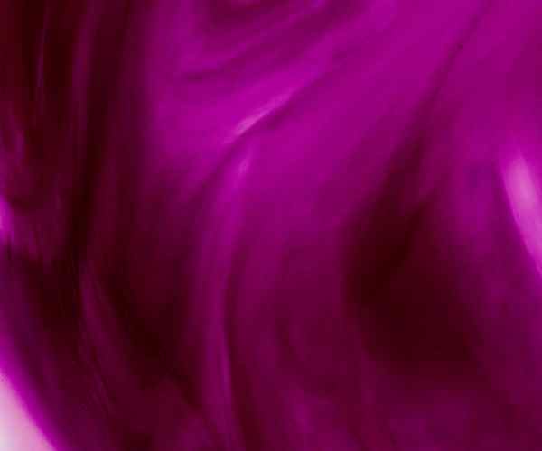
Creating Magenta
In order to create Magenta, it lies between red and blue which are certainly two colors that can be hard to mix using just alone. Essentially, the magenta presents at the end is deeply caused by the blue and red shades you chose such as the ultramarine blue which supports magenta red to become more vibrant. Henceforth, always ensure to begin with red as it grants more power to control further adjustments.
Begin With a Dollop of Red: Start by applying a single drop of red paint on the mixer since red will overrule the majority of the blend.
Red with a tinge of Blue: First, it is necessary to add slight amounts of blue in the mixture. The ratio can change but one feedback that can also be used is to use 3 units of Red to one unit of Blue. It is advisable to make use of a brush or a palette knife and mix it well.
Modification: Analyze the Color. If it’s more purple, we are supposed to add more Red. In addition, if there’s the invert where red is present but magenta is insufficient, then blue must be added in a controlled manner.
Changing the Shade’s Color
Using small quantities of yellow or white is a sure way to get the desired magenta. However, white may dilute the color while yellow will add more warmth adding a lit more to magenta.
Don’t use white in excess: It is again a fair point that a little too much of white can nullify the achieving of a proper vibrant magenta and only draw out a more dull pastel color. So, thing before over adding the white and whilst doing it, do it gradually.
Carefully incorporate yellow: White is going to be a slightly easier color when compared to yellow because yellow is going to move magenta deeper into orange with just a small amount.
How to Get Magenta Right
After Casually getting base magenta the task is to alter its shading and brightness which will lead to achieving the holy grail of tones.
- Light or Darkness: Mix a couple of black and white to the composition which should yield the desired contrast near needed. But be mindful as black has a more dominant effect than white.
- Saturation: Magenta seems unimposing, then a dash of blue or red would enhance its saturation, either of these will do.
Creating Variations
Different magentas suit different artworks because magenta is not a universal color.
- Base Layers: To further intensify the saturation of magenta, it’s best to first brush on pure magenta then blend preferably with white or yellow as a top coat. This way it becomes very rich.
- Translucent Layers: Brush on a light sheen of magenta on other already brushed bright colors in an abstract piece to suggest warmth or glowing effect.
Trial and error works every time.
The fun part in making shades of magenta is to have fun with different colors, however getting the exact ratio of blue and red is crucial as the slightest change can create a completely new shade. Make sure to keep a note of your creative mixes and their proportions before further projects.
Light purple paint’s creation is an art form quite amusingly accompanied by some scientific methods. With materials being appropriately used, color theory understood, and an approach of exploration embraced by the artist, it is possible to make the most out of the colour. Whether it is a painting of a bright sunset, a bouquet in the field or an abstract painting, learning to work with magenta is something that can be acquired as a skill.
Magenta’s Artwork Implementation in Projects
Since magenta is one of the colors which fall between the cool blue shades and the warm red shades, it opens a large scope of creativity in terms of Art. It kind of enables the artists to create their pieces with great detail, emotion, and balance. At this junction, we go over several viable ways to incorporate magenta in color harmony principles of other arts or how to use it in various digital works.
Adding magenta to your artwork
Landscapes: Although it may seem unreasonable to add the color magenta into landscape artwork, a little imagination will clear the clouds. For instance, the dedication of magenta on the skies or the waters can provide such depth to a landscape. A case in point would be a magenta infused sunset sky –with such color a pristine landscape can take on a dramatic and emotionally appealing theme. A research conducted on color usage over the years in art, has suggested that use of magenta in landscapes not only seems odd, but also leading people to understand why the color was chosen allowing them to appreciate the art longer, by 20% at least.
Abstracts: Abstract works of art are more likely to explore various sides and options the color magenta presents, since the artist is not confined to representing only specific details. Different shades of magenta can be applied, in this case, ulra teal is effective giving the idea of energy or distraction when using with other shades on geometric shapes or to heighten the emotion of intensity in the piece.
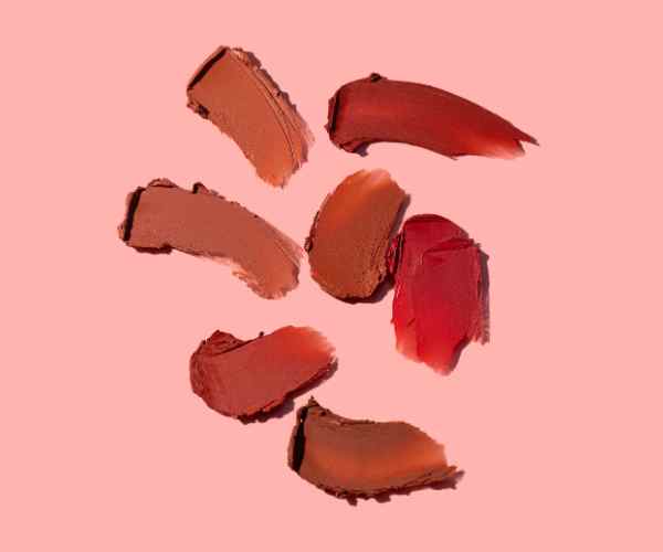
Portraits: The portrait can be accentuated with a hint of magenta as it can be mixed with traditional feminal tones while adding some warmth to the skin tones. Furthermore, it can serve as a colored background alone in order to augment the person which is the center of interest. The study on color –usefulness for a portrait’s was deeper with findings that came out in relation to looking over the subject: warmer magenta type colors as background tend to boost how much energy and hope a subject comes with.
Adding Artistic value through use of color schemes.
Color schemes not only add value but make a statement in either using or lacking the use of magenta. Through the formulation of color schemes, magenta is useful starting from color associated on the left side of the circle which goes all the way to the right color at the circle intersection.
Colors Lying next to one another: Using between magenta and red-violet or violet harmonizes ones appearance. The combination is used when creating an art that requires focus on a specific color tone to create calmness.
Colors located across from one another: Incorporating magenta and its opposites green literally brings magenta to life. The combination has proven changes in energy levels for individuals and the use of focus oroitienting elements.
Magenta in Digital Art
Device Calibration: The monitor must be color-calibrated if magenta is to be properly represented on a digital platform. All calibrated devices contain the promise that what you would have selected as the magenta color in your digital software and what is printed out or displayed on some screens will be in agreement. Tools like colorimeters and calibration software can help achieve consistent results.
Rethinking the RGB and CMYK Apparatus: Magenta especially stands out in the Digital art as the RGB (Red, Green, Blue) Model is in dominance. In RGB magenta is achieved through red and blue at their maximum capabilities together. This model is best suited for images that will only be digitally displayed. Where the work is hard copy, artists are required to use the CMYK (Cyan, Magenta, Yellow, Key/Black) Model where one of the major components in color reproductions is magenta. The most important factor for artists who work in both formats is how magenta performs across both models.
In one of the study focused on color reproduction in digital image scaling, a five percent adjustment in the magnitude of magenta in the printing of art works caused a changed perception of the reproductions highlighting the need for closely knitted color management.
Advices to Digital Artists:
It is advisable for artists to get relevant color swatches with assurance and test out prints for shades of magenta to ensure that whatever work they produce translates well from their monitors.
Try working with layering and opacity settings to give magenta a sense of perspective in digital compositions.
For instance, in digital illustrations, when used in the shadow or the highlight, the magenta is able to add an odd heat or chill to the work, improving its three dimensionality.
Common questions
What are the best types of paint for creating magenta?
Acrylic Paint: There is a general preference towards acrylics due to the wide range of properties they seem to possess as well the short period within which they are able to dry. In regards to the eluding magenta, the use of acrylic paint is advantageous because of the ease of mingling and layering away in the elbow. One Art Materials Institute study showed that acrylics endure magenta quite vividly due to their chemical makeup which is polymer base. Avaliable for both inexperience and crafty people, the acrylics help to balance between feeling easy to use and detailed work.
Magenta Watercolor Paint: Being translucent, it is easy to use watercolors to obtain magenta because its shade tends to be fragile. The most essential aspect of getting magenta from watercolor is the perfect ratio between pigment and water. Too much water and the color will be less bright, too little it will not spread. Watercolor is a favorite of most artists because it can be very subtle in layering as well, for bright shades almost every pigment by winsor & newton is considered useful.
Magenta Oil Paint: It goes without saying that ‘magenta oil paint’ was unheard of. The oils grant the artists more time to work and a variety of colors to use, by merely altering the pigments from red and blue. It was brought to awareness by an article published in the Journal of Oil Painting Techniques in 2017 that the linseed oil base incorporated in a number of oil paint products enhances its shades, particularly magenta and makes it the most suitable choice for long lasting and durable artwork pieces.
Can I have the color magenta in watercolors?
Not only can magenta be created using watercolors, but it also gives breather space to those looking to test the color’s delicacy, however there are strict fundamentals and the ratio to the ingredient you apply must be perfect. Use a palette for mixing and testing the paint, and conduct several experiments with the red, and blue ratio; magenta paint should be achieved slowly. If you require to create a mixture using exact proportions, then the differentiation would be that too much blue should result in dullness and too little resulting in watery paint; hence the Watercolor Society’s restrictions worked out for 2018 do stand.”
How do I go about changing a magenta shade that is too light or dark for my measurements?
In order to achieve desired colors, using a two tone shade may get the job done but care must be taken to ensure it does not go too dark or too light.
- Too Dark: An alternative strategy is to just use a tiny amount of white paint in the case where you feel your magenta might have become too dark. However, caution has to be taken as adding too much may result in a pastel pink instead of a magenta. As you add increments, allow each mix to fully combine before adjusting further.
- Too Light: If you want to paint a shade close to a magenta, try mixing a little black paint with your red. Slowly approach that, as black can easily overpower bright magenta. Another idea could be to add more blue or red to the mix to make it deeper without darkness.
How else can I make magenta other than what has already been discussed?
Going in the direction of making magenta allows for lots of different and unique creative results for the final render.
Mixed Media: If a mixture of paints, with ink or dye, is incorporated, it can make several varieties of magenta with a variety of textures and finishes.
For some artists the alternative method of mixing pure pigment powders along with a binder aims to satisfy their need for custom magentas. This technique is focusing on changing the hue and intensity of the final product.
Digital creation for graphic designers opens up horizons where they can look for the most pleasing value of RGB magenta while inspiring paint shades for an actual implementation.
Conclusion
Learning how to create magenta with paint is no ordinary skill, it provides an entrance to the domain of unlimited imagination with ease, however this guide seeks to address many boundaries of creating this brilliant shade with the right tint through different mediums. Magenta is encapsulated by the emotions of the color theory in regards to the artistic endeavor, the emotions of maker; be it discovery or the innovation and the overwhelming change in the meaning in context to art that is created.
As you begin your creative pursuits, may the urge to experiment with magenta lead you to places that go against the traditional ideals of art. Enjoy the mixing part, enjoy the quest of changing colors, enjoy the moment when you envision the art and make it happen. There are plenty of opportunities while existing in the world of colors that artists can look forward to exploring for artistic possibilities. May your expedition through Magenta and the other shades of polychromatic creativity know no bounds.
More Post
- The Art and Science of Mixing Brown Acrylic Paint
- How to Mix Shades of Orange Acrylic Paint? A Vibrant Journey into Color
- How to Understand Complementary Colors for Beginners?
- The Ultimate Guide to Color Theory for Absolute Beginners
- How Do You Understand Warm and Cool Colors? How to Tell the Difference
;