Mixed media art has taken the world of modern design by storm as it offers designers and artists the chance to create freely without any constraints, mixing paint, fabrics, photography or using any surrealistic elements. This design practices doesn’t only focus on adding more layers but rather creating an attention grabbing texture which has a deeper design.
Let’s say you enter a room where there is a colourful canvas attached to the wall which consists of magazine cutouts, a few brushstrokes, and even some elements like wires or pieces of fabric. The result is spectacular. Mixed media can enliven one’s room turning a basic design into a multi-dimensional experience.
This blog will focus on mixed media as a practice, how it has evolved, and what is considered to be modern design and the reasons why many designers are fascinated by it all. We will help you understand how you can integrate mixed media into your own work and assist in fulfilling your creative visions.
Mixed Media in Contemporary Design
What is Mixed Media?
The term mixed media refers to a technique that combines various artistic style to form a single artwork It includes a variety of approaches like Collage, Photography and Digital manipulations etc which goes beyond just painting or sketching. It’s about integration rather than random assortment.
Mixed media has it’s origins dating back to the Cubist movement wherein Pablo Picasso and Georges Bende Braque gave birth to collage. They amalgamated cloth, paper and Paint to create something radical and new. Now with increased sophistication we can say that mixed media is a widely used technique in modern fine arts and design due to its simple usage and vast potential. This technique in tandem with modern tools allows for rapid sophisticated concepts to be fully realised in a given piece of design.
Why Mixed media is widely used
So why design classics and contemporary mix media designs have entwined. The answer lies in individual expression and being outside the placid. With mixed media you are no longer confined to one aspect of creativity, With the ability to employ several textures, colors and materials in a piece of design, the end product turns to be extraordinary.
I still recall my adventure with multi-medium art which left me utterly spellbounded. It was during my college years when I was tasked to create a work of art which closely represented my personal life. After gathering a sizable canvas, I began to paint multiple coats. Although I wasn’t satisfied with it, all hope was not lost. I had an epiphany when I decided to include travel pictures, fragments of my worn out clothes, and even some newspaper articles. As I affixed these items, the art piece evolved, and it began to narrate a story that I never wished for it to serve solely as a painting. That unforgettable moment was the genesis of my love for mixed media, and I have never been able to turn around.
The same thing happened, or rather is still happening, with design. Let’s look at Jessica Stockholder, a contemporary artist who is best known for making sculptures and installations that incorporate found objects, paint, and a variety of common materials. The emotion aroused by some of her pieces and their relationships with space and objects are intriguing. Another source of inspiration is the graphic design made by Keith Haring whose mosaics and illustrations are full of colors and are a combination of graffiti, paintings and pop culture.
These artists let us know how mixed media can excel a design project, it doesn’t only stop at beauty, but it is also about a narrative and experience. Entering this thrilling area, you will witness how you can utilize the skill of mixed media to enhance your classic designs into wonderful art pieces.
Utilization of Mixed Media in Your Design Process
Picking Out Your Materials
The materials are the most essential in any mixed media project, it is what will make or break it. It is so greatly diverse that comes in so many colors, textures and character. Some of the materials you can consider are watercolor paints, acrylics, oil pastels, collaged papers, fabric scraps and found objects such as leaves or buttons.During one of summer breaks, I got the mix media bug and started experimenting with it.
I had everything; old magazine cutouts, fabric pieces from my sewing projects and dried flowers. I had an endless option that left me puzzled initially, but I quickly learned that the key was to look for options that would satisfy my requirements. It is worth noting that such materials should not only complement each other aesthetically, but also help express the idea behind your artwork as well.
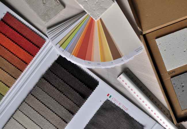
An idea that I found to be very effective is to set a “material palette.” To visualize the outcome, you can set out all of your selected materials. Do the colors match? Could the textures serve as a resonant difference? For example, when you mix a soft and textured fabric with a hard gloss surface free paint, it can give a new level to your design.
I mean don’t limit your thinking to what looks right only, think about what materials would complete the whole idea as well. Get creative and do not hesitate to experiment with strange pairings. Some of my best pieces have been created by mixing materials that do not normally go together!
Approaches for Complementary Art
But now that we have rest our materials, I would like us to focus on techniques. One of the best examples of mixed media art techniques that I like to use is layering. You can set the scene by building a painted backdrop with colors then layering with digital prints to that. Not only depth is created, but a blend of old and new techniques can be applied to the mix.
A technique that I find quite fascinating is collage. Creating collages allows one to tell stories through images. For instance, one can cut pictures out of magazine and add them on top of their drawings. This was the case with one of my projects where I took a few pictures from my latest trip. I cut them up and used watercolors on top of them. The results came to be numerous vivid outs that told the stories of my trip with their variety of images and colors.
Another appropriate technique also considers art to be digital and physically primary sources. For example, you could make a manually painted image, scan it and then use the graphic software to add things such as typography or other graphics to it. This method expands the boundaries of creativity.
Look at the works of artists like Robert Rauschenberg, who worked in painting and sculpture and used everyday items in his art. One of the most gifted explorations of mixed media concepts is Robert Rauschenberg’s “Bed”. It gives us many interesting ideas about how elements of the same sculptural form may come together and interact.
Creating a Blend of Design That Is Connected
Cohesiveness in a mixed media project like a painting or a sculpture is very important. The variety in materials and techniques can be exhilarating, but staying true to your vision will ensure the creation of a powerful. If you have a cohesive design, it also makes it possible to reach your audience at a deeper level with your work. Speak to artists like Anselm Kiefer and his mixed media works with history or even mythology embedded anthropology. His elements are stunning not only due to the materials but due to the storyline and what is being depicted.
Giving the project some thought, how I want the work to look like overall is up to straight, pretty clear how I want it to appear while letting the boundaries be a bit looser and not overly strictly defined. Questions like how does one employ the use of emotion when designing a steel sculpture, and how does one go about incorporating the materials being used in this design? The final outcome would always be having an aim to keep you in focus when employing use of mix and match elements in the final look of the project.
Exploration And Experimentation
The most thrilling part of working in mixed media is the artistic license to experiment. Never be afraid to go over the edge! Most of the intriguing designs are from artists who are willing to take chances. I remember a workshop where we were encouraged by the instructor to try out strange combinations of materials. One student used a string and fabric to make a wall hanging that involved some traditional weaving techniques blended with a modern style. It was magnificent and most of all, it was completely surprising!
I have heard a story about Yoko Ono, an artist, who would go this extra mile of exploration. In her works, she is for the most time empowering the audience to collaborate with her which creates a margin where a creator is also an audience. The people’s spirit of mixed media is essentially the same, it is all about broadening your aims of communication and inviting other people into your creative process.
While working on your mixed media work, it is worth remembering that all those “mistakes” have enormous potential in aiding you much greater than you can imagine. Cherish these moments and let them take your imagination where it may need to go.
The Influences of Technology in Mixed Media Art
Technology, indeed, transcends the reach of any other construct in this day and age. When it comes to mixed media design, it allowed for great changes in the art form. It allowed designers and artists to synergize more effortlessly upon tools such as Adobe Illustrator or Photoshop by allowing them to play around with images, color, or even create digital collages.
Tools such as Procreate have been a great source for my iPad and have helped me sketch and design mixed-media artwork all on a singular template. This has enabled me to better imagine the ideas I want to develop before even touching the physical material. Furthermore, digital devices ease the integration of multiple features, acting as a link between classic and modern design.
Online Resources and Communities
The final thing is to discuss with you how to get started, how to gain insight and where to get help. For those interested in mixed media art, there are plenty of websites and communities available online. If you log into websites such as Skillshare or Youtube you’ll find an extensive number of professional and beginner techniques to help you out in your schedule so you can plan accordingly.
Social media, with an emphasis on Instagram and Pinterest, is a tremendous source of inspiration alongside other mixed media artists and even new ideas available globally, through challenges. Simply follow passionate creators and gain access to a wealth of inspirational ideas at a range of scales.
I’m using the word ‘building’ as it best describes the mixed media art style which is an amalgamation of multiple forms. Joining communities and socializing with like-minded individuals definitely assists in the development of the skills. During such engagement, constructing and building new pieces, old friendships can be revived and new ones can be built, all taking place while gathering more knowledge.
FAQs
What are the basic principles of mixed media design?
There are fundamental principles which can help you when working with mixed media design.
Balance: The principle of balance is simply described as Heaviside consisting in ‘weight’ to be correctly distributed within a piece. It is, however, not always a necessity to have the designs symmetrical some of them may look more appealing if there are no ‘symmetric’ components for example a piece of collaged artwork. I do recall my very first piece of mixed media collage, when one side was filled with a large thick paint stroke collage which was heavy on one side while the other was light and airflow collage materials. The artwork became more lively because the two sides complemented and, in some ways, amplified each other.
Contrast: This principle deals with the showcasing of difference, for example, between colors, textures and materials – for example, glossy paper and rough fabric can be paired together to capture attention. I usually view contrast as the seasoning in a meal – a little can go a long way!
Harmony: It is exciting to work with different materials, however; it is important to find harmony in all of them. It is not to say that all elements have to be the same, rather their combination should give a clear message or theme in a specific sense. For example, while working on my projects, I frequently choose the color scheme that unifies the visual so that even small bits do not seem to be out of context.
You can really take your mixed media work to another level by understanding these principles, for now, it becomes not only aesthetically pleasing but has meaningful reasoning behind it.
Can mixed media be used efficiently by beginners?
For sure! Mixed media is one of the most friendly domains for you as a beginner.
So one of the best things to do is to take baby steps, instead of trying to attempt myriad techniques and materials at once, it would aid you to begin with a single canvas or even smaller a sketch book.
Magazines and glue can aid you in making collages of greatness, and on them, some doodles or washes of watercolor can be used. Play around with them, and implement them, for the goal is not perfection, it’s the process. Just like when I was trying out mixed media for the first time, my goal was simply creating beautiful dresses and collaging them together on older notebooks. It was so much fun!
You can also try and focus on two materials only, if you feel at ease, then slowly increase the elements use. As a result of that, stepwise decided improvisations will instill confidence in you, coupled with a distinct power since a wide variety of different materials will be used.
What deny you should keep in mind:
Many artists mess up, and mixed media is reasonable! Here are some of the many areas to steer clear of:
Chaos from going overboard with the design: It’s obligatory to dip your toe into every material, however bear in mind that it may lead to a conundrum that is not exactly creatively desirable. I’ve had projects where I ended up with a cluttered mess instead of a clear message. A good rule of thumb is to limit your materials to two or three main elements and build from there.
Forgetting drying time: In this category, if you are using a wet medium or wet material such as paint with a dry one such as paper or a fabric be careful of the drying times. I once added a wet layer above dry paper in order to finish up a project on a short deadline and the result was a huge disaster! The final mix media result was completely a wet mess. Always remember that patience is quite an important virtue within mixed media.Patience is quite an important virtue within mixed media and that’s what I lacked in the above case.
Lack of a clear vision: Trying out the mixed media without a proper plan most often leads into confusion. Please set aside some time and think about your project. Make sure to have a plan in advance. It is not ‘goal’ but a visionary type of ‘goal’ motivating type of map we are talking about here. It helps us in concentrating on the specific goal we want to achieve and this also redirects our imagination.
You can save yourself from these mistakes by being cognizant of basic mixed media processes learning.
What ensures you that the materials can work well together?
This is perhaps the most vexing aspect of any form of art including mixed media projects; what materials works best. In my case, I use trial and error as well as personal preference to decide which materials to use in my mixed media projects. Here are some tips:
Texture and weight: Always critical in the selection of materials are physical properties. Wood, metal, etc are considered to be heavy material and heavy objects provide optimum support for light objects like paper or fabrics. A well-balanced combination will enhance visual hierarchy.
Color palette: It is suggested that you select a coherent color that pulls all of your materials together. For example, if you are using warm colors, make sure that the materials are at close range to the color. I find it helpful to make a swarch of colors first to understand how the materials will fit one another.
Trial and error: Do not hesitate to experiment with various combinations! Take some leftover material and make a few small samples to test how they work together. I know some of my best pieces came from a surprise but that is simply because they did not get paired together until then.
As you try different materials and see what great things they can do when put next to each other, you will slowly get a sense of what will work best in your mixed media projects.
Conclusion
For all those seeking innovation, mixed media in contemporary design provides a wonderful array of options. It inspires you to step outside of conventional constraints and accept the unknown.
So, as you write your projects, I encourage you to begin with an open mind and a desire to try new things. All artists began somewhere, and even now, we have a great way to try new things with mixed media.
I would love to know your history with mixed media! Have you tried it? What materials do you have the most fun with? I invite you to join me in this discussion and let’s continue this conversation by sharing your thoughts and stories!
