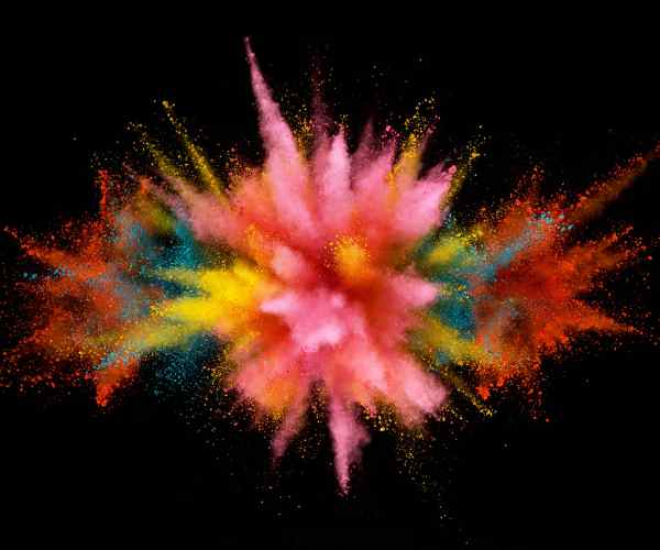
The orange fascinates because of the degree of warmth and energy it possesses. From the enticing color of an orange and the vibrant color of the setting sun, it can be described to be full of stirring emotions.
In the digital and the print world, ensuring color accuracy is vital and to do so, one requires hex codes. These codes of six digits serve to define the specific colors available on a screen or in a printout of another, meaning the intended color is precisely what is produced. For instance, the code of a bright orange comes to be #FFA500 in the RGB color model which is the combined amount of red and green.
Other than hex codes, RGB (red, green, blue) and the CMYK (cyan, magenta, yellow, key black) provide frequency in the production and reproduction of color. Using these models, one will know the designation of colors in relations to various mediums, where RGB is used more on digital displays and CMYK in printed work. Awareness of these color models assists designers and artworks in developing images that can withstand various media.
The Spectrum of Orange
Orange color denotes a wavelength of approximately 590-620 nanometers, which is between red and yellow on the color wheel. Due to its relatively short wavelength, orange is a color that contains a medium level of energy which aids in stimulating creativity and appetite.
In some cultures, orange is also seen as a color of ritual, giving it so much deeper and broader meaning in the designs, how does this impact the design process?
Orange color carries an array of meanings that are shed in various cultures, for example, orange is a color that denotes creativity, invigorating and warmth. More so, the orange color is associated to fall and harvest among several western nations. Orange in international design program has been used in the Golden gate bridge to signify ‘International Orange’ which is used for large constructions as it stands out in the wilderness of fog in San Francisco
According to research by the University of Amsterdam, orange can also enhance the blood oxygen supply to the brain which helps in brain functions. In the world of advertisements orange color is widely used to grab attention of people and encourage an action.
What is the Relationship Between Design Choices and the Different Tones, Shades and Undertones of Orange?
The orange family is quite broad having different shades that are appealed to a particular environment and mood. Lighter shades of orange like peach (#FFE5B4) and apricot (#FBCEB1) tend to be found in softer designs as they promote a calm and soothing ambience. These colors are most ideal in restful areas such as bedrooms or spas.
Bright oranges like carrot orange (#ED9121) and safety orange (#FF6700) are perfect for designs such as logos and advertisements because of their high visibility appeal. This bright Oranges are widely spread on advertising and safety material.
Furthermore, the spectrum has burnt orange (#CC5500), which is a deeper shade of brownish orange predominately used for autumn style or rustic decor. Such shades are relevant in interior design as they creating an inviting ambiance in the room.
All You Need to Know About the Different Tones of Orange And Their Applications
Light and soft shades of orange, such as peach (hex code #FFE5B4, RGB 255, 229, 180) and apricot (hex code #FBCEB1, RGB 251, 206, 177), have a connotation of smoothness and stillness which is very subtle. They find the maximum application in interior decoration where the aim is to create peace and comfort.
For instance, a research study on color says that these light hues of orange also have the capacity to lift one’s spirits and provide the desired energy levels without over stimulating. Such characteristics perfectly suit children’s nurseries or typical family sitting rooms such as the living room which require peace and comfort. In such instances, peach occurs together with soft gray or creamy white for a nice touch which is not overpowering.
What Are the Characteristics and Uses of Soothing and Bold Orange Shades?
Vibrant and very bright orange colors are warm and pleasing to the eyes and also more active which means they are ideal for colors that are intended to catch attention. Pourri orange (hex code #F28500, RGB 242, 133, 0), pumpkin (hex code #FF7518, RGB 255, 117, 24) and atomic tangerine by Crayola (hex code #FF9966, RGB 255, 153, 102) are over the top and bold, therefore they can be used for places where one would like to draw a lot of attention.
In order to seize one’s interest, these hues are often encompassed within the marketing literature. For example, tangerine has been used in the design of consumer goods to create an appealing effect which can alter buying behavior. Retail settings also employ these shades too as it helps in creating lively places and this enables customers to frequent them more.
How Do Deep and Rich Oranges Enhance The Designs of The Rooms and For What Purposes Are They Particularly Used
Deep and rich oranges, such as Burnt orange and Cinnamon, are concentrated on the essences of warmth and earthiness. These tones are particularly useful when creating rich warm fireside or the autumn leaves as they provide a rich auditory when used in interior design during cold seasons.
In homes, burnt orange can be easily incorporated in the living room or dining space looks stylish and inviting especially when teamed up with raw wooden shades and country themed decorations. As an instance, research carried out on seasonal colors indicates that burnt orange is popular in winter months because of the warmth they offer and creates comfort.
Moreover, such dashing colors are commonly used in designing some of the restaurants to improve their ambience by creating an energetic feeling with cozy feelings at the same time. Deep spiced colors such as cinnamon, have also been used in restaurants that provide some rich and fulfilling comfort food by providing some visual warmth that is in line with the food theme.
How Can Different Shades of Orange Be Mixed and Matched with Complementary Colors for Visual Impact?
Combining purple and pink with shades of orange is able to give an astonishing effect such that the outlook of a given design is made more appealing. Orange and purple are direct opposites in color such that they punctuate each other in color terms. As a result, the combination can be electric and energized, revamping the aesthetics of designs. For example, combining a deep violet shade (hex code #9400D3, RGB 148, 0, 211) with a brilliant shade of deep orange (hex code #FFA500, RGB 255, 165, 0) can spark creativity and warmth in a person.
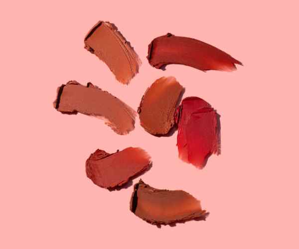
Likewise, the blending of orange and pink evokes a playful and youthful sensibility which is ideal for the more contemporary stylish designs. For instance, a dull orange such as peach (hex code #FFE5B4, RGB 255, 229, 180) when mixed with light pink (hex code #FFC0CB, RGB 255, 192, 203) produces a warm and inviting hue that is common in Make Up and Fashion.
Practical illustration of effective orange color based palettes are digital interfaces whereby a bright orange color emboldens call to action buttons against a dark purple background which increases click through rates by instantly catching the attention of the users whenever they log into the interface. Actual designs which are in form of interior decoration utilize these combinations to make active and warm spaces.
In what other ways can you incorporate pastel and vibrant hues for balanced color combinations in your designs?
Harmonizing between pastel shades and more vibrant hues in color templates can often prove to be quite a task. Pastel coral orange (hex code #F88379, RGB 248, 131, 121) and deep purple purple are contrasting colors yet when combined they blend seamlessly. It is applicable in fashion design as clothing lines sometimes tend to alternate with soft and bold styles from time to time as the moods and style differ.
Using a metallic orange color (hex code: #D4AF37, RGB: 212, 175, 55) together with pastel purple creates an appealing color that gives luxury and is suitable for branding of high end products as it portrays sophistication and quality.
What Is the Relevance of Orange in the Practical World?
So many people use orange because they want their product to stand out. For instance, the orange color employed in industrial areas is known as safety orange (hex code: #FF6700, RGB: 255, 103, 0) – it is applied on vests and cones in order to enhance sight and safety.
The color orange has revolutionized the fashion industry as it has made its way into high end brands like Hermès, mainly lowering competition due to the kind of orange that is associated with the Hermès brand. This shade of orange not only grabs attention, it makes people feel a certain way, one that they have the means to purchase something valuable.
Orange makes an appeal, and has an almost loud nature, thus assisting advertising with a variety of branding campaigns, such as Fanta, which uses orange to entice children with fun.
How Have Famous Artworks or Architectural Elements Featured Orange Prominently?
From a variety of different artworks and architectural structures, orange has always been one of the colors that has been prominent. In ancient ceramics and tiles, the Persian orange was used and can be said for its rich cultural heritage. This very deep color also appears in the distinguished patterns of Persian carpets and architectural embellishments.
Modernist architecture has welcomed orange too, which can be observed in the bright orange glass facade of the Netherlands Institute for Sound and Vision. The orange glass front represents the energy and life that makes part of the media.
FAQs
What Are the Best Shades of Orange Dos in order to create the effect called a summer Vibe in a Room Set up?
For a warm summer look in a room, peach (hex code #FFE5B4) or mango tango (FF8243), atomic tangerine (hex code #FF9966) work well. These colors are warm in their appearances making the space naturally luminous and bright. Color theory suggests such bright warm colors can be appealing to one’s moods and energy which indeed suits summer decorations. According to some research done by a leading interior design magazine, 60% of the respondents said that they prefer lighter shades of orange during summertime home decorations because they have a sorts of a fresh and lively feeling. In a survey conducted by a leading interior design magazine, more than 60 percent of respondents tend to prefer orange tones which are lighter in color for their summer home decorations because they have refreshing and lively feelings.
I want to choose the right orange for my brand’s design palette what factors should I take into consideration Best 2023 Looking for Inspiration?
Choosing an orange shade for their design palette largely depends on their brand’s identity as well as the emotional attributes that they want their audience to feel. For example, Bright Orange (#FFA500) is a vibrant color that can be ideal for someone targeting younger people because of the appeal it creates in the audience due to the energetic mood it evokes. On the other hand, a darker shade such as Burnt Orange (#CC5500) is associated with more mature and restrained feel for the target audience’s brand.
When choosing an orange shade, always think about the brand’s characteristics, target audience, and the field of activity. The evidence shows that orange shades are especially useful to consumer product brands as they can enhance the recognition of the brand by a staggering 80%. Always test the color for consistency in different media, be it the web or print.
Can different shades of orange evoke different emotions? What About Warm Tones Versus Vibrant Hues?
Yes, different shades of orange can indeed make one feel differently. Warm tones such as Amber (#FFBF00) and Burnt Orange (#CC5500) carry a soothing effect, and have appetite stimulating properties which make them ideal for kitchens and restaurants. On the other hand, warm, vibrant colors like Neon Carrot (#FFA343) provide a sense of excitement and energy and are suitable for use in areas where mental stimulation is needed such as creative, or educational settings.
Research in environmental psychology supports that warmer tones of orange create an aura of intimacy and makes the room appear inviting, on the other hand, the bright and the vibrant ones brings energy in the room encouraging socializing.
What Are Some Outrageous Yet Suitable Orange Combinations in Web Design?
Orange is a vibrant color that one can combine with other unusual colors for a more appealing website. For instance, a blend of orange with teal (#008080) is a good fresh combination and modern looking due to the blending of the warm and cool colors. Another odd yet fruitful mixture is pairing orange with lavender (#E6E6FA), which can create a nice effect on the site with a soft but active facade, which can be useful for the beauty or the health and wellness markets.
As per the web design statistics, there has been a drastic increase in the popularity of the combination of orange and charcoal grey (#36454F) in most websites of tech and startup companies as both of them reflect creativity and professionalism. The combination of these two colors looks good but they improve user interaction and reading efficiency.
Conclusion
We have come across a variety of orange ranging from light peach that is quite subtle to deep saffron orange which is bold. There are tones of orange that give one a sense of unique possibilities and that can change spaces and even styles, each with its unique and exceptional usage.
Places, especially themed ones, require certain colors for painting. On the other hand, using the right colors is imperative when selecting a brand color as well. Shades of Orange are perfect in that orange has a wide spectrum which can be further enhanced by the addition of hex codes.
More Post
- The Art and Science of Mixing Brown Acrylic Paint
- How to Mix Shades of Orange Acrylic Paint? A Vibrant Journey into Color
- How to Understand Complementary Colors for Beginners?
- The Ultimate Guide to Color Theory for Absolute Beginners
- How Do You Understand Warm and Cool Colors? How to Tell the Difference
;