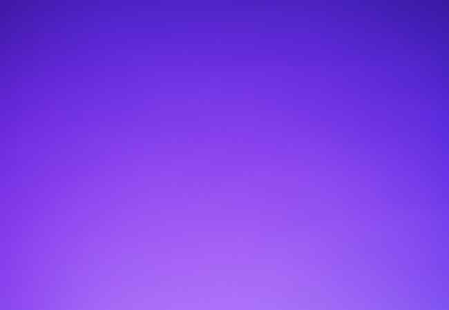
Purple Color Palettes are among the auspicious colors in the designing scene as it houses a number of colors and brings forth some sets of feelings. When it comes to purple palettes, the colors selected are not just random or thoughtless but do represent a form of class or elegance to the particular design.
Shifting towards the digital design, there is need of a specific coding language or lettering that is universal. Hex codes are such a situation. Hex codes enforce a color to be adhered to and that specific color is used. It is also vital to bear in mind that, in addition to measurement accuracy, these codes are very useful in ensuring that the same design is replicated on different devices.
One of the other critical aspects that enables a designer to develop and conceptualize an artwork is the color wheels. This one basically assists in showing the relativity of colors and then also in demonstrating how one color relates to another and combinations of colors. Concerning the earlier point, purple palettes are placed within a color wheel ensuring that a perfect shade is selected helping make the final product a sight pleasing one.
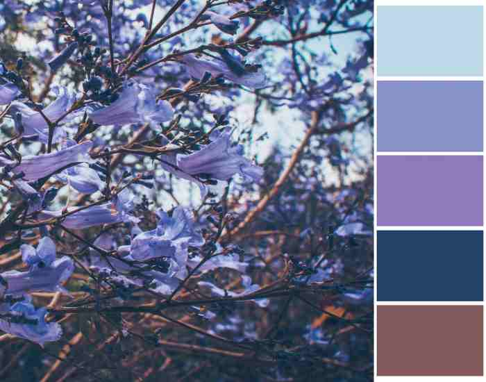
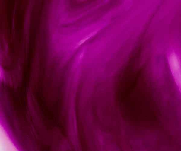
The diversity within a purple color palette goes beyond the basic distinction between light and dark shades. From the deep and regal tones of royal purple to the calm and soothing hues of lavender, each shade brings its own character to the palette. Exploring this variety allows designers to tailor their choices to the specific mood, message, or aesthetic they wish to convey.
Purple Colors
A firm shade that designers prefer to utilize, purple has many variations and tones within it, each harnessing a distinctly different emotion and character. Designers have managed to utilize purple in their designs and leave a message without diluting the feeling it evokes.
Various Shades
If one is to observe a Dull Purple that conveys mystery and elegance, Dull Purple aids in deepening designs which makes for a wonderful color for strong visual elements.
On the other hand Electric Purple comes with significant energy and color. It tends to be a showstopper color and swiftly captures attention, which makes it better for modern stylistic designs which tend to be quite entertaining.
Medium Purple on the other hand acts as a natural bridge between Dark purple and electric purple, therefore it can also conjure feelings from calm to powerful with ease.
Why undertones of colors are important
No doubt interpreting the nature of a particular undertone is of great relevance for color classification especially with regard to the setting itself. It greatly affects the way the whole space flows by influencing the vision of the observer.
Test Form: Grasping the Peculiarity of Blue Undertones
Coincidentally, blue undertones are one of the blue tones that some shades of purples are capable of encompassing. This radically alters the perception of the color purple ranging from soft to the more vibrant side. Designers should avoid making too much use of shades of purples with blue undertones but they should not forget the impact that blue undertones have on the former.
To put it another way, blue undertones added to a purple color may be a preferred choice for many as it comes across as an overly calm shade along the lines of a cloudless twilight. On the other hand, purples that have some modest warm undertones infuse a sense of motion and shine. This comprehension of the pastel hues of purples appears encouraging as it empowers designers to be creative and design cosmetics as per their clients’ expectations.
Color Psychology
A firm shade that designers prefer to utilize, purple has many variations and tones within it, each harnessing a distinctly different emotion and character. Designers have managed to utilize purple in their designs and leave a message without diluting the feeling it evokes.
Various Shades
If one is to observe a Dull Purple that conveys mystery and elegance, Dull Purple aids in deepening designs which makes for a wonderful color for strong visual elements.
On the other hand Electric Purple comes with significant energy and color. It tends to be a showstopper color and swiftly captures attention, which makes it better for modern stylistic designs which tend to be quite entertaining.
Medium Purple on the other hand acts as a natural bridge between Dark purple and electric purple, therefore it can also conjure feelings from calm to powerful with ease.
Why undertones of colors are important
No doubt interpreting the nature of a particular undertone is of great relevance for color classification especially with regard to the setting itself. It greatly affects the way the whole space flows by influencing the vision of the observer.
Test Form: Grasping the Peculiarity of Blue Undertones
Coincidentally, blue undertones are one of the blue tones that some shades of purples are capable of encompassing. This radically alters the perception of the color purple ranging from soft to the more vibrant side. Designers should avoid making too much use of shades of purples with blue undertones but they should not forget the impact that blue undertones have on the former.
To put it another way, blue undertones added to a purple color may be a preferred choice for many as it comes across as an overly calm shade along the lines of a cloudless twilight. On the other hand, purples that have some modest warm undertones infuse a sense of motion and shine. This comprehension of the pastel hues of purples appears encouraging as it empowers designers to be creative and design cosmetics as per their clients’ expectations.
Designing with Purple
A proficient creator can utilize the purple color palette in their work to achieve various branding goals and perform a variety of functions that will help grab the attention of the desired audience. In this section, I will provide graphic design examples where purple is used in different contexts, making the designs more flexible.
Exhibition of Graphical Designs
- Website Creation: A Web page may make use of a blend of deep purple and lavender530 lavendar525559534as and preferably user measure not user guris mean of eccentricity when blended into this approach. This approach is likely to suit beauty and fashion brands quite well.
- Brand and Logo Designing: Companies who wish to show a high class and sophisticated aspect to their brand foster branding that allows them to incorporate purple for their marketing, Cadbury’s signature purple is a great example of this branded technique as well as Crown Royal branding’s purple crown.
- Printed Materials: In addition to brochures, purple can also be used as a dominant color to other off set packages so as to increase the attractiveness of all printed materials. When violet purple or lavender are the background hues they are set off to great advantage.
Adapting to Several Design Environments
- Interior Designing: In interior designing, purple is preferred because of the different moods that can be expressed in a space. Deep purple on walls or fabric will spice up a room while light purple on décor will calm the senses.
- Graphic Designing: There is a lot that one can accomplish with purple in graphic designing. Purple has a lot of work to do, it can be overbearing or calming, it can be delicate. The different tones of the color can further cater for different branding.
- Fashion Designing: Purple certainly performs its part when it comes to dressing up. Colors are used by designers to convey moods, of current styles or just messages. From a dark purple evening gown to a plain lavender dress, the range of colors is simply overwhelming.
Form Completion Test: The Effect of Purple across the Domains of Design
Speaking about the influence of purple towards various branches of design, it suggests that purple is not restrained at the borders and is functional throughout.
- Interior Design: The hues appropriate to a space should be chosen carefully. Purple bedroom walls, medium in shade, can create a warm and inviting environment meant to lull the user, and the space designer perfectly examined this phenomenon.
- Graphic Designing: In terms of color, purple enhances much more than graphics, in fact, within the digital realm it can engage users’ minds, facilitate smooth programming and users layouts’ development.
- Fashion Design: I think it will not be difficult for anyone to realize the role of purple in the wardrobes of the attendees of fashion house shows, or how to say it, in everyday clothes! Expect your new purple coat to turn heads, together with pastel purple shades which are more relaxed. All in all, the color purple is and has always been in fashion.
Baronial Taste and Sophistication
Being the color of the royal family, purple had always been considered to be a color of wealth and class. This section will try to examine how the various forms of purple’s classiness can be applied in creating age proof designs.
Purple and Luxury.
We’ve often heard, ‘She is so posh’, or ‘That’s such an elite brand’ , and it all traces back to the color Purple. When Ofuscated Purple came in, the rich and elite loved it so much that it was used to make clothing. This form of clothing represented one as a mark of high society. Even in the past, Purple as a color was associated with the elite class, and it still today is.
Utilizing Purple For Upper Class Augmentation
- Luxury Branding: Numerous products in the market, that are all subsidiaries of several other brands, seek to come out as exclusive and for such products the shade purple is used in the logo and marketing. Owing to the fact that purple is highly associated with elegance, brands like Cadbury and Rolex use this color to enhance their brand image.
- Interior Design: When speaking about the color purple, it is in fact regarded as one of the best colors to add within the interior of a space that needs to look exquisite. The combination of gold and silver with deep purple shades, furniture, upholstery and accent pieces can achieve great decor.
- Fashion and Accessories: Purple is a color that is mostly used by the high end fashion designers, deep violet and French violet dresses are worn in high fashion shows together with lavender accessories offered by different luxury micro channels. Purple shade has always been associated with classy and elegant aspects.
Test Form: The Color Purple Transforms into an Accent of Luxury.
Test Form: The use of purple in various designs signifies a much more advanced level of luxury.
- Regal Accents: Graphic designers and web designers love to use royal purple because it is extremely elegant and rich at the same time. This could be with buttons and headers or even background elements that need to be in the scent without the whole graphic changing.
- Packaging Design: Test Form: Do you think a perfume packaged in a royal purple cover is not on the high end? The same story is to chocolates. It creates a system where the bright purple color equals wealth and exclusivity.
- Event Decor: For example, accessories such as table décor, draping material and florals of royal purple are used to give the desired feel of luxury to perfect occasions such as weddings and gala evenings.
What are the reasons for choosing a purple color palette in designs?
Answer: Purple as a color has many tints from classy to creative. From the diverse spectrum of colors, purple seems to have a multifaceted meaning. This versatile color enriches your design making it appropriate in an assortment of circumstances.
How do I select the right purple for my drawing?
Answer: Ask yourself what kind of emotion you are willing to pour into your drawing. Deep purples give off the soothing and sophistication hues, lighter ones help with the feeling of calm while rich active purples give the sense of power. There is leeway here, different configurations can be used to test the right color.
Is there any specific area that is more enhanced with the use of purple?
Answer: Purple is synonymous with regal wealth, which is perfect for the beauty, fashion, and reputation service industries. But these are not the only areas where this can be applied, as it can be used for many others as well.
What is the pure purple rgb color?
Answer: A true purple can differ from one another, however pure purple can be represented approximately with RGB 128, 0, 128 which is a commonly accepted level of representation. These numbers can be modified by the people and the design in accordance with their preferences.
How can I incorporate purple in my drawing as a secondary color?
Answer: Purple tends to get overbearing at times but when used as a secondary color or mixed with softer colors, it can be quite soothing for the eyes. Aspects like saturation and brightness can also aid in creating the desired balance.
Does a darker shade of purple signify something different than a lighter shade? What distinctive message do purple colors send as purple is said to be the color of kings and nobility?
Answer: Many colors depict varying feelings, yes, a dark purple is said to have more of an elegance or fancier taste along the other end lighter shades portray calmness. Understanding this difference will ensure that the message meant to be communicated is properly crafted.
Are Hex codes important if you are working with color names?
Answer: Working with color names has its advantages, but using hex codes is far more effective as it is a format that defines exactly the same color on any device whether it is android, Ios or windows. This is especially true when designing for the internet..
Do Purple color also mean I should consider the RGB values?
Answer: Yes, colored models of RGB actually makes a significant difference especially on computers as this is what displays the color color that is being used. Use Different RGB values in order to have the best representation of the depth of the color.
Which feeling working up with purple in aesthetic would work towards accentuating the beauty of a historic art piece?
Answer: The aesthetic touch which the artwork is expected bring forth will also determine the specific tint of purple which will be needed. For example: Lighter shades of purples compliment a much pacifying atmosphere while darker shades tend to call for more potency of the scene. Always keep the bigger picture in perspective and apply the suitable colors in your artwork where it is needed.
How are hex codes color palettes working with purple?
Answer: Hex codes are color computer systems easily recognizable by numeric and alphabetic characters that enable users to quickly create exact colors in a digital environment. it also Makes these colors universal. Hex codes must be used uniformly to ensure maximum accuracy as far as web and digital filling forms are concerned.
What color works well with purple?
Answer: Purple is complemented by gold, silver, and white combinations. The mixing with the other core colors and its perks with the optimization of saturation works well with the aesthetics.
Conclusion
To sum up, the fashion trends to the international styles tend to range from purple to rich, lavish and deep dark red purple, creative techniques for designers amets ranging from shades. Of late purple strategies have embraced the strategies of shades of light purple, color patterns, and the significance of purple in ancient times.
Purple’s Complements: Purple is one of those colors that can be used more or less anywhere. No matter if it is an inviting cover of a product or a warm shade of color for the interiors, purple comes in different colors that can serve an endless amount of needs.
Psychological Effects: Purple can either feel rich or it can feel very creatively pleasing. Purple helps in eliminating the urge to doodle or makes any extensive and significant deep designs quite easy which makes it an asset for a designer in the field of visual storytelling.
Inquiries and Answers motivate the designers to make use of the creative charge that the purple color endows on them. Different levels and combinations and techniques would create the most distinctive of design interpretations. Each level from the bold statement of electric purple to soft assertive mauve helps create beautiful designs that touch ones feelings.