Muted colours are a curious adventure into a different and understated form of beauty which is why they are fascinating to use in art and even in everyday life. Their beauty in these colours is deeply inherent for reason of modesty. The sophistication that these tones emanate is bound to evoke calming effects. Now, the aim of this discourse is quite simple. We set out to understand the meaning of muted colours and their reach in affecting emotions, We also look into how these colours can be effortlessly introduced into the much broader picture that is life.
Muted colours is complex and involves psychology behind it, and we will be looking at the ramifications muted colours were meant to serve from this moment on. It is more than just deciding on a colour, it is selecting a colour that has a tender touch that influences the emotions in one way or many.
What we will also perceive in this section is how different eras and prominent artists have tried to incorporate muted tones in order to provide their masterpieces with great emotion and depth to it. We will go through Edward Hopper’s enigmatic portrayal and Vincent Van Gogh’s bold stroke, interpreting what these quintessential artists had in mind while using muted palettes.
But that is not the end of it! We will be fast heading towards the world of design and decoration where the use of modern color gradient goes beyond an artist’s canvas. Here we will share practical tips on how we can incorporate such colors stylishly into their environment. For instance, If you are trying to create an aesthetic vibe around the room consider using a brighter tone to amplify contrast or If you are trying to accentuate an interior use a collection of subtle tones the choices are limitless.
What Are Muted Colors All About?
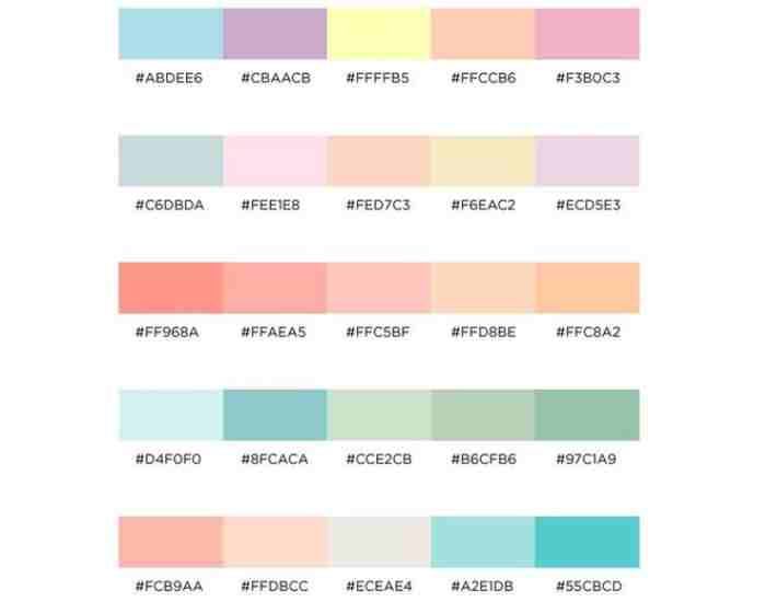
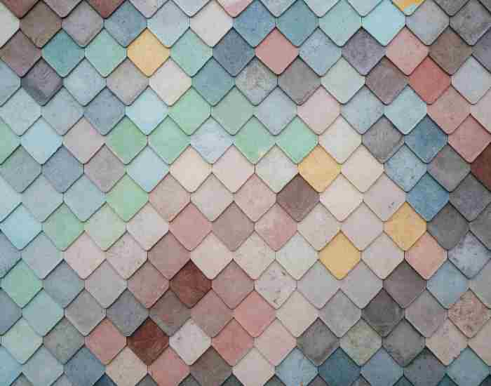
Muted colors can be defined as one more class of the intensity spectrum clearly demonstrated by moderate saturation as well as low vibrant appeal. They create effortless charm reflecting an alternative to the loud electric high vibe dominant colors of the world as we know them.
Focus on muted colors whenever you are feeling as if the world is simply making too loud of a noise where the brightness of colors can overwhelm being soft and focus instead on subtle blue hours, robes, gray, or other similar tones the brilliance is not in blending in with the rest of the world but rather standing out from them. Unlike strong tones, muted colors do not fight to command the attention of some, perhaps even indifferent, audience rather they use their delicacy to entice.
Muted shades regardless of if they are in art, design, or even life can feel soothing. It emits an aura which feels calming, pensive, and subtle elegance. The feeling and sentiment that it evokes is similar to soft melodies, they may not be loud but they can invoke strong feelings.
Due to the lower intensity of muted colors, these can be more tempered with other colors while avoiding the risk of a clutter of strong colors. Because of this quality, they are very suitable to be used in many situations as they do not affect the overall design too strongly.
Having walked through the aesthetics of muted hues, it feels obvious that they are heavier than vision. The effect which they have on our minds enables a soothing experience and distracts from the overload of sensory emission which comes from a high pace and vivid world. We are encouraged through these tones to seek out beauty in not being subtle while at the same time stimulating a more versatile experience from the environment around us.
The Psychology of Muted Colors
While examining the complicated relationship between color and psychology, we notice how muted colors speak to our emotions, concentration, and well-being. These colors are not only aesthetically pleasing, but they can also influence a variety of emotions. Maintaining the right ambiance becomes so much simpler.
Let’s begin with muted blues. Gone are the days when I would be nervous to utter the words ‘light blue’ while delving into the ocean of color psychology. Blue hues are said to induce calmness and tranquility, making them perfect for use in spaces meant for relaxation. Remember how soothing the waters look on a pleasant day with light clouds hovering a clear blue sky? This is what muted blue shades evoke. What are your thoughts on blues?
Then come muted oranges! A muted coat of orange makes a space feel warm and inviting. Green adds a subtle bite and an impression of calmness to any situation. We are all aware of how color makes people respond. So, whole design concepts based on the psychology of color can work to infuse warmth and coziness into rooms. Orange in its muted form will always be an elegant blend of vibrancy needed along with a quiet composition.
Decoding the emotional complexity of different muted colors entails traducing the importance of color psychology. Muted tones already sit between being bold and being neutral allowing a soft touch which communicates a range of emotions.
The muted color psychology does not concern only personal taste but also includes the sociocultural perceptions. For instance, some muted shades might trigger some form of nostalgia, or a sense of someone’s past, relating us to set experiences and memories. Engaging these emotions adds more richness to the narrative about color psychology.
It does not take long to figure out as we move through the psychology of muted colors that every every variation may be identified as a brush on the canvas of our emotions. For instance, muted shades of blue add an elements calmness while oranges soothe with comfort and by its warm nature while muted hues of gray add subtle sophistication and in the process all three complement each other and shape the emotional design of the world that surrounds us.

How do artists utilize muted colors?
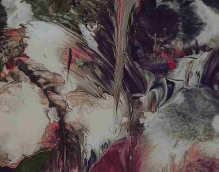
Art is a form of expression that involves creativity in its truest form, exquisite artists have always picked muted colors to showcase their pieces. These artists were able to use muffled shades in their art pieces without losing its sense of depth, meaning or even emotion, the meters of emotional tension were perfectly crafted giving it an ethereal feeling taking it beyond any realm of time.
Looking at the great Vincent Van Gogh and one of his great work, Starry Night, In this piece, van Gogh employs muted shades as the colors, giving it an almost dreamlike look and feel. The sense of stillness combined with the massive mystery that the reasonable choice of colored tones creates gives the picture a stillness that inspires hope and awe, the night’s quietness and the sheer size of the sky bring calmness to the viewer all thanks to the showy colors of the dress, blues and greens.
Edward Hopper ‘Nighthawks’ is also a well known example of muted toned paintings. This timeless work focuses on the mystery and sadness of a diner scene during the middle of the night. Using muted yellows and gray blues caused a gloomy effect. The muted hues enhanced the characters’ sense of loneliness and the peacefulness of the night, which made it easier to consider the scene as the characters did.
The muted colour palettes used in art evoke certain emotions for the artist. These artists make assertive decisions while creating their pieces which serve to enhance facts and instances. Colour selection is one of the bold decisions made by artists and can define the aura of the painting, and mute colours ensure timelessness.
Contemporary artists also make use of muted colours in order to create visually appealing and heartfelt pieces of art. These artist avoid overusing a wide range of colours to highlight specific aspects of the message that they would like to be focused about. Solely using one colour or a combination of very few can help provide a different perspective on the overall idea of the art piece.
Case Studies: Famous Paintings and Muted Palettes
Despite having different philosophies, Edward Hopper and Vincent Van Gough’s Starry Night and Nighthawks perfectly demonstrate the use of muted colour palettes while being breathtaking pieces. They not only display a plethora of other features at the same time but also succeed to complement each other rather than clashing. Let’s analyze these case studies to observe how these well distinguished artists tend to thoughtfully employ subdued tones.
Vincent van Gogh’s Starry Night
Starry Night has had a colossal impact on the art scene and bears testimony to van Gogh’s skill in constructing a magical vision with the use of muted tones. The colors and the hues swirl in a taming manner to colorful blue and grey which dance to a soft melody and enchants the viewer. In fact, the colors serve to bring out more emotion in the picture instead of overshadowing the vibrance. Because of Van Gogh’s preference of the use of soft colors, the calm background enables the stars to sparkle more softly and in turn makes it look rather mesmerizing. The color palette he uses becomes van Gogh’s strongest impression for quite a strong and profound time in the word.
Edward Hopper’s Nighthawks
Edward Hopper’s Nighthawks depicts an exquisitely dull color scheme to connotate the loneliness that resonates within a midnight diner. Soft, warm yellows fill in around the blue and gray colors accenting the piece, allowing for a haunting atmosphere. The cooler colored tones work in synergy with the subject matter, aiding the audience in fully grasping the emotion of Hopper’s characters. The colors fit perfectly alongside his muted gray hues, maintaining a blank canvas while simultaneously portraying strong feelings to the viewer.
The former examples highlight a recurrent narrative strategy that high caliber artists are often found to employ in their works. The color scheme in this specific painting is not there without a reason behind it, guiding the viewer through a more intimate view of the true meaning behind it. In other terms, these case studies advocate that color choices are not weaknesses in a painting but rather a powerful tool to enhance the voice of an artist.
Soft Hues in Design and Home Decoration
When it comes to design and home decoration then soft hues resonate with the feel of sophistication, tranquility, and stress-free atmosphere, which is why these colors are timeless. Whether you want to change the entire theme of a specific room or simply want to create a little work of art with the use of subtle muted colors, yes, there are ways to do it practically and feistily.
How to Pair Muted Shades for a Color Palette for Your House
With the selection of color, the first task when considering muted tones for your house is identification of a sound color scheme. For that, what kind of theme do you wish to create for that room determines the palette you select for the combination. Once again, for areas whose focus is relaxation, try off-whites such as subdued blues, greens, or soft grays. But if that theme were to be for off-whites then muted oranges along earthy reds and browns works their magic and creates the feel of warmth.
Designing a Room using Muted Tones
Adding Depth:
One of the key principles when achieving a look using muted colors is to have contrast in the room using different themed sections of that room. For example, when trying to use this for a living room then adding muted toned pieces such furniture paired with brighter shades of darker paint can add interest. Then say for that same room having blue sculptured land art can create a striking wall and compliment the look of the room turned seamless.
Impact of Color and Light with Tolo
There are many things a builder or a designer has to consider before jumping to the work, one very basic and crucial aspect is the relationship light and color has. Rethink the construction decisions the colors you will use in conjunction with the natural light coming from windows. The outcome of these colors creating a realistic texture in the air, is quite appealing and rather welcoming. Do consider testing these colors for the ideal tinge that would elevate the visual and feel of the room.
Combining Mute Colors with The Accessories and Furniture
Uphold the use of these colors to your other accessories and furniture. Choose muted shades for the sofas, chairs, and curtains that work well with the existing colors. Furthermore, introduce decorative pieces such as throw pillows, rugs, and canvas that possess these muted colors and can be smoothly blended in without breaking the uniformity that is required in design.
Usage of Mute Colors in Separate Spaces
Master bedrooms: A Personal Sanctuary
When designing a bedroom I would recommend using moderate blues and greens or soft grays. Hopefull with these colors the room will be transformed into a harmonious set that will allow the person to sleep better at night by promoting a peaceful environment.
Living rooms: The Interaction Area
With a living space there should be a mix of some warmer colors while still retaining the muted tones. These warm colors will help other elements shine and be the focal point of the area, which in turn will make the space feel more friendly and enticing.
Advice for Working with Muted Tones in Interior Design
Applying muted tones in any of the various sections of your house can undoubtedly add sophistication to it provided the shades are well thought out, and are appropriate with the given space. As you prepare to give your home a new look, there are two things regarding muted tones to remember.
Marrying Muted Colors with Vibrant Shots Focused Decor: One of the most effective ways to elevate the impact of muted colors is by creating contrast within the space you’re working with. While the understatement of muted colors is bright in its own right, the addition of accents that are vibrant or bright will undoubtedly inject energy into the room.
Accent Furniture and Decor: Select key furniture pieces or decor items in bold, bright colors. For example, a muted gray sofa looks great with throw pillows in bright colors or a bright artwork on a subdued blue wall adds drama to the decor.
Statement Pieces: To enhance and set the overall theme in the space, incorporate statement furniture or accessories from a different extreme in color, that will seamlessly serve as a focal point. This encourages a vigorous dialogue between vivacity and beautiful subtlety.
Textiles and Patterns: Consider using curtains, rugs, and upholstery in bold colors and accented patterns. Beside layers of muted hues, they can also add liveliness to the room.
Artwork and Decorative Items: Use vivid colors in artwork and other decorative items to focus on certain areas. These features not only spice up areas with muted colors, but they also enhance the space’s movement and visual impact.
Muted Color Palettes for Different Rooms: Finding the Right Inspiration
Each room in your home has its individual function and how you choose your muted color palettes can impact the feeling and essence of the room. Let us look at suggestions based on the specific rooms to define how different areas of the house can be improved.
Bedrooms: The Most Serene Rooms
For bedrooms consider colors that are soft and tend to be calming such as gentle blues, greens or grays. These colors will enhance the soothing effect in the room and help maintain a serenity that is ideal for a good night’s sleep.
Living Rooms: Social Places That Want You To Feel Comfortable In
In combination with the appropriate elements, living rooms should be out of this world by including touch of beauty to the blander rooms. Choose a color other than beige or white for at least the walls and the bigger furniture so that the colorful throws pillows, pillow covers, or artwork can make the room pop out of its borderline and throwfurniture space. This serves to enhance the home’s aesthetic and social space.
Workspaces: Increasing Effectiveness
For home officesits best to use DIY workspaces which are soft tones which ensure concentration. Using soft greys, soft green and weak blues as the primary color are a good starting point to set a stage where concentrating and being creative is quite healthy for the occupant.
FAQs
Answer: Can muted colors be vibrant?
Definitely so! Muted colors have a vibrancy that differentiates them from the more bright versions, how are ai they not unique? Naturally they won’t be scream at you, but bifurcation allows sound to have a vibrancy to it that is subtle. Think of it as the softness that enhance every other aspect which adds some sort of detail to every other space.
How Do Muted Colors Affect the Psychological View of One’s Space?
Muted colors can give an interesting perception of the space as they are on the softer side. Unlike strong colors that will make the room feel larger than it is muted colors tend to blend into the background, which helps in the room’s appearance. For this reason, they are ideal for rooms located in dimly lit locations like indoor rooms. It tends to have a more spacious and open feeling.
Are muted colors good for use in every season?
Certainly! The use of muted colors is not restricted to any season since these colors can be utilized for any season. Once you change the shade of a color muted color palettes can help to reflect a different season entirely. The use of soft pastels would freshen up the air for spring while for fall or winter deeper muted would be ideal as it would help prepare a warm atmosphere. In this case, muted colors are virtually unaffected by seasonal change trends, and they make the ideal selection for a living space since they are ageless and versatile.
Conclusion
Mutedness adds depth to design, beautifies home decor, and embellishes artistic works; hence the use of muted colors is not just an aesthetic but a purposeful way of transforming an environment. Using muted tones will help you tone down a certain area that exudes class, elegance, and peace.
Along with trying out these muted colors, it’s important to learn how these colors will affect feelings and how they will be perceived in relation to space. Muted colors add a subtle but powerful vibrancy, which can have a positive effect on your mood, thus making your spaces full of exquisite beauty.
So with every accent you apply, let the cohesiveness go for accenting around the gentle essence of muted colors. It’s redesigning an area where you reside in but more importantly, it’s preparing an area where your life philosophy of being conscious and positive will thrive.