Designing does involve color in every aspect because it completes a purpose such as conveying emotions, establishing branding presence, and in general making graphics attractive.” Taking into consideration the fact that color is a key element of the design, its appropriate application is also important to the audience perception of the final product.
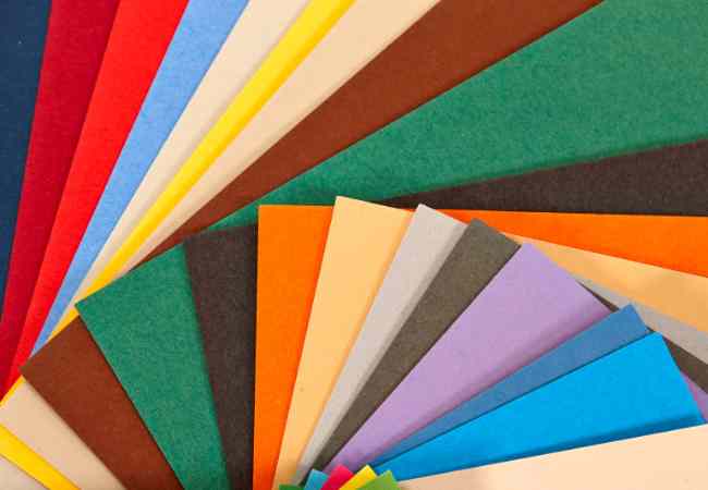
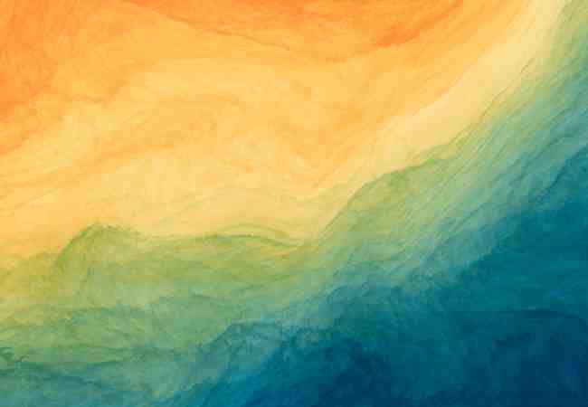
Some of the most popular colors that are becoming a popular trend in the designing world are pastel colors. These shades tend to give an “I don’t care” impression instead of the strongly vibrant colors. The graphic design to interior designing has been revolutionized by soft pastel colors which have captured the eye of everyone.
Precision with Hex Codes
To obtain consistency in colour reproduction, designers are increasingly using hex keys now. These are alphanumeric codes which are specific colours in the hexadecimal format, and they provide a standard way of encoding and rendering colours in a range of mediums. Hex codes as a form of technical language facilitates consistency in the presentation of colour which is a norm in design culture in the 21 st century.
Fashion Aesthetics in Pastel Colors
It is at this point where pastel color combinations blend in and shine due to their ability to come up with a pleasing design. Soft and delicate tones and gentle additives, as well as sharpening in details in pastel colours adds to the level of production from high class to universal appeal with any project. as most of the designers opt to use the combinations as accents in new modern pieces and deep emotions alongside colour design palettes, pastel colour combinations makes sense.
Making Head or Tail: Understanding the Terms
There are few things that are likely to be difficult for a novice and so the lexicon comes in handy while understanding the world of pastel design and colour. These will include color palettes, the many ways of forming a blend with pastel, the features of different pastel colors and also hex codes which make up the rest of the defintions. That knowledge is an essential part of preparing for deeper involvement in the world of designing and pastel combinations.
What are Pastel Colors?
Pastel colours can be defined as colors that are soft or washed out in nature. Generally, pastel shades can be considered as dull shades which are never in your face. People and designers alike are falling for these particular shades mainly due to their calm and elegant vibe.
Characteristics of Pastel Shades
Pastel shades are said to be faint and soft. It is a mixture of a color and white. Pastels which are the lighter shades of a color are widely known for their relaxing effects and tranquil lives. It is hard to believe that the very color can be perfectly beautiful when its intensity is lowered.
Feelings and Interpretations Related to Pastel Colors
Similar to all the colors, pastels too have feelings attached to them. This is to say that, pastels also appeal to our deeper level, and hence we express a range of emotions while viewing them. For example, pink is said to symbolize love and affection, and pastel blue has a pastel hue reminiscent of the gentle waves of the sea. These sentiments are also associated with pastel colors and the range could be wide providing the designers with a wider scope.
It Is Crucial To Have A Better Understanding Of Terminologies In The Pastel Palette
Have surrounded in a pastel setting, one is required to learn the specific terms and concepts related to its greater usage. What is a pastel in the first place,what measure do I have to take to make a color palette in the first place, and how to use hexadecimal languages are all useful pieces of information to solve this one specific question. Such terms act like a building block to create stunning designs for others wishing to extend the use of pastels.
An Explanation Of Hex Codes
With hex codes, nothing is free for all and nothing is left for imagination especially after there has been an unconditional trust. So, what are these alphanumeric codes and what role do they play in the building block of designs.
Hex Codes And Its Significance
Hex codes need to be simplified and a common tongue needs to be employed if they are to be used appropriately, this is often the case when discussing how colors are used within the virtual world. By definition these codes are based on letters and numbers and therefore do need to be associated with a color to have any value when using them. The reason why this technique specifically is useful is because it’s built in hexadecimal form means that a color can be chosen accurately while still being able to greatly widened their range as There will always be 16 digits to choose from which means a wide variety of colors can be made.
Hex Codes In Design Projects
The Most Relevant Application is in The Graphic Design Industry is where hex codes have become design standard in precision which helps better attention to details. Thus, whether it is a graphic, apparel, or any other item of designer’s work, a designer using hex codes can specify exactly what color should be used in order to reproduce it on different systems and devices. This strength is very significant especially for branding as colors must be kept.
Hex Codes and Marketing Compliance or Consistency With The Brand
As we discuss the visuals of the brand which are its quintessential aspects like its elements which includes a very good feature which is a logo however, the other feature branded hex codes assists with the color consistency that forms the very base of the brand. Forming a coherent brand hex codes allow you to generate a brand with dominant color elements that integrates simultaneously a website, a brochure, an animation and any such numerous assets into the brand logo.
Hex codes can add up in getting overly complicated with their concepts: Something You Need to Know Along with Hex Codes
Well, for hex codes they have unique as well as normal attributes which are terms colour codes and binary in nature. There is a wide range of hex codes alongside colour representations that require their own hex codes to go along with. These terms form the vocabulary that helps practitioners make sense of the complex and chaotic world of color representation.
With the concept of pastel colors fully defined and the mechanics of hex codes fully mastered, we can move on to the next step: the creation of your own pastel color palette. To achieve a beautiful and effective pastel palette, it takes experience in mixing and complimenting of colors, as well different colours and the designing elements in design.
Pastel Shades and Their Color Combinations
The first thing when preparing a pastel color palette is to consider the various colors of pastel shades. From pastel pink or a pale blue, there are soft shades to consider. Expanding your view of pastel colors can also include its tone, intensity and hue, which will inspire you in an entirely new way. In this way, creating a more effective and disciplined pastel color palette becomes easier.
Concepts with Regards to Color Combination
The task of combining colors, even in the case of pastels phrases may seem to be the least fun job becomes the most fun. The combination of Bolly Blue and Green or Deputy Pink and Yellow seems to be a choice that is supposed to be focused on for hours, wishing to grasp the objective that is supposed to be achieved through the design. You can artfully combine light and dark colors or warm and cool, and find the pastel shades that work in harmony.
Adding Pastels to an Already Built Palette
Pastels are great for almost everything. However, if you are an established business, trying to make a connection with the already existing color scheme may prove to be a challenge. Hopefully, you have learned to skillfully incorporate pastel shades into your business brand without losing the little details that bring the pastel to life. When branding yourself, try using pastels as a vibrant pink accent. In any case make sure to do it in a way that does not seem unprofessional or contradictory to the already existing brand pictures while being aware of how it interacts with the current brand colors.
Blueprints of the Pastel Colour Schemes: Important Phrases
In the attempt to alter our visuals by using a pastel color palette, there are some other terms we have to get acquainted with. The importance of learning this key relational vocabulary lies in creating a wish to advance in the designer’s profession by enabling them to make wonderful color combinations, integrate pastels into the brand’s color scheme and narrow element in pastel colors.
This Article Features Pastel Color Color Scheme Ideas That Are Easy on the Eyes and Hi Mates,
While we take a first look into the realm of pastel colors, consider leaning the pastel shades towards bewitching color combinations that we will look at next. In terms of design, these creations look sophisticated in addition to being beautiful by themselves.
This post will feature:_______________________________ Starting with serene metaphorical settings or illustrations painted in pastel, this article will touch on such facets of design as the effective use of pastel colors in conjunction with other elements. Try to imagine what would happen if the mix of pastel colors was used to create the desired look and feel for certain design purposes.
Pastel Combination Project for Web Design and Packaging Shining Being Part of Them in Different Design Contextures Web design, packaging, branding and a lot more others are three variant design context areas where pastel colors can be used. The linear order can show you that pastel color combinations can be used in different projects without emphasizing bulk separation. But I have always considered and still consider for almost all tasks, soft color shades of pastel colors are the best solution, of which even bright colors can be used in turn.
Pastelwaussen Twedici Community More insiders talk about warm pastel and how that art is flourishing. There are designers to who pastel colors are a weaknesses Unfortunately we might not have enough projects that would showcase our prowess and use of pastel colors like these Pastel Color Combinations Palette Fashion warm Pastel Color Palette Babe Warm Pastel Colour Warm pastel colors are soft, light colors.
In Crazy Attempt, Here are Hex Codes Similarly, the pastel color combinations which are warm and love some, but may change because their project design is bright, they can find hex codes resembling that would suffice the scheme title. Alphanumeric codes acts as color brushes when where designers paint with digitally colors or other color merging tools. The scope of such codes has such colors virtually skeins that endeavor them those designers that may need those shades in their pastel color combinations.
Awareness and Comprehension: Glossary of Terms Pertaining to Pastel Color Scheme
Before you can grasp the examples demonstrated in the final section, they must be determined and defined, just like the concepts of pastel color combination. It is beneficial, for instance, with the pastels and hex codes that serve as building blocks for creative designs, to comprehend the guidelines for using color schemes as an overlay. It is always helpful when building unique breathtaking designs together with hex codes, which act as a medium of keeping everything where it is supposed to be.
Soft tones have gained a foothold in the realm of design and appear to have crossed over into the territory of fashion and lifestyle. In this instance, we examine the pastel color’s role in fashion and the improvement it brings to clothes, accessories, and lifestyle photography through the use of pastel colors.
Fashion Trend: Pastel Colors
The all-encompassing realm of fashion is dominated by ivory shades, the fashion current. Given the astonishing new significance of the accessories that go with ivory gaunty, there’s an ongoing debate of whether the color ivory is set to claim the spot of new ‘black’. Light hues are great for creating intricate cuts, while ivory shades intimidate the ladies fashion scene. And it’s not just for the dresses me, for the accessories too.
Illustrative History and Themes of Pastels On Clothes and Accessories
The examples we will use will also include clothes and apparel in order to explain the various forms soft tones can be used in. Lets examine this mini case study in order to understand what makes someone’s creativity to come up with these extraordinary designs. All illustrations reveal the variety of ways of applying soft tones in the world of design for instance tailoring suitable clothes for fashion shows to a more regular casual wear.
Use of Pastel Colors in Fashion and Lifestyle Photography
Expand your knowledge on the role of pastel shades in the fashion and lifestyle photography field. Pastels play a very important in the context of in visually balance the whole story. Be it a fashion dress up, a marketing campaign of a lifestyle product in social networks or simply posts in social networks considerately incorporated these colors embellish the visuals and bring into focus sophistication and elegance.
Pastel Colors in Fashion: Key Vocabulary
To fully grasp the essence of pastels in fashion and lifestyle, it is crucial to understand certain terms. It is because of these very terms that fashion designers or enthusiasts can explore in leaps and bounds, the ever evolving sphere of pastel colors and fashion. These terms create the core vocabulary, from the understanding of pastel colors and their grays in the scope of fashion, to the details of pastel pink and baby blue in the perspectives.
pastel shades in communication design projects
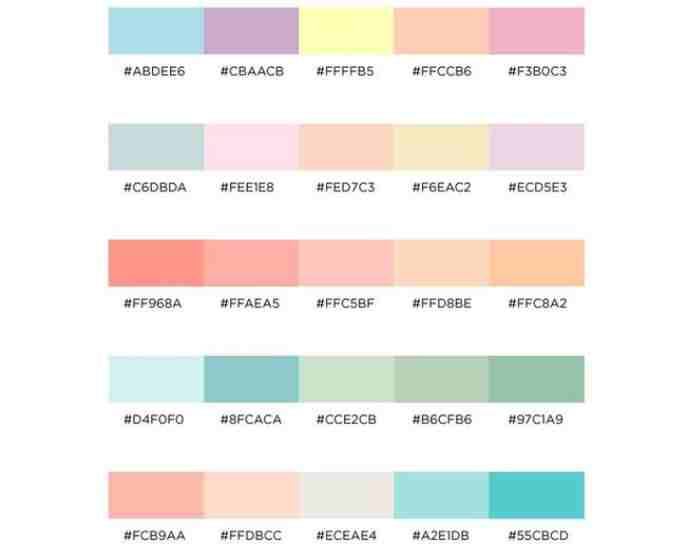
We can safely remark that pastel shades are not only a fad but also the wave of the future, in the world of design projects. Their application, whether in web design or graphic design, opens up a new realm of possibilities. As was stated previously, Pastel colors are the way to go. In this instance, there are pastel color palettes which are soft and feminine in nature that can be achieved. A few of the most popular hex codes will be used to demonstrate the versatility of Pastel colors in design.
The wide acceptance of pastel palettes in web and graphic designs started in the last decade, despite their long-standing attraction. Nowadays pastels are a go-to design element whether it’s for social media graphics, website interfaces or any visuals in general. Pastels fundamentally alter the pragmatics of these formats because they put the users in control of their senses, contrasting and heavily emphasizing the interface in place.
Pastel In Design, Where To Start
Pastels can be used in almost any design including typography, illustrations, images, themes, backgrounds buttons and everything in between. Pastel combinations for instance are capable of serving as a backdrop for different types of designs enhancing their true Modern Sophisticated look. In the last decade even in this competitive market one’s marketing sense has to be on New Level Automated undertones.
Hex Code of Pastel Tones that Builders and Designers Would Fondly Appreciate
If you would like to incorporate alluring pastel colors in your design, then it is mandatory to understand the hexadecimal codes. For instance, many people like the pastel blue shade color, there are codes for different pastel colors available that can make your design idea more appealing. Getting any pastel color in any design apps is easy as these codes assist in getting the exact tone without any hassle.
The Bridge Connecting Pastel and Color Design: Basic Concepts
To be able to use pastel shades in any design projects, it is crucial to know a couple of basic concepts related to the topic. For example, one needs to learn how to integrate the different aspects of designing the pastels such as: how to attach hex codes correctly, for example: using the hex code 000000 for black, a color to define a color. Such terms help merge complex tasks and make them easier to manage.
Common Questions
What Parts of the Pastel Tones do You Consider While Designing?
The soft-muted tones influence the intensity and saturation of a particular shade, giving it pastel properties. This softness of shades adds to elegance while still giving off an eye pleasing effect.
How do you mix to get the perfect pastel color in a design project?
First, one has to source for pastel tones and complement them with the brand colors. Secondly, because of hex codes, a pastel color is now in range. Pastels are coded.
How do you keep the pastel collections fashionable?
For instance, you want to mix colors that look good and then determine what emotion the color evoke. Start off the genre creation process with a mixture of pastel colors that look visually appealing so that you achieve a balance between them.
Are pastel colors compatible with bright colors?
Yes, pastels can work with dark tones, but the design must remain visually appealing, without deviating too much from the primary purpose of the design project indeed it can, but the main thing is to make sure that the whole pastel project is visually pleasing.
What would I do in order to be able to use the pastel tones in a home aspect decor?
Such as light pink and lavender because they can help create a greater feeling of warmth and cosiness in interior design and soft furniture, otherwise replacing decor and furniture with pastel-colored items would have the same effect.
Prototyping Clean packaging design — Are Pastels Appropriate?
Absolutely! Cosmetiques, food, and other consumer goods are amongst products that are hardened by pastel tones, it adds price appeal and uptick to their marketing. These colors portray an ample aesthetic value that invites luxury, which is ideal for this industry.
When designing social media graphics for pastels, what approach strategy should you employ?
When it comes to Instagram and other social media platforms, ghrabbit.com graphics work best with pastel shades that are color combination oriented. An appropriate colour palette that resonates with your audience’s energy will be the best way to determine hexs, later layering this with pastels that compliment the desired design will perfect the desired ambiance.
From the perspective of SM branding, do pastels have the potential to aid branding efforts?
Yes, I contrived pastels to be used on social media, In remembering brands, the combination of pastel colors is appropriate, logos of brands became identifiable by combining the different shades of a certain color in a utilitarian graphic design.
People have often questioned the role of a particular shrine dealing social media places pastel color palettes. In this case, It deals with hex codes, color combinations, and other terms. The place they are situated at serves as a starting point towards all the colors, methods and pastels utilizations which are life and design-related with all the elements.
Conclusion
As we near the end of our conversation on pastel palette colors and their potential use in the world of design alongside pastel design ideas, let’s try to recap the conversation and emphasize on the soft hues and their strength in the realm of creation that is rather very much durable.
Starting off this journey we looked at how important colors were in art and design then proceeded to why it leads to pastel colors and the precision a hex code offers, the chemistry behind the colors. We were able to tackle the whole building of pastel color palettes including, giving examples, how they were used in different pastels such as in fashion, lifestyle through clothing, digital personas and much more.
As designers, creators, and even amateur enthusiasts, we would like to cheer you on and encourage you to use pastel color hues that are bold and out of the box. Combine different colors, different pastels; let the muted hues do the work in terms of aesthetics, for the design you are working with. Pastel colors only add aesthetics to designs and although they are only viewed as a trend, the notion that they are just a fad is highly mistaken.
The trend is pale shades people. Of all the only aspects that one can call a trend in fluid palettes is probably their relevance, that isn’t quite the case as there is way much more underneath. Pastel colors add an ageless touch to this sometimes innovative, always confusing and chaotic environment that is deeper than the eye can see. Be it in visual branding, in fashion, in digital design the pastel design has the abilities to move and motivate its audience. To give the world an architecture of elegance.