The emotional tone set for any graphic design project needs a specific color palette and combining different colors guarantees the versatility purely based on the warmth of the tone and blue being the hue, in terms of options, the heat and blue tones seem to get the job done the best.
Warm colors tend to sell more, this is where the assembling of warm and blue schemes pays off, warm colors when used leave an imprint of strong feelings of passion, warmth and energy which can provide stronger grips than purely blue schemes as blue is simply a sign of calmness, stability and tranquility. However, when these two colors are used together, they create the perfect balance, which allows them to be used in a wide range of new designs.
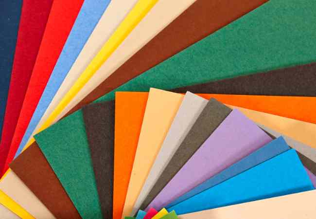
In this blog post, we’ll delve into the intricacies of the 12 best warm and blue color palettes. Each palette is meticulously curated to offer a diverse range of options for designers seeking inspiration. From lively combinations suitable for vibrant designs to soothing tones perfect for a calming atmosphere, these palettes are accompanied by names that capture the essence of each selection.
Names and Hex Codes
Each palette has its hex codes and names alongside, so designers have a comprehensive guide on how to use them in their work. Additionally, grasping the essence of hexadecimal representation helps the graphic designers maintain the required level of accuracy and consistency which is crucial in the graphic design industry.
Warm Colors in Design
As the name suggests, warm colors include warmth induced red, orange and yellow. Basically, these ranges can be closely associated with the sun, fire, and any other source of heat. In terms of a color palette warm colors are used effective for creating emotionally appealing designs, grabbing users’ attention and designing attention seeking components.
In addition, warm colors can be added to a color palette to dominate viewers attention in a particular way while giving off an impressive rush and high intensity. Furthermore in branding, warm colors are mostly employed to express feelings of warmth and love. While to rest, those who want to express a different meaning than the one being brought forward need to remember the importance of warm colors.
Blue Colors And Their Psychological Perspective
At the opposite end of the color wheel, it is safe to say that blue colors simply embody peace, stillness, and soundness. These can be applied quite a large range of design applications, from the sky bluish to navy. Blue strengthens the palettes of trust, professionalism and reliability.
The Blue color can create an environment that appeals to the target demographic, which can include any industry since the color has the potential to sway perceptions. When branding, blue speaks of trust, a reliable element that engenders confidence.
In design processes, blue often enhances the effect of other bright colors or warm hues which can accompany the blue. The color can range from a wide variety of dark to soft hues which if utilized appropriately, gives rise to strategy integration or messaging integration.
Explanation of Hex Codes and Their Role in Digital Design
In this vast field of digital design, it is impossible to emphasize enough how much precision is necessary. The use of hex codes ensures the accuracy needed in color reproduction on different platforms. A hex code is a type of color short for hexadecimal and consists of six numbers in which a particular color alongside its RGB value can be stored.
For a digital designer achieving a precise reproduction of color is imperative and understanding hex codes assists in developing definitions of color reproduction that are standard. Be it web designing, graphic, or any digital development project designers during their development phase integrate shades into their project without any confusion. Such precision becomes more important while working with teams or developers, or when taking screens to print designs.
In factual terms, hex codes are the language of color in the digital domain because their application on the mobile device or any platform ensures the visual experience the artist wished for is brought to life. Moving on to the warm and blue color palettes later on in the 12 best sections of this post you’ll notice that hex codes are used with each section as it assists in the exact color representation in a strong digital design.
The Importance of Color Descriptors in Facilitating Design Communication and Controlling Variance
Colour names facilitate the team better in case of hex codes and are a great way to make the design more user-friendly. It is important for the stakeholders, design teams and the clients to use language that most of them are familiar with which is not a hexadecimal code and therefore colour names can come in handy.
Naming a color is much more than just saying a particular arbitrary number, it incorporates feelings, builds strong relations and adds to the narrative of a particular design. For instance instead of saying one of these alpha numeric strings, a designer can simply say “This color represents a cloudy day” . Doing this fixes communication problems while also creating a unified design style in the whole project period.
These Names of Colors can fuel designers imagination giving them the facility to have a collective vision of artistic objectives. If teams with different people work together on different parts of the visual language of a project, knowing colours by their name is extremely helpful.
Palette 1:
The first warm and blue color palette in our collection is a broad spectrum of color choices that are specifically designed to cultivate a certain feeling or mood. As with the former, our warm and blue palette paints a balanced picture as every color in it has been specifically selected for a particular purpose.
Explanation of The First Warm and Blue Color Palette
The warm undertones present in this palette blend beautifully with deeply relaxing tones of blue creating stunning warm and blue combination. The combination of these hues guarantees that this palette can be employed in a variety of designs such as high-energy marketing materials or low energy background websites.
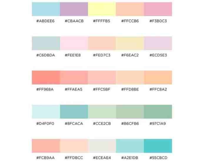
Hex Codes and Color Names Showcase
Here are the exactly matched diverse shades belonging to this attractive palette with their respective hex codes for better building opportunities of your creative design projects:
Warm Hue 1: #FFA500 (Saffron Gold)
Warm Hue 2: #E34234 (Ember Red)
Warm Hue 3: #FDBE57 (Sunrise Orange)
Blue Hue 1: #3498DB (Sky Blue)
Blue Hue 2: #4B77BE (Cerulean Blue)
Blue Hue 3: #5C94B1 (Oceanic Teal)
You can use these codes in your favorite application and create the vibrancy and balance that is required of the design in order to assemble the pieces of creativity and deliver the right message.
Illustration of a Design Employing this Color Palette
To illustrate the design aspects of the warm blue color palette I’ve included the an example design: [ Insert Example Image ] This palette will work well on a website as well as on other branding materials or social media graphics. This is a versatile color combination that will help you display the art of design.
Palette 2:
Let us shift to the second installment of our collection of warm and blue color palettes. Each of the color palettes has been carefully designed, and Palette 2 consists of a nice combination of warm and blue colors that will enhance your creativity.
Explanation of the Second Warm and Blue Color Palette in Detail
The second warm and blue color palette successfully combines blue was warm color and warmth. The soft blues in this palette balance the warmth of the colors selected in this palette and thus flamethrowers can be used with a variety of design media.
Hex Codes and their Corresponding Color Names
For your designing software’s accuracy, these are hex codes and color names assigned to each of the shades Making up Pallette 2’s shades:
Warm Hue 1: #FF6347 (Tomato Red)
Warm Hue 2: #FFD700 (Gold)
Warm Hue 3: #FFB6C1 (Light Pink)
Blue Hue 1: #87CEEB (Sky Blue)
Blue Hue 2: #4682B4 (Steel Blue)
Blue Hue 3: #87CEFA (Light Sky Blue)
Do note that warmth and coolness needs to be applied as per as the palette necessitates through replicating the palette precisely by using these codes.
Sample Artwork Employing this Palette
The versatility of the Palette can be better understood through its application in one of the designs specifically exhibiting the use of Palette 2. [Insert Example Image] Some can use it for a poster and others with a digital design or branding, this palette is flexible across all scope and illustrates this seamlessly.
What are Some Design Tips for Warm and Blue Color Palettes?
The vastness that designing with warm and blue color palettes brings us calls forth limitless opportunities and sorts of feelings alongside the tones that should be set. Hence, we encourage you through best practices, insights and tips to better utilize these palettes on your graphic design ventures.
How to Cope with Adjusting the Warm Blue Color Palettes Effectively
Take some time to research the psychological impact and meanings of warm colors as well as blue colors. This professional field will be beneficial for you in analyzing how every color can resonate with the nature of your project.
To achieve balance, it is important to stay within the warm colors and the blue colors range. However unlike warm – blue tones, finding the right ratio between blue and warm can create a sense of visual appeal.
Consider the warm tones and the blue colors alongside the audience you are dealing with. Warm colors can mean strong physical feelings as well as blue colors which can mean emotions of tranquility. So, depending on your potential audience you can adjust your palette.
Make use of warm colors carefully in your design so they serve to highlight a part of the design. Warm colors are generally used in buttons on websites, when wanting to capture the viewer’s simply warm colors can be used.
Blue colors are always great when it comes to use for backgrounds, adds a soft and reflexive sense to the design behind the content. In such cases, it is advisable to go with a range of blue shades and pick one that flows the most with the rest of the design.
Advices on Balancing These Palettes To Form A Unique Combination
When you’re starting with your design, select a primary color from either your warm or blue palette. This color serves to be the base of all of the other design elements you will incorporate.
Another option is to use analogic color schemes to colors that are close to one another on the color wheel. This guarantees a smooth transition but variety at the same time.
Use complementary colors to increase the level of contrast between different elements of your design. A small dose of a warm or blue complementary boost can make your design more appealing.
Use grays, whites, or creams to neutrals in order to reduce the effects of warm and blue colors. Neutrals help to set boundaries preventing the palette from being too strong.
Always check your design on different devices and under different circumstances. How the colors appear under certain lighting should make a difference in the way the implementing is done to the design.
Frequently Asked Questions
Get answers to your most pressing questions about the warm and blue color palettes in this section and hone your application of these great colors.
What makes warm and blue color palettes a popular choice in design?
Answer: They are popular because they can be seamlessly integrated with various designs. Warm colors always evoke energy and passion and blue tones give a sense of peace and stability. The combination aids designers in striking a perfect equilibrium between energy and peace and that is visually appealing for a multitude of designs.
Which warm and blue color palette should I go for my project?
Answer: Figure out what the feel and emotion behind your project will be. The vibrant hues of warm colors grab the attention followed by a cool color base of blue. You can try out various combinations keeping in mind the culture and the intention behind your art.
Do certain warm and blue palettes work better for specific themes or industries?
Answer: Of course, certain warm and blue palettes may be better suited to certain themes or industries. Warm tones or blue on the other hand will work great for corporates while trying to create a friendly yet professional look. Try out the different palettes until you find one that fits your theme and style best.
How can I make sure that I maintain the same warm and blue color palettes when I use them across several platforms?
Response: Make use of hex codes so as to be able to get accurate colors. Hex codes define colors in a way that eliminates ambiguity, and thus one does not run the risk of finding inconsistency across various electronic media. Always check your creations on various equipment to ensure colors are as required.
Are warm and blue color palettes able to be modified to make them more usable?
Response: Yes indeed. It is recommended that one evaluates hues and saturation particularly when warm and blue colors are employed to make a design usable. Use an appropriate color for the ink that facilitates the eye in reading or seeing what is intended. More so, there are adequate tools and recommendations to aid in the colors for making designs that are accessible to all users.
What ways can I employ to make warm and blue color palettes more personal to me?
Response: Amuse yourself by trying out various tints and shades of both the warm and blue color palettes.Wait tryping in adding accent colors or some distinctive design aspects. It is also appropriate to note that these palettes are more forgiving in design but still creative ideas can be incorporated.
Are warm and blue color palettes ideal for a wide range of design projects?
Answer:Although warm and blue color palettes are versatile, their appropriateness greatly depends on specific details related to the project. Reflect on the feelings you want to instill and the general concept to ascertian whether warm and blue tones fit your design needs.
Conclusion
In our final thoughts, let’s briefly summarize how warm and blue color palettes can be utilized in the broad field of design.
In the realm of design, warm and blue color palettes offer a combination of contrasting odds making it very powerful and emotional and at the same time very appealing to the designed audience. Marriage of warm hues with the blue tones, gets a very strong blend in settings and in day to day public branding. Their incorporation cuts across multiple facets design from ameture basic corporate branding to crazy artistic designs.
Graphic designing is a field that requires attention to detail, and one such detail being the color selection. Palettes of warm and blue colors allow graphic designers to tell a story, instil feelings into people, and create an impression. The gradation and differentiation of these colors provide the palette with designs that are not only easy on the eyes but also deliver the desired message with accuracy and delicateness.