Complementary colors form an intriguing and amazing color theory. For someone who is new in the industry, learning color theory can help you understand the new dimensions of painting, designing, or building a brand. This blog is meant to introduce the concept of complementary colors in a fun way by including stories, real examples, and other people’s stories: color of coffee from Malaysia, vivid blue color seen even by colorblind person, etc. Whether you are an artist or a designer or an intermediate trying to put feelings and shades in your work and looking to enhance your color knowledge for future projects. This guide will assist you in the process.
What are complementary colors?
One of the most important concepts in color theory is understanding complementary colors. Complementary colors are directly opposite each other on the color wheel and they offer a high level of contrast. This particular section will address basic tenets of color theory, and looks specifically at blue and orange, yellow and purple, and red and green and how they work together to make the visual quality of an artwork or design appealing to clients and consumers.
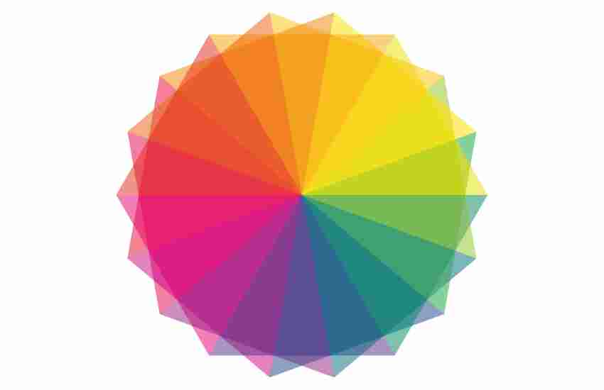
The color wheel is not just a tool but a guide to mastering the art of color combinations. It allows designers and painters to learn about primary, secondary, and tertiary colors as well as warm and cool colors. This part of the guide will simplify the color wheel, making it more intelligible for novices and enable them to understand and apply the concepts of complementary colors to their projects.
We’ll appreciate the use of a complementary color palette through examples of painting, digital art and nature we will demonstrate. Examples from the real world, such as blue sky with orange sunset or purple colored flowers with a yellow background will clarify the tenet of color harmony that exists not just on theory but in practical life as well.
Using Opposite Colors
Making use of opposite colors can easily boost your work, especially in the designing world as it will allow you to produce more lively and engaging works. A canvas, web page design, or a brand image may all be sharpened by knowing how to make great use of opposing colors. This section offers such techniques by way of taining exercises that are aimed at enhancing your color sense so that you can be able to judiciously and confidently select colors while designing.
To open, start with the pilot projects and work with web palettes. On Paint or Illustrator, or even a color wheel, start trying out shades of blue and orange to see to pair complementary colors right. Play is an attachment to color theory in art, tug on where something is placed to change emotional expression; for example, orange and blue alone can depict trust and excitement which is a perfect brand image balance.
Now, complement what you made with layering as you comprehend digital art better. If you are a painter, mixing up some colors will allow you to work with high saturation and maximum exposure. Those who would like their panels and typefaces to be visually attractive should have experimental fun because some colors paired may be better explaining why one element is important to a target audience’s eyesight.
Don’t forget ,it’s not only using the complementary colors, but trying to comprehend why and in what ways they will increase the worth of your piece of work. Take a break and try to reflect on your designs, request a colleague to assess your work or analyze your designs before and after using these principles. This consistent reviewing and reflection will develop your insight and give you a respect for color theory, rendering it intuitive in your design practice.
Complementary Colors in Interior Design
Understanding the impact of color schemes such as complementary ones changes the paradigm in terms of interior design. If you are an interior designer, then you know that when colors are properly used they are able to affect feelings and perception so as to design comfortable and beautiful buildings. This section will demonstrate and provide the different ways and techniques of using complementary colors to achieve color harmony in a space.
In this case, a strategy may be to select one color for the walls and use the opposite color as an accent on the soft furnishings, artworks or even the carpets. Take for example, light green walls in a room can be warm and inviting if it is decorated with a touch of magenta. Lighting also interacts with how these colors look so it is wise to look for areas where the colors will look good, both in natural and artificial light.
Moreover, color cannot be the only significant detail, for texture and material also add to the manner in which colors complement each other. A velvet-purple sofa stands out well in a room which has a yellow hardwood floor, effortlessly blending sophistication into the space. Trying out various materials and finishes can be adventurous and can be very pleasing and altering in nature in relation to the way one feels about the particular interior design.
The psychology of complementary colors is further explained in the below sections, including the particular thoughts and feelings associated with its respective tones. And as we all know a color has feelings, colors influence our emotions and our behaviors, and one needs to understand how to correctly use it. A good understanding of the emotions associated with the various colors and their arrangements can bring an all-embracing tilt in the User experience whether it is art or in design and branding.
Due to the high opposing contrast, it can even be the case that the mood is set by the color. This should then mean there is no limit to available possibilities such as a red and green combination which could also promote excitement and vitality in promotional designs. In the same breath, the opposite effect can be achieved, for instance using color blue and orange would serve to be a calming yet warm combination which would be great for web design and brands targeted at health care and relaxation.
Here’s the critical thing about applying complementary colors. It is about the background and the message you want to convey. The reaction to the same color schemes is not constant but varies based on the cultural perceptions, individual’s past experiences, as well as the type and the shade of the colors. In respect to this, it is advisable to always design for the appropriate color and audience.
Dealing With Common Problems
Beginners sometimes hate using complementary colors. Using vibrant colors in designs often leads designers into trouble in over the top stimulation where rather than the designs being appealing, they become a lit explosion of multiple colors. This section seeks to highlight the common and easy to avoid mistakes and advises on how to correct them, for instance, over-saturation and lack of balance.
Another common problem is the use of saturation. Saturated colors while applying them in the designs can make them spectacular and eye catching, the problem arises when the viewer loses their vision. In order to solve this, it may be better to use toned down colors in order to give the eye a break allowing the brighter colors to stand out without coming off as overpowering.
Finding the equilibrium also poses a difficulty. While combining colors, it is important to avoid allowing one color to drown the other unless you are trying to achieve a particular effect. This can be dealt with through observation of the value and saturation of the colors, so that both elements are given room for expression in the design.
Through correcting these mistakes, artists and designers can polish and improve their approach to assemble better and more balanced compositions. It is not easy to agree on the aim that draw’s visual experience. The incorporation of these problems as part of the artistic process leads to a more sophisticated approach and color usage in one’s tasks.
Sharpening Your Color Perception
Color perception is a skill that takes time to develop, it is a process that is endless. In fact, when dealing with complementary colors or color combinations any color basics are not enough, a deeper understanding as well as sense of how colors are able to relate to the viewer and each other is required.
This section of the guide will offer particular exercises and practices directed toward the improvement of your comprehension of tens, degrees, and saturation, and therefore also sharpening your capability to deal with such tools as complementary color as well as other color combinations in your assignments. One effective exercise is the color mixing diary, which entails creating a small color study on each day concentrating on one aspect – mixing complementary colors in order to impact others. So, with this brought to the actual scene a person would be able to grasp the barely perceivable details of how the colors interrelate.
Yet another practice is to engage in color observation in your everyday activities. Focused on the ambient colors, even the mild ones in a morning sky or the bright graffiti tones in city sceneries and even think how they interact with each other. This active engagement with colors will enable not just sensory improvement of the color sense but will also spur novel and great color mixes in your works.
Complementary colors are pairs of colors that, when combined, produce a grayscale color such as black, white, or anything in between. Their position can be easily distinguished using the color wheel. They will be placed in an area opposite each other on the wheel. Because of this opposition, when these colors are combined in art or in design, a strong contrast along with a vibrant look is produced making them a strong asset in the hands of artists and designers.
Finding complementary colors on the color wheel is not that difficult. The first step is to find a color on the wheel. Whatever color will be opposite to the chosen color will be the complementary color to it. For example, opposite to blue is orange, red – green, and yellow – purple. This is a very quick way to find a suitable color pair to combine with each other in your work.
Beginners in using Adobe Color should understand the tools used to create Complementary color schemes. How the complementary color pairs are affected because the design alters the native colors of the original image. To use digital tools like Coolors or Paletton confidently, a very simple understanding of color theory guidelines is enough because they compensate the shortcomings in the applications. Finally other physical tools like color wheel and swatch book do help one to learn by touch and assist as references.
Why are the work of the two artists more visually effective and appealing to the audience, than their original artworks? The answer is very simple: by using the color wheel it has been noted that repelling colors when combined produce a brighter end product which energises the observer. Moreover, the very act of contradictory itself draws attention making sure no keyui elements get missed or rather are absorbed in a dynamic action making balance or dynamism possible. From a broader and more detailed widow, the goal can be solely based on the use of complementary colors which speaks in silent terms with regards to the emotions, mood and ambience it creates.
Conclusion
Starting to learn about what are complementary colors, one unlocks new ways of improving their creative works. The purpose of this guide is to present complementary colors idea to beginners in a way that allows them to develop the color theory sense, some practical aspects, and how to fix color issues. Creating and using colors is always an ongoing journey. Keep practicing and observing in order to find the endless possibilities colors have when it comes to expressing ideas, feelings, and gorging images. We appreciate you being a part of this vibrant experience, and we hope all your projects in the future will be well balanced, yet contrasting.
More Post