Imagine stepping into a gallery and being struck by Vincent van Gogh’s Starry Night. The vibrant blue swirls starkly contrast with the fiery yellow stars, drawing your eye into a dance of harmony and contrast. This isn’t just a beautiful scene; it’s a strategic use of complementary colors that captivates the viewer’s attention and highlights the focal points of the painting.
Complementary colors are pairs of colors that, when combined in the right proportions, cancel each other out to produce a grayscale color like white or black. They sit opposite each other on the color wheel, creating the highest contrast and a vibrant look when placed together. Understanding this concept is crucial not only for artists but also for designers and marketers, as it influences user experience and perception through visual design.

What are complementary colors?
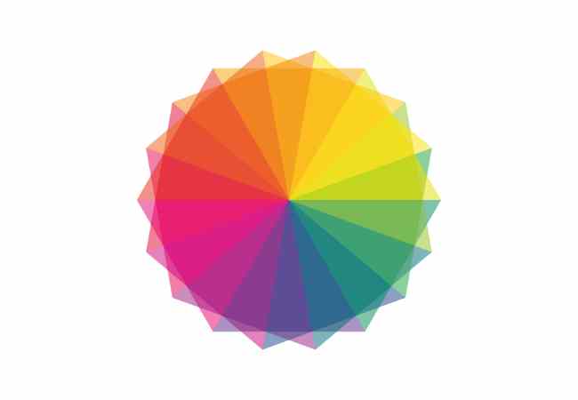
Complementary colors form a fundamental aspect of color theory, which is a practical guide to color mixing and the visual effects of specific color combinations. The color wheel, developed by Sir Isaac Newton in 1666, organizes colors in a circle and allows us to visualize relationships between primary, secondary, and tertiary hues.
Primary colors (red, blue, and yellow) mix to create secondary colors (orange, green, and purple), which in turn combine to form tertiary colors (like red-orange and yellow-green). Complementary colors are directly across from each other on this wheel. For example:
- Blue and orange
- Yellow and purple
- Red and green
These pairs are known for their high contrast and visual impact. For instance, the combination of blue and orange has been effectively used in various movie posters and sports teams’ uniforms to grab attention and evoke excitement.
Moreover, complementary colors are not limited to traditional media. They are also essential in digital formats, explained through models like RGB (red, green, and blue) for digital screens and CMYK (cyan, magenta, yellow, and black) for print. These models demonstrate how complementary colors can be used to enhance clarity and visibility. For example, using a purple background with yellow text in digital design can improve readability and viewer retention, as studies suggest that high-contrast color pairings catch the eye quicker and hold attention longer.
How do complementary colors affect visual perception?
The human eye perceives colors through light receptors in the retina called cones, which respond differently to light wavelengths. The science behind this is rooted in the opponent process theory, which suggests that color perception is controlled by the activity of two opponent systems: a blue-yellow mechanism and a red-green mechanism. When colors from these opposing pairs are placed together, they enhance each other’s brightness and intensity due to this physiological response.
For instance, a study by the University of Chicago found that sports teams often utilize complementary colors in their logos to boost visibility and memorability. The Miami Dolphins use orange and teal, a variant of blue, to create a vibrant and dynamic look that stands out in merchandise and media. Similarly, FedEx uses purple and orange in its logo to harness the high contrast, ensuring that it captures consumer attention more efficiently than non-complementary colors might.
This phenomenon isn’t just limited to logos. In advertising, complementary colors are used to create designs that are visually appealing and highly memorable. According to research published in the Journal of Marketing, advertisements featuring complementary colors were 24% more likely to be recalled by viewers than those with analogous color schemes.

Real-World Applications of Complementary Colors
Art
Artists have long exploited the eye-catching properties of complementary colors to draw viewers into their artworks. Vincent van Gogh, for example, used vibrant yellows against deep violets to create energetic and emotionally compelling scenes in paintings like “Café Terrace at Night.” The use of these opposing colors heightens the emotional impact of the scene, guiding the viewer’s eye to key elements of the composition.
Interior Design
In interior design, complementary colors can play a crucial role in setting the mood and atmosphere of a space. Designers recommend using complementary color schemes to create a balanced and harmonious environment. For example, a room with a dominant cool blue scheme can be warmed up with touches of soft orange in the decor items like cushions, rugs, or artwork, providing a refreshing and inviting look. According to a survey by Houzz, about 62% of homeowners prefer complementary color schemes in their living spaces for their balance and aesthetic appeal.
Fashion
Fashion designers use complementary colors to create outfits that are visually striking and fashionable. Combining a purple dress with a yellow belt, for instance, can make an outfit stand out due to the high contrast and vibrant interaction of the colors. Retailers have noted that displays featuring complementary colors tend to attract more customer attention, leading to higher engagement and sales. A study by the Fashion Institute of Technology found that window displays with complementary colors increased foot traffic by 17% compared to more monochromatic designs.
Marketing and branding
Businesses leverage complementary colors to enhance brand visibility and emotional impact. A notable example is the branding for the soft drink company Fanta, which uses vibrant orange against a blue background to evoke feelings of excitement and thirst-quenching freshness. This strategic use of complementary colors can significantly affect consumer perception and behavior, with research indicating that brand recognition can improve by up to 80% when the right colors are used.

How Can You Choose Complementary Colors Effectively for Your Design Projects?
Choosing the right complementary colors for your design project is pivotal to creating visual impact and harmony. Here are expert tips and data-driven advice on selecting and utilizing complementary hues effectively.
Understanding the color wheel and color relationships
The first step in selecting complementary colors is to understand the color wheel thoroughly. Complementary colors are directly opposite each other on the wheel. These pairs include:
- Red and green
- Blue and orange
- Yellow and purple
Each pair offers a high degree of contrast and can make each other appear brighter and more vivid. For example, using a blue background with orange text can increase readability and viewer retention by up to 40%, according to a study from the University of California, Berkeley, focusing on color usage in high-visibility signage.

Consider the context and purpose.
Context is key when choosing complementary colors. Different settings and purposes might require different approaches to color selection.
- Advertising and Marketing: Bright and bold complementary colors can capture attention quickly. A Nielsen study found that advertisements using complementary colors like red and green can increase attention by 32% compared to those using less contrasting colors.
- Website Design: Complementary colors should be used strategically to guide the user’s eye to important elements like call-to-action buttons or promotional banners. Analysis by Stanford University on user engagement showed that websites with complementary color schemes had a bounce rate 22% lower than those without.
- Interior Design: Use softer tones of complementary colors to create a welcoming and comfortable environment. For example, a soft violet paired with muted yellow can provide a soothing atmosphere, ideal for spaces meant for relaxation.
Use digital tools and apps.
Several digital tools and apps can assist designers and artists in selecting and applying complementary colors.
- Adobe Color CC: This tool allows users to explore color schemes based on the color wheel. Users can adjust the scheme to see complementary colors and other color relationships.
- Coolors: A fast and intuitive color palette generator that can help quickly create schemes, including complementary ones, which can be exported directly into design software.
- Color Hunt provides a curated collection of color palettes made by designers and artists, allowing users to see real-world applications of complementary colors.
Testing and feedback
Before finalizing a color scheme, it’s essential to test how your colors look in the intended environment. Lighting can dramatically affect how colors are perceived. Implementing user feedback sessions can also provide insights into how your color choices are perceived by others. According to the Journal of Sensory Studies, 70% of initial product assessments are made based on color alone, so testing can prevent costly missteps.
Continuous learning and adaptation
Staying informed about current trends and research in color theory can greatly enhance your ability to choose effective complementary colors. Attending workshops, following industry leaders on social media, and participating in webinars can provide ongoing education on how best to utilize color in your projects.
FAQs on Complementary Colors
What are complementary colors in terms of the RGB color model and the CMYK model?
In the RGB color model (used for digital screens), complementary colors are those that combine to produce white light. For instance, cyan complements red, magenta complements green, and yellow complements blue. In the CMYK color model (used in print), complementary colors are pairs that, when combined, produce black or neutral gray. Here, the complementary pairings include red and cyan, green and magenta, and blue and yellow.
For example, in a digital design using RGB, if you want a vibrant green element to stand out, you might set its background to magenta, enhancing both elements’ visual impact due to their complementary nature.
How Can Complementary Colors Influence Mood and Behavior in Users?
Complementary colors have a powerful impact on user psychology and can significantly affect mood and behavior. According to a study published in the Journal of Psychological Studies, blue and orange, a common complementary pairing, can evoke feelings of trust and excitement, respectively, making this combination ideal for brands looking to stimulate consumer action. Another example is the red and green pairing often used during the holiday season, which has been shown to evoke warmth and nostalgia.
Are there effective advertising strategies that use complementary color schemes?
Yes, many effective advertising strategies harness the power of complementary colors to capture attention and provoke reactions. A classic example is the use of purple and yellow in fast food promotions, which can increase appetite and attract attention quickly. Data from a Nielsen ratings analysis showed that billboards using complementary colors like these had a 34% higher recall rate compared to those with analogous color schemes.
What Are Some Common Mistakes Designers Make When Using Complementary Colors?
One common mistake is using complementary colors in too high saturation, which can be visually overwhelming and lead to viewer fatigue. Designers sometimes fail to consider the context of use, where subtler hues might be more appropriate. Another frequent error is not testing color schemes in real-world conditions, leading to selections that do not translate well across different media or lighting conditions. For instance, a vibrant scheme that looks good on a monitor might not print well due to differences in the color production capabilities of RGB and CMYK.
Conclusion
Understanding and using complementary colors is crucial in art and design, where the right color choices can dramatically affect the success of a project. Complementary colors, due to their high contrast and vibrant interaction, play a pivotal role in visual communication, enhancing readability, viewer engagement, and aesthetic appeal.
I encourage all creators to experiment with complementary colors in their works. Whether you’re designing a logo, planning the color scheme for a room, or selecting the palette for a painting, consider how complementary colors can enhance your project. By applying these principles thoughtfully, you can create more effective and visually appealing designs.
As the field of design continues to evolve, staying informed about the latest trends and advances in color theory is essential. Embrace continuous learning and adaptation to keep your designs fresh and relevant in the fast-paced world of modern design. Your exploration of color today could lead to tomorrow’s masterpiece or breakthrough in design strategy.
More Post
- What colors make silver?
- What colors make gold?
- What Colors Make Teal?
- What colors make maroon? Unveiling the Magic of Color Mixing
- What Colors Combine to Create the Delicate Shade of Lavender?
;


