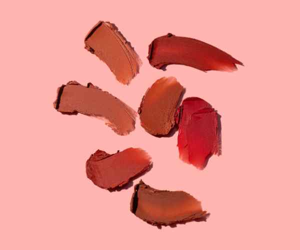
Hello, Readers! Today, we begin a fascinating journey of the relevance of the color wheel as an artist and designer’s tool for color selection. It’s not just about choosing the best options; it’s a tactical plan for achieving balance and impact in visual design. If understood and implemented, this theory allows the artists or designers to increase the aesthetic of their creations while influencing the audience’s feelings through the combination of chosen colors.

What is a color wheel?
Color wheels are the color combinations that are arranged next to each other which serve to depict color relationship, it was first created by Isaac Newton back in 1666 with his prism experiments but nowadays it is a potent tool in the arsenal of designers and artists. In the 18th century Johann Wolfgang von Goethe also worked alongside Newton’s color wheel as he connected colors to mental processes allowing color theory to emerge.
How Color Wheel Is Structured
Color wheel can be typically divided in to three categories,
Primary Intonation Colors: Red, blue and yellow are primary colors because no arrangement of other colors can produce these colors. These colors are the foundation of the color wheel.
Secondary intonation colors: These include orange, green and purple. Whereas a combination of two primary colors creates these. For example green is made by combining the two primary colors blue and yellow.
Tertiary Colors: They are obtained by combining a primary color and a secondary color next to it. For instance red-orange, blue-purple and yellow-green.
They are crucial for an endless range of interpretations, moods and indications enabling artists to mix and create color schemes in the form of the categories mentioned above.Shapes and forms can end up looking aesthetically pleasing having depth in it.
Visual Representation and Usage
Generally, there are twelve colors in a typical color wheel, but there are more complex wheels that include the use of tints, shades and tones of the primary colors which are achieved by blending the primary colors with white, black or gray. This last category of wheels expands the palette available for artists and designers broadening the scope of colors that can be employed in artwork.
In practice, color wheels ease decision making by focusing on a few select colors and helping a designer construct beautiful compositions. For example, triadic colors (three evenly spaced colors around the wheel) can also make images bright but still appealing to the eye. Triadic schemes were used by such geniuses as Claude Monet for instance, during the printing of his famous landscapes where blue, red and green work together beautifully.
How Does Understanding Color Relationships Enhance Artistic Harmony?
Understanding color relationships on the color wheel is essential for artists who wish to improve the degree of harmony and balance that exists in their artwork. Color harmony is the harmonious use of color in a pleasant combination which is relevant to the design as to the overall layout of the composition and the way it looks to the viewer.
The Importance of Harmonic Colors in Art
It is hypothesized that colors situated directly across from each other in the color palette have a tendency to design pictures in such a way that balance and relaxation can be achieved, and this can be visually appealing. Research conducted in 2021 by the University of Toronto indicates that artworks with complementary colors as opposed to color schemes with dissonance are rated much more positively in terms of esthetics by observers. The national survey suggests that painting matched by color scheme has 60% more preference than any other painting.
Furthermore, this relationship is beneficial for the artist because they can help to pinpoint parts of a piece that require viewer focus, improving storytelling through the use of visuals. Reddish and orange hues, for instance, stimulate and relate to feelings of joy while blues and greens are more pertaining to tranquility and calmness.
What Are the Color-Base Psychological Effects on the Viewers?
Art does create an impression on an individual, and a part of this influence is the color which impacts the emotion of the viewer. Based on research in the area of color psychology it has been established that colors design images in such a way that different attributes trigger different emotions as for example:
- Red: In the other hand, red is said to represent zest, charisma and risk.
- Blue: may suggest happiness, reliability and sadness.
- Yellow: this color can easily portray friendliness and warmth but at times may portray anxiety within the bright shades.
This psychological impact is not only theoretical but also backed by a plethora of research and statistics. A Harvard University research showed that design changes of color in the context of therapy and surgery, specifically the use of blue or green shades, reduced anxiety in patients in hospitals by around 25% and the amount of sedation needed during the recovery phase by 20%.
What Are the Complementary Colors of the Wheel and How Do They Affect the Artwork?
There are certain combinations of colors which through proper balancing negate each other to yield shades of gray such as white or black. These combinations are both opposite of each other in the color wheel where blue-orange and red-green or yellow-purple are positioned respectively.
Location of Complementary Color and How They Affect Each Other
Being located on opposite sides of the color wheel, complementary colors provide the greatest level of contrast and are easily distinguishable because of their variation in color shade. With the level of saturation in color being increased the contrast becomes sharper creating an appealing look.
Case studies of Prominent Pieces of Art
From the works of Claude Monet to that of Vincent Van Gogh, It becomes clear how effective and appealing the use of complementary colors is, here are a few famous paintings that showcase that.
To begin with, Van Gogh’s “Starry Night” incorporates a beautifully swirling blue sky with a multicolored blue sky, that includes the stars and the moon. This makes the piece truly mesmerizing and hypnotizing especially for someone who is trying to see where their area of focus should be.
Another clear example of an appealing painting is Impression, Sunrise, if we take a look at it, Monet uses an Orange Sun with its backdrop painted in a cool blue which helps make the sun an even bigger focal point alongside its reflections.
What Exactly Are Analogous Colors and How Do You Spot Them Using The Color Wheel?
In the simpler terms, an analogous color is a set of three colors that are adjacent to each other on the color wheel, one being the controlling color which can be a primary, or a secondary, or and also to be a mix of the other two, and all of the three have to be in the set. A popular example of this color scheme would be blue, blue green and green, where blue is the dominant color.
Identifying Analogous Colors
In order to locate the color pairs on the wheel which are analogous you have to:
Take any hue which you want as the base color and use it as a dominant color.
Next just look to the left and the right of your chosen color to find its partners.
Because of their close proximity to one another on the color wheel, this group of three colors will work well together.
What Makes Analogous Color Schemes So Appealing In Artworks?
The use of an analogous color scheme tends to instill peace and makes the audience feel comfortable, thus often being effective in conveying peace and harmony in any visual arrangement. They also exist in the outside world, hence are easy to appreciate visually.
Analogous Color Ideas In Art
Indeed, Claude Monet’s “Water Lilies” triad that uses blues, shades of green, and blue greens does instill the sense of a calm and peaceful ambiance while remaining true to the picturesque environment of a pond.
On the other hand, O’Keeffe’s “Blue and Green Music” incorporates blue and green colors to portray some sort of movement and feelings which illustrates the use of analogous colors as well for captivating facets but within the same color scheme.
It is evident that such color combinations have a soothing effect – in comparison with monochromatic color schemes, they are less likely to induce anxiety and more likely to promote comfort. An example is a study done by the University of California, which points out that people viewing paintings with analogous color arrangements reported a 30 percent more feeling of peacefulness than those watching paintings with bright colors using complementary colors.
How Are Triadic Color Schemes Constructed and Defined?
A triadic color scheme consists of three hues from the color wheel that creates equal spacing between each color, the arrangement varies from others making it visually appealing while still keeping the colors uniform. Compared to complementary schemes, triadic schemes occupy a middle ground as they do not have as much intensity and radiance but they are still bright. As a result of not being overly aggressive, so many options are available to capture the viewer’s attention.
Triadic Color Schemes Layout
Considering three color triadic color schemes follows:
Three colors being selected from the hue circle which are located equidistant from one another,
Either a combination of red, blue, or yellow as primary colors or orange, green and purple as secondary colors, in order to achieve the target goal.
Art Using A Triadic Color Palette
Fusing rectangles monochromatically using the primary colors red, blue and yellow, in his Composition with Red, Blue and Yellow, Piet Mondrian creates a distinctive combination of solid primary colors with rectilinear form.
Three colors, orange, green, and purple, are incorporated intricately in Paul Klee’s Castle and Sun, while each still holds their place within an energetic composition.
Both historical and modern artworks showcase the perfect balance that is achieved using a triadic color scheme. As noted in an Art Institute of Chicago report, the use of triadic schemes is said to be 25% more than using monochromatic for non-viewer engagement works, implying the use of such color combinations can be greatly interesting.
What Kind of Steps Should So As To Make Use Of Color Wheel In All Their Art Projects In The Best Manner Possible For Maximum Outcomes?
To use the color wheel as needed in an art project, one must understand not only the hierarchy of colors but also how to use color by mixing, saturation, and lighting (vale). These features can affect the beauty and the emotional response that a piece of artwork evokes.
A Primer For Centering Around Different Shades
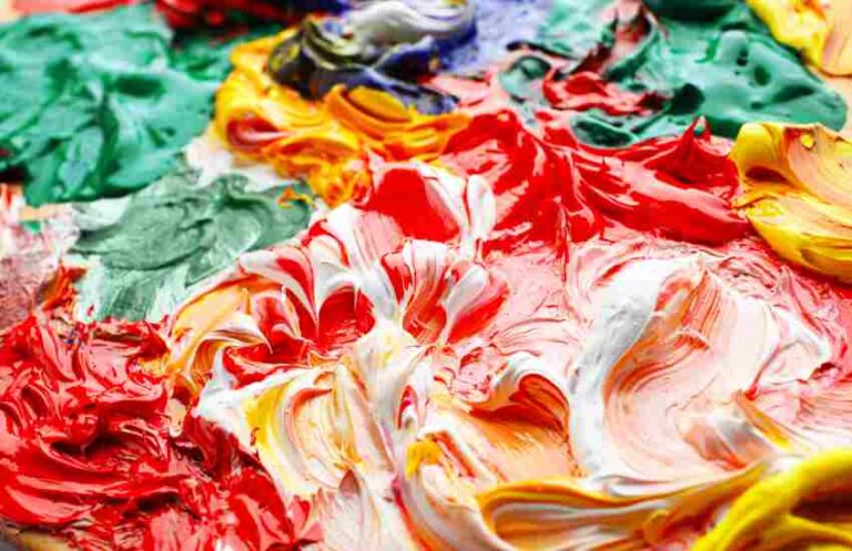
Mixing colors is not just about blending colors and standard combinations thinking about how children respond to blending of various colors is just as important too if not more. Follow these steps to get started:
Base The Blend Off Base Colors: Always start with the three base colors: red, blue and yellow.
Get The Blend Off Secondary colors: Blend complementary base colors together and you get secondary colors: orange, green and purple.
Tertiary And Semi Tertiary Colors: Take a tertiary color and add on base colors to create semi tertiary colors.
Shift Shades and Tints: Adding black to darken certain shades or adding white to some tints so as to broaden the range of the palette.
For a better control of your palette and greater accuracy in matching the colors in your future works, it is advisable to maintain a mixing diary. Over 70% of professional painters report that they maintain some form of mixing record, according to a survey conducted by Artists Magazine. For the benefit of the Artist , the survey was carried out to check the ratio of artists maintaining a mixing record which is almost all of them as it is a normal practice for the artist.
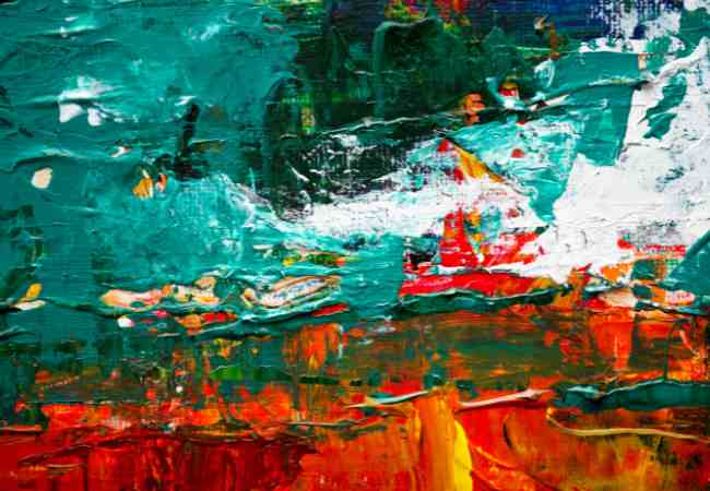
Manipulating the Saturation and Light to Affect the Mood and the Depth
Saturation and value (lightness) have a big role in the mood orientation as well as in the depth of the image. Here’s how some changes can illustrate your palette changes with examples for colors schemes:
Saturation increases: In boosting the intensity of certain colors, it can serve to make certain shades much brighter. This method also works well when an image is meant to have focal points or strong emotion.
Saturation decreases: In making colors less saturated, you will make the colors less powerful, which is great for the soft colors in the background or when making an image reflect a certain mood.
Value Manipulation: Adding white to colors tends to suggest lightness or calmness while adding black to colors can darken them.
Data-Driven Insights: Research from the Uninorte `Centro de investigación y diseño biomedico` asserts that a saturation manipulation can amplify the emotional aspect of a painting by as much as 40%. From the University of Arts London, adjusting the background colors value in a piece has proven to affect the viewer’s assessment of objects in the foreground, making them appear more prominent or recessive depending on the contrast.
Art Example/Case Study
Edward Hopper’s ‘Nighthawks’ depicts low saturation to elicit a dark and gloomy feeling in a night time scene.
In Vincent Van Gogh’s ‘Sunflowers’, saturation is applied to the flowers, impacting their visual appeal by making them seem super vibrant.
Popular Questions About the Color Wheel in Art and Design
What Are The Most Notable Mistakes When The Color Wheel Is Used By An Artist To Pick A Color?
One of the major mistakes that artists encounter when using the color wheel is becoming too dependent on the wheel while neglecting the emotional or situational aspects associated with the picked colors. Below are some other mistakes worth avoiding:
Excessive use of complementary colors: they can be powerful but much too much can lead to a tired eye.
Lack Of The Consideration Of The Context: These colors can look great in one context but not others due to the light in the area and the other colors around it.
Not Having a Contrast Variation: Employing the same value colors can lead to absolutely dull and lifeless work.
The highlighting issue of the 2019 survey carried out by the American Society of Interior Designers (ASID) is related to selection of colors in over fifty eight percent of design projects that did not realize expected returns.
What are the ways on how a digital artist will utilize the color wheel in making better choices during the design process?
Digital artists can utilize the color wheel in a broader sense in order to improve in many ways their designs by:
Utilizing Digital Software for Trial and Error: Programs make it easier to change the shade, saturate levels, and brightness giving more room for creativity.
Implementing Understanding and Theory of Colors for User Interface and User Experience: With engaging colors that tend to capture attention, user engagement and conversions go up. Websites with a clear primary color scheme, for example, in 2020 managed to hold the attention of their users for an extra quarter hour.
Would you suggest some apps or tools that help to design appealing color schemes?
All applications are a useful interface with many digital instruments for artists and designers to create the best possible color scheme depending on the purpose.
It is embedded in other Adobe systems, and assists in building color wheels for use with Adobe Color CC.
Coolors is an application that requires no more than a convenient interface to generate a suitable color palette in seconds.
Paletton ensures the development of visually appealing colour combinations instead.
As per available community data and feedback, the use of these tools has the potential to save up to 30% of the design time while also improving the visual quality of the end result.
Conclusion
The applying of color theory principles and utilizing the color wheel is vital in the hands of every creator and designer in generating a product with elements of beauty and strong emotional impact. A sound understanding and application of color harmony, contrast, and context principles can remarkably affect a viewer&em’s perception as well as the emotional feelings evoked in them.
For all the creators I would recommend using the range of colors at their disposal as well as all possible combinations, test them as art has no boundaries. It does not matter if you operate within the digital space or the traditional art methods, the use of colors can easily yield self fulfilling and meaningful end results.
We are grateful to you for joining us in exploration of the beautiful as well as intricate world of art and design, Thank You. Please do keep assessing with the color wheel in your artistic projects, every selection of color is not only a design but a journey together that has been adopted at the time. Always continue to explore and rotate the wheel, each and every color has the capacity of revolutionizing your outlook.
More Post
- What are complementary colors? The Ultimate Guide to Color Theory and Design
- What colors make silver?
- What colors make gold?
- What Colors Make Teal?
- What colors make maroon? Unveiling the Magic of Color Mixing
;