Have You ever asked yourself, ‘Why do some rooms feel cozy instantly and others feel cooled?’. The answer wondered here lies in understanding the difference between warm and cool colors. This information is not only basic for painters but prominent for anyone wanting to change their home decor, clothing or even marketing. In this article, we are going to explore the basic approach to color theory, which is one of the essential aspects of art as well as one of the most powerful tools such as basic color psychology and decision making.
Color theory is more than just a lesson taught in art; it is a useful aid that influences how we relate to the world around us. By the end of this exploration, you will see why the right choice of color is vital in making a dull room, a warm nest or an active place.

Exploring the Basics of Warm and Cool Colors
Warm colors include shades of red, orange, and yellow. Fire and sunlight are some of the elements associated with these colors, and they generate the feeling of warmth and comfort. A research by the University of Georgia found that warm colors painted in a room could raise an individual’s body temperature which creates a sense of warmth.
Real Life Examples of Warm Colors:
- Sunset: The combination of red and orange during sunset is inviting and comforting while always maintaining its warm essence.
- Cozy Fireplace: Sitting next to a fire is pleasant; not only because red, yellow, and orange flames can keep you warm, but also because they help foster a sense of comfort and safety.
These examples show how a warm color can be present in those environments which need to be homely and warm. When draping a throw on your couch or when painting your kitchen walls purple, warm colors can assist in giving you the cozy atmosphere for which you are in search.
What colors are considered to be cool?
Cool colors refer to blue, green and purple shades. These colors are mostly related to water and vegetation, which makes one feel tranquil, at peace and close to nature. According to a study by the University of British Columbia, being surrounded by colors like blue and green can drastically lessen stress and encourage more creative ideas.
Here are some of the many real world examples of cool colors:
- Forest Scene: The colors of green in a coherent dense forest can shift an individual into a peaceful meditative state amongst the greenery. Natural greenery is popular when there is a need to relax or calm anxiety as it is proven to be stress-relieving.
- Tranquil Sea: Deep blue colors of the oceans can be interpreted as calming in a plethora of scenarios and thus used in high end spas or retreats to create a serene environment.
These examples depict how tonal balance when experimenting with colors can aid in the creation of a soothing aesthetic environment. Bedrooms, bathrooms, offices, or any area requiring relaxation or focus can take advantage of these hues, which aid in creating a suitable environment where the user is at ease.
What’s the Role of Warm and Cool Colors toward Mood and Perception?
There is an emphasis on the cultivation of interior space along with marketing and advertising practices since it is hugely emphasized on the color theory and its implications. Warm colors tend to do exactly the opposite as it places the person in a highly active state where they are encouraged to speak more, interface and provoke movement. In a more reserved sense, cool colors aid in keeping someone calm and collected which is more fitting for an atmosphere where the emphasis is on focus and serenity.
Studies and Expert Verdict on Color Psychology:
- Effect on Perception: A red environment is reported to increase stress-related responsiveness while a blue one is said to foster creative design work as per the University of Rochester.
- Marketing Impact: According to the Seoul International Color Expo, color only accounts for 90% in determining a product which means the first glance color at least is required to make the perception of snap addition.
The knowledgeable application of warm and cool shades of color contributes to the perception of space as well as displacing the people within that space while also having subversive and profound effects on their moods and actions transfixing. Like for example, the usage of reds and oranges at fast food restaurants is aimed to garner an increased appetite while in hospitals the more warm variants are trimmed to provide a soothing environment so that more focus can be placed on the recovery time.
Where Can Warm and Cool Colors Be Used?
In the case of home decor and interior design, selection of warm and cool colors can be crucial in terms of both space utility purposes as well as the ambience of a place. For social places such as living and dining rooms where a friendly and warm atmosphere is needed, such inviting surroundings are there, warm colors are appropriate to use. On the other hand, cool colors are suitable for bedrooms, studies, or other areas that need a calm and focused atmosphere.
How to Use Warm and Cool Colors in a Room:
Living Room: To achieve a warm and inviting appeal, it is suggested to cover the walls in warm hues of red and orange and accessorize cool colored fabric, like blue or green.
Bedroom: For a striking yet soothing impact, embrace a cool tonality when covering the walls, followed by strategically placing warm accents.
A survey conducted by the Interior Design Society found that using a balanced approach to the warm and cool colors indicates a maximum approximation of up to 23% enhancement of a home’s aesthetics alongside comfort and fashion.
The premium clothing colors that one should consider wearing can best be chosen by determining the kind of impression the person has in mind and the type of the skin undertones they have. Fashion is all about understanding the impact warm and cool colors can have. For example, a person with a cool undertone looks elegant in green or blue whereas warm undertones require them to wear warm colors like orange and yellow.
Having a look at fashion case studies, Jennifer Lopez and George Clooney are always wearing vibrant warm colors that go well with the natural golden tones they have.
Patagonia and The North Face offer a range of clothes with cool colors in their outdoor collection, designed to calm down the wearer and help them connect with Nature
In the world of business, color psychology plays an important role, how does it affect marketing? For instance, Telecommunications and FMCG use red a lot because they want to attract the most amount of people, and the color works. Other industries tend to use purple as it builds a reliable impression of the brand.
Taking a Glance at Successful Brand Color Strategies:
Red is the color that McDonald’s emphasises on its branding as it helps to increase their appetite and can help attract a number of onlookers.
The tech A&I company uses blue in their logo since it invokes professionalism and stability – both qualities that their technology catering clientele expects.
According to a research study published by Color Communications, Inc., color increases brand recognition by 80%. Such a figure indicates how crucial it is to choose the right colors, which supplement the identity of one’s brand and the way one seeks to interact with customers.
So What is The Effective Way To Blend Cool and Warm Colors?
Let’s Learn The Ways of Color Mixing:
Color mixing is an important part of extending one’s available repertoire when it comes to visual enhancement. If you are a color user, either in art or design, or in your regular decision making, it is very important to know the basic color relationships consisting of primary, secondary and tertiary colors.
Primary Colors:
Red, blue, and yellow are the three colors because they cannot be produced by the mixing of other color.
Secondary Colors:
When two primary colors are mixed, they become secondary colors these are blue and yellow into green, red and yellow into orange and red and blue into purple.
Tertiary Colors:
These include yellow-orange and blue-green and they are obtained from mixing a primary color and a secondary color.
Relations Between Warm and Cool Colors:
To mix colors, warm and cool colors can be mixed across each other to mute or brighten the color of each other. For instance, a warm red can be subtracted from a cool blue in order to produce a rich purple, and violets may occur if a violet hue is added instead.
Visual aids for color mixing
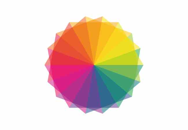
In order to see how colors and their combinations work, a color wheel is very effective for use. It does provide an effective color map especially for mixing color, as it illustrates in detail the range from warm color to cool color.
What are the Inter Ib Advanced Techniques of Color Harmony
Color harmony means using different schemes where one color would use warm and the other cool colors in order to be eye pleasing. Bringing into play complementary, analogous and encompasses triadic color schemes are of great importance in achieving balance and eye catching visuals.
For instance, Complementary Color Scheme
This scheme uses such colors which are diametrically opposite on the color wheel e g blue and orange to achieve a vibrant and contrastin high look. Often seen in media where there is a need to capture attention quickly.
Analogous Colour Scheme:
The colour wheel adjacent green blue and blue-green overlap each other, which is an example of an analogous color scheme, one that has its place in nature as it always delivers great soothing designs.
Triadic Colors:
Combining three colors that are equidistant from one another that can be red, blue and yellow will give you a Vibrant triadic scheme. This is more balanced than using complementary schemes.
Color harmony canvass in works of art and Advertising:
Art: For instance, a unified painting would often use the combination of Yellow and blue to create the Starry Night. Done by Vincent van Gogh.
Advertising: The color balance Pepsi has on their logo of red white and blue is an example triadic colors.
FAQs
What is the most versatile warm color for use in home decor?
When we talk about home decor, the most effective warm colour is perhaps the yellow. As many people would know this yellow does tend to bring warmth and happiness which is ideal in allowing a selection of rooms to be used. Spaces such as kitchens and bathrooms can be more inviting while the many shades available help to improve the versatility of decorating that can be done.
Do cool colors have the ability to energize someone, and if so, how does it work?
It is possible that cool colors could energize someone differently from warm colours. Where warm colours, say orange or red, could stimulate passion and excitement, blue could channel relaxation while still energizing someone to concentrate. Research done by University of Sussex shows that exposure to blue light boosts cognitive function as well as alertness, so it is an ideal color for workplaces and areas requiring focus.
Which Are The Best Combos in Terms Of Colors For A Soothing Bedroom Theme?
A soothing bedroom should primarily make use of a mixture of cool tones to enable unwinding, so the following combos can be used:
Light blue with white: blue represents calmness while white represents freshness and completeness.
Sage green and lavender: both the colors are relaxing and create an environment suitable for better sleep.
Pale grey with blush pink: They when combined provide a cooling but relaxing cuddly atmosphere.
How Do Warm and Cool Shades Impacts the Looking of Food in Photography and Restaurants?
Colors can greatly shift the perception of food in terms of photography and also in the context of décor of a dining space. It has been observed that warm colors such as reds, oranges, and yellows boost hunger and stimulate the senses hence food being marketed appears more attractive than it is. On the other hand the cooler colors such as the greens and blues give a feeling of tranquillity and can be used to express the concepts of being ‘fresh’ and ‘healthy’.
Food photographers combat it by having warm lighting and warm backgrounds to the food while the restaurants use warm shades in their interior design to please their customers and urge them to finish their food.
Conclusion
There is more to the concept of warm and cool colors than many people assume; it is a lot more than just a mere beautification It allows those that are engaged in differing activities to benefit from the nuances in color. Color Theory, as affect a profound amount of living aspects, from design engaging homes and making stylish statements and uh so much more.
As you strive to retain this information, remember that the colors aforementioned, warm or cold, affect your decision. Make use of different color combinations, enjoy their diversity more, and don’t forget to apply color theory to enhance your experience.
Warm, cool, or even neutral colors can have a profound effect on one’s environment. As such, creating appealing surroundings is easy. All one needs to do is ensure that color theory is well integrated into their life. So go on, experience what color is all about and let your intuition lead the way!
More Post
- How Does the Color Wheel Help Artists Choose Color Schemes?
- What are complementary colors? The Ultimate Guide to Color Theory and Design
- What colors make silver?
- What colors make gold?
- What Colors Make Teal?
;


