The world of design is a vibrant canvas where colors play a pivotal role in shaping perceptions, evoking emotions, and creating visual experiences. Among the myriad colors, green stands out as a versatile and significant hue. Its importance in design extends beyond aesthetics, delving into the realms of psychology, culture, and environmental consciousness.
Green holds a special place in design due to its association with nature, growth, and tranquility. It symbolizes harmony, balance, and a connection to the natural world. Designers often leverage the calming effect of green to create spaces and visuals that resonate with a sense of freshness and vitality.
While green is a single word, its visual impact is far from monolithic. The spectrum of different shades of green offers designers a vast palette to work with, allowing for nuanced expressions and varied moods. Understanding these shades is crucial for creating designs that communicate specific emotions or cater to diverse target audiences.
Various Terms Associated with Green Color Exploration
- Various Terms Associated with Green Color Exploration
- Exploration of Different Shades of Green
- Shades of green
- Definition of "Shades" in the Context of Colors
- Exploration of Various Shades of Green
- Examples and Use Cases for Each Green Shade
- Green Hex Code and RGB Color System
- The Color Palette
- Creating a Cohesive Color Palette
- Building a Green Color Palette for Design
- Utilizing Different Tones and Hues for Visual Appeal
- Exploring the Use of Complementary Colors in a Green Palette
- CMYK and RGB codes
- How Do These Codes Contribute to Different Shades of Green?
- Practical Tips for Using Codes in Design Projects
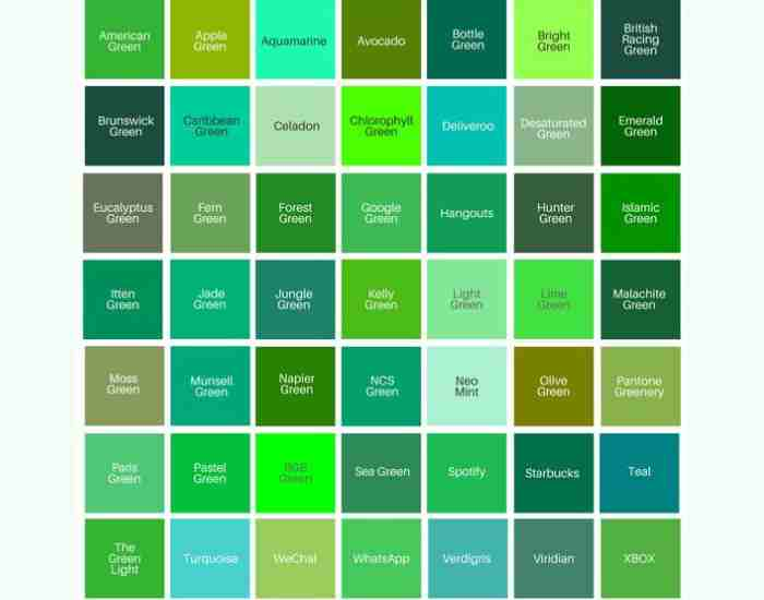
- Naming the Greens
- Popular Names for Different Green Hues
- Understanding the impact of names on design perception
- Exploring the Concept of Color Name
- Undertones and tones
- Explanation of Undertones in Green Shades
- Different Tones Within the Green Color Spectrum
- How do undertones and tones influence design outcomes?
Embarking on a journey to explore the world of green involves familiarizing oneself with a lexicon of terms. From the technical aspects of color models like CMYK and RGB to the naming conventions of specific shades such as mint green or hunter green, each term contributes to the intricate language of design. The green hex code and the significance of color names also add layers of complexity to the exploration of this captivating hue.
Exploring green colors
In the vast realm of design, color is a fundamental element that can influence emotions, perceptions, and the overall impact of visual compositions. It serves as a powerful tool for designers to convey messages, create brand identities, and establish a visual language. Understanding the basics of color, especially the nuances within the green color spectrum, is essential for harnessing its potential in design.
Definition of Color and its Role in Design
Color, in its essence, is the visual perception resulting from the way an object interacts with light. In design, it goes beyond mere aesthetics, playing a crucial role in conveying mood, establishing hierarchy, and guiding the user experience. The careful selection and combination of colors can evoke specific emotions and communicate messages effectively.
Green Color Spectrum
The green color spectrum encompasses a diverse range of hues, each with its own unique characteristics and associations. From the lush tones found in nature to the more vibrant and unconventional shades, green offers a broad palette for designers to explore. This spectrum provides a rich tapestry of possibilities, allowing for creativity and expression in design projects.
CMYK and RGB Color Models
To truly grasp the intricacies of green color, it’s essential to delve into the technical aspects governed by color models. The CMYK (Cyan, Magenta, Yellow, Black) and RGB (Red, Green, Blue) color models are integral to the world of design. Understanding how these models work provides insights into the reproduction and representation of colors, including the various shades of green.
Exploration of Different Shades of Green
With the basics in place, let’s embark on an exploration of the myriad shades that make up the green color palette. Each shade contributes to the visual language in unique ways, offering designers a broad spectrum of options to convey specific emotions or create distinct atmospheres.
Dark Green
Dark green exudes sophistication, depth, and a sense of mystery. Often associated with evergreen forests and elegance, dark green can serve as a powerful anchor in design, providing a sense of stability and timelessness.
Medium Green
Medium green strikes a balance between the richness of dark green and the vibrancy of lighter shades. This versatile hue can be employed to convey a sense of harmony, growth, and natural balance in various design contexts.
Light Green
Light green embodies freshness, youthfulness, and an airy feel. Evoking the essence of spring, this shade can bring a sense of renewal and positivity to designs, making it suitable for projects that aim to convey a light-hearted or eco-friendly message.
Shades of green
In the realm of colors, the term “shades” refers to the variations of a particular color that result from altering its intensity or brightness. Understanding the concept of shades is crucial for designers, as it allows them to wield a broad spectrum of visual expressions. In this section, we will delve into the diverse world of shades of green, exploring notable variations like hunter green, mint green, and olive green.
Definition of “Shades” in the Context of Colors
Before we embark on our exploration, let’s clarify the term “shades” in the context of colors. In color theory, a shade refers to a color produced by adding black to the original hue. It is a way of darkening the color while retaining its base tone. Understanding shades is pivotal for designers seeking to evoke specific emotions or create varying levels of contrast in their visual compositions.
Exploration of Various Shades of Green
Hunter Green
Hunter green is a deep, dark shade of green that draws inspiration from the lush foliage of forests. Its rich and robust nature makes it a popular choice for conveying sophistication and a touch of the outdoors. This shade often finds its place in formal settings, evoking a sense of classic elegance.
Mint Green
On the opposite end of the spectrum, we encounter the refreshing and light-hearted mint green. This shade, reminiscent of the coolness of mint leaves, brings a sense of freshness and vitality to designs. Mint green is often associated with a modern, clean aesthetic and is popular in contexts where a vibrant yet soothing palette is desired.
Olive Green
Olive green takes its cue from the muted tones of olives and has a distinctive earthy quality. This versatile shade can convey both a sense of calm and a connection to nature. Olive green is often employed in various design scenarios, from fashion to interior design, where a subdued and sophisticated palette is desired.
Examples and Use Cases for Each Green Shade
To truly appreciate the impact of these green shades, let’s explore some examples and use cases:
- Hunter Green: Ideal for creating a luxurious brand identity, it can be used in logos, packaging, and upscale product designs.
- Mint Green: Perfect for refreshing and modern designs, it can be applied in web design, product packaging, and branding for youthful and trendy products.
- Olive Green: Suited for creating a grounded and natural ambiance, it can be utilized in interior design, outdoor branding, and eco-friendly product lines.
Green Hex Code and RGB Color System
In the world of digital design, understanding the technical aspects of color representation is paramount. The green hex code and RGB color system provide a standardized way to communicate and reproduce colors consistently across various platforms.
- Green Hex Code: A six-digit code that represents the color in hexadecimal format. For example, the hex code for pure green is #00FF00.
- RGB Color System: Utilizing combinations of red, green, and blue, the RGB system quantifies colors in terms of intensity. Understanding the RGB values for a specific shade of green ensures accurate reproduction in digital designs.
The Color Palette
In the intricate world of design, the creation of a cohesive color palette serves as the bedrock for visual harmony, conveying a unified message, and establishing a memorable brand identity. This section delves into the significance of crafting a thoughtful color palette, particularly focusing on the nuances of building a captivating green color palette. We’ll explore the importance of cohesion, the incorporation of different tones and hues, and the artful use of complementary colors.
- More Post: What Are the Different Types of Paper and Their Uses?
- More Post: 7 principles of design in art, with examples
Creating a Cohesive Color Palette
A cohesive color palette is the key to unlocking the full potential of a design. It involves the strategic selection and harmonious blending of colors to create a unified and visually pleasing composition. Cohesion in color choices ensures that the design communicates a consistent message and evokes the intended emotions.
Whether designing a website, a brand logo, or an entire marketing campaign, a cohesive color palette reinforces brand recognition and strengthens the overall visual impact. It guides the viewer’s eye, establishes hierarchy, and fosters a sense of professionalism and intentionality in the design.
Building a Green Color Palette for Design
Crafting a green color palette requires a delicate balance between different shades, tones, and hues of green. The chosen palette should resonate with the brand personality, the target audience, and the emotions the design aims to evoke. Here are some steps to consider when building a green color palette:
- Identify the dominant green shade. Select a primary shade of green that aligns with the brand or design theme. This could be a classic green like emerald or a more unconventional choice like jungle green.
- Incorporate Lighter and Darker Tones: Introduce variations in lightness and darkness to add depth and dimension to the palette. This can include lighter tones like spring green and darker tones such as forest green.
- Explore Different Hues: Experiment with different hues of green, ranging from cool tones like mint green to warmer tones like olive green. This variety allows for versatility and adaptability in different design contexts.
- Consider Cultural Associations: Be mindful of the cultural connotations associated with specific shades of green. Different cultures may interpret green differently, and this awareness can influence the success of the design.
Utilizing Different Tones and Hues for Visual Appeal
The magic of a green color palette lies in its ability to evoke diverse emotions and create distinct atmospheres. Two notable tones worth exploring are spring green and jungle green.
- Spring Green: This lively and fresh tone embodies the essence of the season. It is perfect for designs that seek to convey a sense of renewal, growth, and positivity. Spring green injects vibrancy and energy into any composition.
- Jungle Green: Inspired by the lush greenery of tropical jungles, this deep and rich tone brings a sense of mystery and sophistication. Jungle green is ideal for designs that aim to convey a bold and adventurous spirit.
Exploring the Use of Complementary Colors in a Green Palette
While green is a powerful color on its own, the judicious use of complementary colors can elevate a design to new heights. Complementary colors are those that are opposite each other on the color wheel and, when combined, create a visually striking contrast.
In a green palette, consider incorporating complementary colors like yellow or blue. These combinations can add dynamism and balance to the overall design, making certain elements pop and creating a memorable visual impact.
CMYK and RGB codes
To truly grasp the intricacies of green color in design, one must delve into the technical aspects governed by color models. Two prominent models, CMYK (Cyan, Magenta, Yellow, and Black) and RGB (Red, Green, and Blue), play a pivotal role in the representation and reproduction of colors.
Explanation of CMYK and RGB Color Codes
CMYK and RGB are color models that provide a systematic approach to expressing a wide array of colors. Understanding the principles behind these codes is essential for designers aiming to achieve precision and consistency in their work.
- CMYK Color Model: Primarily used in print, the CMYK model relies on the subtractive color theory. The combination of varying percentages of cyan, magenta, yellow, and black inks produces a spectrum of colors. In the context of green, adjusting the levels of these ink colors contributes to the creation of different shades and tones.
- RGB Color Model: Employed in digital displays such as monitors and screens, the RGB model follows an additive color theory. By combining varying intensities of red, green, and blue light, a broad range of colors is achieved. Understanding the RGB values for green is crucial for digital designers to ensure accurate representation across various devices.
How Do These Codes Contribute to Different Shades of Green?
The significance of CMYK and RGB codes in the realm of green color lies in their ability to quantitatively represent the components that make up each shade. For instance:
- Dark Green: In the CMYK model, a higher percentage of black may be added to deepen the green, while in the RGB model, lower values for red, green, and blue contribute to a darker shade.
- Medium Green: To achieve a balance between light and dark, various combinations of CMYK percentages or moderate RGB values can produce a medium green tone.
- Light Green: For a light green hue, lower percentages in the CMYK model or higher values in the RGB model result in a softer, more pastel-like shade.
Practical Tips for Using Codes in Design Projects
As designers navigate the application of these codes in their projects, practical tips can enhance the effectiveness of color representation:
- Consistency Across Platforms: Ensure that the chosen color codes maintain consistency across various platforms and devices. What appears vibrant on a computer screen should translate seamlessly to printed materials.
- Testing and Proofing: Always conduct tests and proofs to verify how colors appear in different formats. This helps identify any discrepancies between the intended and actual colors.
- Hex Codes for Digital Precision: In digital design, using hex codes (hexadecimal values) provides a precise and standardized way of representing colors. Familiarity with the specific hex code for a green shade ensures accuracy and reproducibility.
- CMYK for Print Accuracy: When preparing designs for print, understanding the characteristics of the CMYK color model is paramount. Adjusting the CMYK percentages appropriately ensures the desired outcome in printed materials.
Naming the Greens
In the diverse and nuanced world of green color exploration, understanding the significance of names assigned to various shades adds an additional layer of complexity and intrigue. This section delves into the art of naming conventions for green shades, shedding light on official color names like army green and hunter green, as well as popular names such as lime and emerald. We will also explore the profound impact that these names have on design perception, unraveling the concept of the color name.
Naming Conventions for Green Shades
Naming conventions play a crucial role in the identification and communication of specific green shades. Official color names, often recognized in industries like fashion and design, lend a sense of authority and consistency. Army green and hunter green, for instance, evoke imagery associated with military uniforms and deep forests, respectively. These names not only provide clarity in communication but also convey a particular aesthetic or mood.
Popular Names for Different Green Hues
The lexicon of green extends beyond the formalities of color models and codes, embracing a vivid array of popular names for different hues. Each name carries its own set of connotations and associations, allowing designers to tap into the rich tapestry of cultural and visual references.
- Lime: This vibrant and zesty hue is reminiscent of the bright green color of the citrus fruit. It exudes energy and is often associated with freshness and a lively aesthetic.
- Emerald: A gemstone-inspired name, emerald green signifies richness and sophistication. It’s a deep, jewel-toned green that adds a touch of luxury to designs.
These names not only simplify communication but also contribute to the visual storytelling aspect of design, evoking specific emotions and imagery.
Understanding the impact of names on design perception
The names assigned to green shades play a pivotal role in shaping the perception of a design. The impact goes beyond mere identification; it influences the emotional response, cultural associations, and overall aesthetic appeal. Consider the following aspects:
- Emotional Resonance: Names like spring green evoke a sense of renewal and positivity, while deep green may conjure feelings of introspection and mystery. Understanding these emotional nuances allows designers to align color choices with the intended mood.
- Cultural Associations: Certain names, such as jungle green or moss green, draw on cultural references and natural environments. These associations can add depth and layers of meaning to a design, resonating with specific audiences.
- Aesthetic Appeal: The right name can enhance the aesthetic appeal of a design. For example, using the name neon green suggests a bold and contemporary style, while muted olive implies a more subdued and timeless quality.
Exploring the Concept of Color Name
The concept of the color name transcends mere identification; it is a powerful tool for communication and storytelling in design. A well-chosen name can evoke emotions, trigger memories, and establish a connection with the viewer. Consider the difference between presenting a design as “using forest green accents” versus “incorporating hints of enchanting woodland hues.” The latter not only provides a visual description but also paints a vivid narrative that engages the audience.
- More Post: How Much Does a Printer Cost?
- More Post: What are the best paint-pouring techniques and ideas?
Undertones and tones
The world of green color exploration is a captivating journey into the nuances and subtleties that define each shade. In this section, we will unravel the concepts of undertones and tones within the green color spectrum. This includes an explanation of undertones, specifically delving into blue undertones and yellow undertones. Additionally, we’ll explore different tones within the spectrum, such as deep green and rich green. Understanding how undertones and tones influence design outcomes is essential, especially when considering the implications for interior design.
Explanation of Undertones in Green Shades
Undertones add depth and complexity to green shades, revealing subtle hints of other colors that contribute to the overall perception. In the context of green, two significant undertones are blue and yellow.
- Blue Undertones: Greens with blue undertones tend to lean towards cooler shades. This infusion of blue creates a sense of calmness and tranquility. Forest greens and teal variations often exhibit blue undertones, providing a sophisticated and serene aesthetic.
- Yellow Undertones: On the opposite side of the spectrum, greens with yellow undertones exude warmth and vibrancy. These hues are reminiscent of sunny meadows and bring a lively and energetic quality to the color palette. Lime greens and chartreuse often showcase yellow undertones.
Understanding these undertones is pivotal for designers, as it allows for intentional color choices that align with the desired emotional impact of a design.
Different Tones Within the Green Color Spectrum
Beyond undertones, exploring various tones within the green color spectrum unveils a rich array of possibilities, each with its own unique character:
- Deep Green: This tone embodies richness and intensity, creating a sense of depth and sophistication. Often associated with evergreen trees, deep green is a classic choice for conveying elegance and timelessness.
- Rich Green: As the name suggests, rich green tones are opulent and luxurious. These hues may have a velvety quality, providing a sense of indulgence. Emerald green is a prime example, bringing a touch of glamour to designs.
These tones serve as building blocks for creating diverse palettes, allowing designers to play with contrasts and harmonies.
How do undertones and tones influence design outcomes?
The influence of undertones and tones in design extends beyond mere aesthetics; it significantly shapes the overall outcome of a project. Considerations include:
- Mood and Atmosphere: Undertones dictate the mood of a design. Blues lend a calm and sophisticated atmosphere, while yellows infuse energy and positivity. Tones like deep green may evoke a sense of coziness, while rich greens add a touch of luxury.
- Visual Hierarchy: Tones within the green spectrum can establish visual hierarchy. A deep green accent against a lighter background draws attention, creating focal points within a design. This strategic use of tones guides the viewer’s gaze and reinforces the hierarchy of elements.
- Interior Design Implications: Undertones play a crucial role in interior design. Blues may be incorporated for a serene bedroom ambiance, while yellows can bring warmth to communal spaces like living rooms. Tones, such as deep green, can be used for accent walls to create a sense of intimacy, while rich greens may be employed for luxurious furnishings.
FAQs
What are the key differences between CMYK and RGB?
Understanding the fundamental distinctions between the CMYK and RGB color models is crucial for designers seeking precision and consistency in their work.
- CMYK Values: CMYK is a subtractive color model primarily used in print. It stands for Cyan, Magenta, Yellow, and Key (black). In this model, colors are produced by subtracting percentages of these ink colors from white. For example, a green hue in CMYK might be achieved by a combination of Cyan and Yellow with minimal Magenta and no Key (black).
- RGB Color Model: RGB, on the other hand, is an additive color model used in digital displays. It stands for red, green, and blue. Colors are generated by adding varying intensities of red, green, and blue light. In RGB, a shade of green may be created by combining high levels of green and low levels of red and blue.
How Do These Differences Affect Green Color Representation?
The disparities between CMYK and RGB have significant implications for how green colors are represented in different mediums.
- Printed Materials: CMYK is suitable for print, and understanding its values is crucial for achieving accurate and predictable results. However, the color gamut of CMYK is narrower than RGB, so some vibrant greens seen on screens may not be fully replicated in print.
- Digital Displays: RGB is the go-to model for digital design. It offers a broader spectrum of colors, allowing for more vibrant and nuanced greens in digital mediums. However, designers must be mindful of how these colors may translate when printed in CMYK.
How Can I Choose the Right Green Shade for My Design?
Selecting the appropriate green shade involves a thoughtful approach that considers both design goals and the context in which the color will be used.
- Consider the mood: Different shades of green evoke varied emotions. For a calming and serene atmosphere, opt for muted or pastel greens. Vibrant and bold greens can inject energy and excitement into a design.
- Think About Branding: If the color green is part of a brand’s identity, ensure that it aligns with the brand’s personality and values. Consistency in color choices strengthens brand recognition.
- Harmony with Other Colors: Consider the overall color scheme of the design. Greens can work harmoniously with other colors, but the right balance is crucial. Complementary or analogous colors can create visual interest.
Considerations for Audience and Context, Incorporating Graphic Design Principles
- Audience Preferences: Know your target audience and their preferences. Different demographics may respond differently to certain shades of green. Conducting audience research can provide valuable insights.
- Contextual Relevance: Consider the context in which the design will be used. The greens appropriate for a nature-themed website may differ from those suitable for a corporate annual report. Align the color choices with the overall theme and purpose.
- Graphic Design Principles: Incorporate fundamental graphic design principles such as contrast, balance, and hierarchy. Ensure that the chosen green shade enhances the overall visual appeal and effectively communicates the intended message.
What are some popular green color palettes in design?
The world of design is teeming with captivating color palettes that showcase the versatility of green. In this section, we’ll explore some popular green color palettes, including notable examples such as neon green and the natural color system. Additionally, we’ll analyze the impact of these palettes on color space and overall design aesthetics.
Neon Green Palette
Neon green has become synonymous with modernity and bold statements in design. This palette often features vibrant, electric greens that grab attention and infuse a sense of energy into various design elements. Paired with blacks, grays, or other neon hues, this palette is a favorite for brands seeking a contemporary and dynamic aesthetic.
Natural Color System Palette
The natural color system embraces a harmonious and nature-inspired approach to color palettes. The greens in this system reflect the organic hues found in the environment. Earthy greens, mossy tones, and soft leafy shades create a palette that communicates a connection to the outdoors. This palette is often used in eco-friendly branding, interior design, and environmental campaigns.
Analysis of the Impact of These Palettes on Color Space and Overall Design Aesthetics
Neon Green Impact
The neon green palette disrupts traditional color expectations, injecting vibrancy and excitement. Its high saturation and contrast make it suitable for digital platforms and attention-grabbing designs. However, careful consideration must be given to balance, ensuring that the intensity of neon green does not overwhelm the overall composition.
Natural Color System Aesthetics
The natural color system palette, with its subdued and earthy greens, creates a calming and grounded aesthetic. This palette often adheres to softer contrasts, fostering a sense of tranquility and connection to nature. It is particularly effective in designs where a more relaxed and organic vibe is desired.
Conclusion
In conclusion, the importance of understanding different shades of green in design cannot be overstated. The showcased palettes, from the bold and vibrant neon greens to the calming and natural tones, illustrate the diverse applications of this versatile color. Designers are encouraged to experiment with various green hues to discover the unique atmospheres and emotions they can convey in their projects.
- Versatility: Different shades of green offer a broad spectrum of possibilities, allowing for versatility in design applications.
- Emotional Impact: Understanding the emotional impact of each shade enables designers to craft designs that resonate with specific feelings and moods.
- Cohesive Designs: Creating cohesive designs involves a nuanced understanding of green shades, ensuring a unified visual language.
As a final encouragement, designers are urged to step beyond the familiar and experiment with diverse green hues. Whether crafting a brand identity, designing a website, or conceptualizing an ad campaign, the exploration of green shades can lead to innovative and visually stunning outcomes.
Readers are invited to share their favorite green color palettes and explore the many shades of green in their own design endeavors. Share insights, experiences, and discoveries to foster a community of creativity and inspiration.
References
For those eager to delve deeper into the world of color theory and design, here is a list of reputable sources:
- Tondreau, B. (2018). “The Power of Color in Branding.” HOW Design.
- Shaw, M. (2005). “Color Theory for Designers, Part 1: The Meaning of Color.” Smashing Magazine.
- Natural Color System. (n.d.). The NCS System.
- Adobe Color Wheel. (n.d.). Adobe.
- Pantone Color Institute. (n.d.). Pantone.
- Dribbble. (n.d.). Online platform for showcasing and discovering creative work.