Purple, often associated with mystery, royalty, and creativity, is a captivating color that has mesmerized humanity for centuries. Exploring the vast spectrum of 25+ shades of purple reveals not only the sheer diversity within this hue but also the profound impact it has had on art, culture, and design.
The fascination and versatility of the color purple are evident in its ability to evoke a wide range of emotions and moods. From the regal elegance of deep purples to the delicate charm of lavender, purple has a unique allure that transcends boundaries and resonates with people from all walks of life.
As we embark on this journey, we’ll delve into the various shades of purple and uncover their significance in different contexts. Each shade tells a story, reflecting the complexities and nuances of human experience. So, let’s immerse ourselves in the enchanting world of purple and discover the beauty that lies within its many hues.
Purple
Purple is a mesmerizing color that sits at the intersection of blue and red on the color wheel. Defining purple involves recognizing its unique position as a secondary color that embodies both the tranquility of blue and the passion of red. In color theory, purple is often associated with creativity, spirituality, and imagination.
When it comes to digital representation, purple can be depicted using various color models, including CMYK, RGB, and HEX. Each model offers a different approach to representing color, catering to different mediums and applications. In CMYK, purple is created by mixing cyan and magenta with a hint of black, while in RGB, it’s produced by combining red and blue light. HEX codes provide a precise digital representation of colors, including various shades of purple, allowing for consistency across digital platforms.
Beyond its technical aspects, purple holds deep psychological and cultural associations. Psychologically, purple is often linked to creativity, wisdom, and spirituality. It’s seen as a color that stimulates the imagination and encourages innovation. Culturally, purple has been associated with royalty and luxury for centuries, thanks to its rarity and historical significance. In ancient times, purple dye was extracted from mollusks and was so expensive that only royalty could afford it, hence its association with power and prestige.
Moreover, different shades of purple evoke distinct emotions and moods. From the serene calmness of lavender to the bold vibrancy of magenta, each hue carries its own symbolism and significance. Indigo, with its deep, mysterious tone, is often associated with wisdom and intuition, while pastel purples exude a soft, gentle charm that soothes the senses.
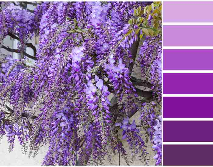
Shades of Purple: A Visual Journey
Embark on a captivating exploration of the mesmerizing world of purple, where every shade tells a story and evokes a unique emotion. Let’s delve into the violet variations and discover the beauty that lies within each hue.
Exploring Violet Variations
Violet is often used interchangeably with purple, but it possesses its own distinct characteristics. As we navigate through the nuances between violet and purple, we uncover a spectrum of shades that captivate the imagination.
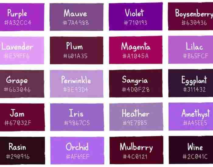
- Lavender: With its delicate, pale hue, lavender exudes a sense of tranquility and elegance. This shade is often associated with femininity and grace, making it a popular choice in interior design and fashion.
- Indigo: Deeper and more mysterious than its counterparts, indigo carries a sense of wisdom and intuition. With its rich, dark tone, indigo adds depth and sophistication to any space or design.
- Lilac: Soft and romantic, lilac embodies the sweetness of springtime blooms. Its gentle hue invokes feelings of nostalgia and serenity, making it a beloved choice for weddings and special occasions.
Through real-life examples and imagery, we’ll immerse ourselves in the enchanting world of violet, exploring its many shades and the emotions they evoke.
- More Post: 5 Best 11 x 17 Printers
- More Post: What Are the Common Sizes for Canvas Prints? Sizes cm and inches
Mauve to Magenta: Exploring the Range
From the muted elegance of mauve to the bold vibrancy of magenta, the range of purple shades is as diverse as it is captivating. Let’s delve deeper into the nuances of these hues and uncover their unique characteristics.
- Mauve: Soft, subtle, and sophisticated, Mauve exudes understated elegance. Its muted undertones make it a versatile choice for interior design, adding a touch of warmth and sophistication to any space.
- Magenta: Bold, vibrant, and unapologetically eye-catching, magenta commands attention wherever it goes. With its intense hue and playful energy, magenta is often used to make a statement in fashion and graphic design.
The Power of Dark Purple Tones
Dive into the enchanting realm of dark purple tones, where depth, richness, and sophistication reign supreme. Let’s explore how these hues evoke a sense of luxury, royalty, and elegance while seamlessly blending into various design aesthetics.
Discussing the Depth and Richness of Dark Purple Hues
Dark purple hues, such as royal purple and deep purple, exude a sense of opulence and grandeur. With their intense pigmentation and velvety texture, these shades command attention and leave a lasting impression.
- Royal Purple: Fit for kings and queens, royal purple symbolizes power, wealth, and prestige. Its regal presence adds a touch of majesty to any space, making it a popular choice for luxurious interiors and upscale events.
- Deep Purple: Rich, mysterious, and alluring, deep purple captivates the senses with its depth and complexity. Whether used as an accent color or as the main focal point, deep purple infuses spaces with a sense of drama and sophistication.
Exploring Their Association with Luxury, Royalty, and Elegance
Dark purple tones have long been associated with luxury, royalty, and elegance. From ancient monarchies to modern-day palaces, these hues have adorned the halls of the elite, serving as a symbol of wealth and power.
- In interior design, dark purple tones can elevate any space, transforming it into a sanctuary of sophistication and refinement. Whether used in upholstery, wall coverings, or accessories, these hues add a touch of glamour and allure to any room.
- In the world of fashion, dark purple tones exude a sense of timeless elegance, making them a favorite among designers and style icons alike. From evening gowns to accessories, these hues add a touch of drama and sophistication to any ensemble.
Providing Examples of How Dark Purple Tones Can Be Incorporated into Design
From luxurious velvet sofas to statement-making accent walls, there are countless ways to incorporate dark purple tones into design. Whether used sparingly as an accent or boldly as a focal point, these hues add depth, warmth, and personality to any space.
- Color Palette: Pairing dark purple tones with complementary colors, such as gold, silver, or cream, can create a sense of harmony and balance in any room.
- Interior Design: Incorporating dark purple tones into furniture, accessories, and artwork can add a sense of drama and sophistication to any space while creating a cohesive and visually stunning environment.
Embracing lighter purple tones
Step into a world of tranquility and serenity with lighter purple tones, where softness, delicacy, and charm abound. Let’s explore how these pastel hues create calming and soothing environments while effortlessly complementing a wide range of design styles.
Exploring Pastel Purple Shades and Their Soft, Delicate Nature
Light purple tones, such as pastel purple, lavender, and lilac, radiate a sense of tranquility and serenity. With their subtle hues and gentle undertones, these shades create a peaceful and inviting atmosphere.
- Pastel Purple: Soft, subtle, and serene, pastel purple is perfect for creating a calming and soothing environment. Whether used in bedrooms, living rooms, or bathrooms, this hue evokes a sense of tranquility and relaxation.
- Lavender: Delicate and dreamy, lavender exudes a sense of romance and nostalgia. Its soft, powdery hue adds a touch of elegance and charm to any space, making it a popular choice for bedrooms and nurseries.
Discussing Their Use in Creating Calming and Soothing Environments
Light purple tones have a natural ability to create calming and soothing environments, making them ideal for spaces designed for relaxation and rejuvenation.
- In interior design, light purple tones can be used to create a serene and inviting atmosphere. Whether used as wall colors, accent pillows, or decorative accessories, these hues add a sense of warmth and tranquility to any space.
- In spa and wellness environments, light purple tones are often used to create a sense of serenity and relaxation. From soothing lavender-scented candles to soft lilac-colored towels, these hues create a peaceful and rejuvenating experience for guests.
Providing Tips on How to Pair Lighter Purple Tones with Other Colors
When it comes to incorporating lighter purple tones into design, it’s important to consider their compatibility with other colors and materials.
- Color Palette: Pairing light purple tones with complementary colors, such as soft greens, blues, or neutrals, can create a harmonious and balanced color palette.
- Texture and Materials: Incorporating different textures and materials, such as soft fabrics, natural woods, and metallic accents, can add depth and visual interest to a space while highlighting the delicate beauty of light purple tones.
- More Post: What are the 7 Colors of the Rainbow in Order?
- More Post: What are the 9 Different types of art with examples?
- More Post: What is Tempera Paint?
FAQ’s
Curious about the world of purple shades? Here are some frequently asked questions to guide you on your journey of discovery.
What are the most popular shades of purple?
Purple comes in a plethora of captivating hues, but some shades stand out as perennial favorites. Let’s delve into the most popular shades and uncover their unique characteristics.
- Lavender: Delicate and soothing, lavender exudes a sense of tranquility and elegance. Its soft hue makes it a popular choice for bedrooms, spa environments, and wedding decor.
- Plum: Rich and decadent, plum embodies luxury and sophistication. Its deep, regal hue adds depth and drama to any space, making it a popular choice for formal events and interior design accents.
- Amethyst: Vibrant and enchanting, amethyst captivates the senses with its rich purple hue and subtle hints of violet. From jewelry to home decor, this versatile shade adds a touch of elegance and allure to any setting.
These popular shades of purple offer versatility and adaptability, making them perfect for a wide range of applications and design styles.
How Do I Choose the Right Shade of Purple?
Selecting the perfect shade of purple can be a daunting task, but with the right approach, it’s easier than you think. Consider the following factors to help you find the shade that suits your preferences and needs:.
- Personal Preference: Start by considering your personal taste and style preferences. Are you drawn to soft, muted hues or bold, vibrant shades? Understanding your aesthetic preferences will help you narrow down your options.
- Context: Think about the context in which the purple will be used. Is it for a specific room in your home, a special event, or a branding project? Different shades of purple evoke different moods and atmospheres, so consider how the color will fit within its surroundings.
- Color Psychology: Delve into the world of color psychology to understand the emotional and psychological effects of different shades of purple. For example, soft pastel purples are often associated with tranquility and relaxation, while rich, deep purples convey a sense of luxury and sophistication.
By taking these factors into account, you can confidently choose the right shade of purple that reflects your personality and meets your design objectives.
Can I mix purple shades?
Absolutely! Mixing different shades of purple can result in stunning color combinations that add depth and dimension to your designs. Here’s how to master the art of mixing purple shades:.
- Understand Color Mixing: Familiarize yourself with the principles of color mixing to achieve the desired results. Experiment with mixing different shades of purple to create custom hues that suit your needs.
- Consider Contrast: Play with contrasts by mixing light and dark shades of purple to create visual interest and balance in your designs. Pairing complementary shades can create a harmonious color palette that is both visually appealing and dynamic.
- Experiment with Accents: Incorporate accents of contrasting colors to enhance the vibrancy of your purple combinations. Whether it’s a pop of yellow, a hint of green, or a touch of pink, contrasting accents can elevate your design and make your purple shades truly shine.
Conclusion
As we come to the end of our journey through the captivating world of purple, let’s take a moment to reflect on the diversity and beauty of 25+ shades of purple.
From the soft pastels of lavender to the deep richness of royal purple, the spectrum of purple hues is truly awe-inspiring. Each shade tells a unique story, evoking a myriad of emotions and moods. Whether used in interior design, fashion, or art, purple has a timeless appeal that transcends boundaries and resonates with people from all walks of life.
As we’ve explored the various shades of purple, I encourage you to embark on your own journey of discovery. Take the time to explore and experiment with different purple hues in your life. Whether it’s adding a splash of color to your home decor or incorporating purple accents into your wardrobe, don’t be afraid to embrace the beauty of this enchanting hue.
Remember, purple is more than just a color—it’s a symbol of creativity, luxury, and individuality. It’s a hue that inspires us to think outside the box, to embrace our uniqueness, and to express ourselves boldly. So, the next time you see a shade of purple that speaks to you, don’t hesitate to embrace it and make it your own.