One afternoon experimenting in my studio I managed to create a wonderful synergy. That of cobalt blue and burnt sienna. The strong and deep earthy green I got od met across any other greens I mixed all all of my life. Such serendipity would be viewed as a happy accident , it would also open my eyes up to endless future opportunities that lie ahead whenever someone mixes colors. That alone served as a stark reminder as to how inspiration can come from the most odd places, like the palette itself.
The combination of colors goes beyond just technique, it is in many cases the foundation tool to new horizons and concepts that may change the way an artist approaches his art. Through this blog, I will seek to expose the most hardest core concepts of color mixing, including some of my experiences, and others from artists who have managed to capture their passion inside color. We will also discuss the scope of actually using color and how that can give birth to new ideas.
The Science Behind Color Theory
Color theory can be explained as an understanding of the relationships and perceptions of color and is taught to artists even before they start creating. I started getting into the color theory through the classroom, but as I said, the studio was a fantastic adventure. I begin to see my canvas differently, for instance, when I learned how to use complementary colors to help each other or you use analogous colors to provide harmony.
For example, studies by the Rhode Island School of Design indicate that when artists bring color theory into practice, it vibrates the composition of their artwork. Triadic color scheme is one such palette, it involves using colors that are spaced evenly about the wheel and can help work stand out.
Similarly, colors also have emotional attachments, which may affect/ impact people or society as well, hence, should be chosen carefully. Researchers at the University of Rochester reported that while a blue color can be soothing, it can also increase the heart rate especially in women, while on the other hand red color is often associated with power and dominance. Art operates on the principle of emotions, and using color aids quite the purpose, one can see it quite vividly in Van Gogh’s Starry Night.
Key Equipment and Tools for Artists in Terms of Color Mixing
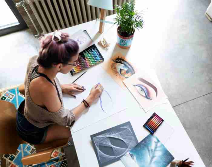
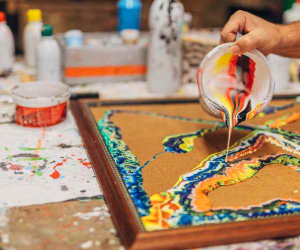
Before delving into any kind of color mixing, it is important to have the right tools for the task. I remember how excited I was when I first used a glass palette and a medium glass spatula. These tools felt new to me completely. Because of the glass palette’s smooth surface, it was easier to combine acrylic colors which showcased the mixed shades more clearly.
Tools are different for different types of artworks, and selection of Tools is also important as it changes everything. For watercolor artists, a porcelain palette can prevent colors from bleeding into each other, while oil painters might prefer a wooden palette that can hold generous amounts of paint without soaking through.
For me, a major advancement occurred when I reinvented my process by incorporating the use of a wet palette to acrylic paint. This tool is helpful as it prolongs the life of water-based acrylic paints, which results in more forgiving conditions when it mixes them. It was a game-changer particularly when it came to working with big pieces that needed lots of gradients and blending.
Tip: When selecting brushes for mixing colors, make sure to analyze the bristles in the context of carrying and mixing paints. Synthetic brushes are great for water-based mediums like acrylics as they smooth blends, but natural bristles, which retain a lot of paint, are much more suitable for oil painting.
A How To On Mixing
With these equipment and the fundamental know-how of color theory, the canvas becomes an enjoyable field of play. Mixing colors is more than simply obtaining the desired hue, it requires comprehending the interactivity of colors on a deeper sense. Each mix comes with a new experience, a new thought and perhaps a new path towards your artwork evolution.
The evolving world of the visual art can make one reconsider the often understated axiom, “The medium is the message.” Swapping between different mediums reveals various layers, depth, and features which can dramatically shift the direction that an artist takes. A good example could be an artist who used to work with acrylics, as soon as they switch to oils their artwork could change imperatively from detail-oriented and tight works to more free and fluid ones due to the characteristics of drying time and texture of the oil paint.
Case Studies:
According to a study conducted by the University of the Arts London, artists who worked across different mediums within one year had 23% increase in both creative and innovative output.
Pablo Picasso and Georgia O’Keeffe are prime examples of artists who worked across multiple different mediums like ceramics, painting, and charcoal, and this caused them to greatly evolve artistically.
A Guide on How to Approach New Mediums and Colors
- Start Small: Take small steps by first doing small pieces to grasp how the medium works without feeling the need of completing a large scale piece.
- Mix and Match: Remember to combine mediums in the same artwork. An example would be to use watercolor for backgrounds then acrylic for the subject and study their interaction.
- Take classes or workshops: There are ideas which are not so intuitive and engaging with experts will provide insight into those techniques.
- Create a Color Mixing Journal: Each art medium has its own journal that has all the color mixes you did with the ratios and effects. This information can be useful in future projects.
- Embrace Mistakes: Every “mistake” is one life lesson closer to achieving something magnificent because these mistakes often lead to untapped avenues.
The Influence of Nature on Color Perception
In all of his forms, art has always found its depends to trust nature, be it through colors, textures or forms. Many times experience brings to reality the implications nature has upon creativity. For instance, while on a mountain hiking excursion, the writer saw the light and colors change over a set of paintings as the sun dipped from a light orange sky tipped with a hint of indigo. There is so much for one person to take and In such situations when one’s nature defines their existence is just one of those times.
Data and Research:
As research voir dire provided by the local geographic society indicates evidence that artists who use elements of mother nature or draw inspiration from the outside have creative disposition that is 34% higher than average.
One simply cannot forget to consider Claude Monet’s Water Lilies paintings series started by him after looking at his own garden in Giverny France and the rest of his work that encapsulated color, light and atmosphere where nature did it transform.
Encouraging Artists to Explore and Find the Inspiration from Nature
Looking at the Micro and the Macro: a single leaf and the entire mountainscape are all different forms of colors and nurturing all that in you is nature.
Use photography to capture natural scenes that resonate with you. You may even turn these images into real-life references or base them to your own abstract interpretations.
Seasonal Changes: Each season has different colors and emotions attached to it such as the flourishing green spring to the bashful orange foliage and red characteristics of fall.
Nature Walks as a Ritual: The majority aims to absorb something when exercising or in this case, let walks through the nature be one of those aims – each step allows to gather items, snap photographs or draw.
Incorporate Natural Materials: Using natural elements such as leaves, sand, or flower petals creates new opportunities for texture and color exploration. Try directly introducing these elements into your artwork.
The Psychological Finality of Colors
The intersection of color and psychology has been an area of interest for study across the globe and throughout history discovering that color plays much more than simply the role of aesthetics as it allows to feel, think and even make different choices. Color psychology hints at reassuring findings that certain hues affect impressions, thus, tempering with perception, which could enable artists to communicate deeper meanings through their artwork.
The language of colors and emotions associated with them Colors have always been associated with certain emotions, here is a short description of what those emotions are and how they were studied:
- Blue: Calmness or peace are two words closely related to the color blue. Blue is also said to be a color that brings about creativity and relaxation as demonstrated in the studies carried out at the University of British Columbia.
- Red: Another color with a descriptive word is red with ‘intense’. Red has been singled out to be quite strong as a color as a study conducted at Harvard university showed red is able to amplify emotions and this makes the color suitable for attention grabbing objects.
- Yellow: A color often associated with happiness and optimism can at times be frustrating as well or lead to a feeling of anger if overused highlighting the importance of stability in using colors.
- Green: Green is associated with nature and relaxation and according to a study or a number of studies that have been conducted, it has been shown that the color green can improve concentration and comprehension making it an ideal color for relaxing places or spaces.
- Useful Tips For Writers : You can choose a specific theme and then choose applicable colors for that theme: For instance, if you want to create a climate with a focus on peace then you can choose Royal blue, a cloudy tone, or a sage tone. If you want to create hype then merely use dark T.
Turn Color to Your Advantage: Use color to enhance visual aspect of your work and attract attention to the elements that you would like the viewer to respond to.
Practice Color Toning: High saturation colors evoke strong emotions while low toned colors give a sense of calm and lack of depth. Further, changing saturation can complicate the emotions conveyed by a piece.
Do Not Forget The Context: It is important to note that differences in cultural backgrounds can alter how colors are viewed. Articulateness and consideration for one’s audience can increase how widespread the message communicated can be.
The Upper Hand That Color Trends Wield
Art and design are constantly evolving and so do color trends which alter the visual era of that particular point in time. Keeping abreast of these trends can assist artists in finding new color schemes to follow while also making it difficult for them to express those colors in a way that is consistent with their artistic identity.
Understanding Artistic Color Trends
Dissection of Art Trends: For instance, this year, we acknowledge Pantone’s Color of the Year which influences more than just fashion and design. The fact that Classic Blue was chosen in 2020 was in itself a picture of the dire need for security in a world full of formidability and strong reassuring art was satisfactory.
Incorporating Trends into Your Work: For Takashi Murakami and many other artists, brightly colored trends enhance their artworks, making them relevant in the contemporary world. This is how any trend can be made one’s own as it gets so hot when it comes from a firmly original perspective.
Narrowing Trends Down to Stay in Line with Your Vision
- Narrowing Trends: Rather than using trend colors as the main or the base colours, use them as accents or as aid which will let speak with your art.
- Conceptualization: Go for trends that do not deviate from the concepts and themes that your art is centered on. This way, no matter how many trends are incorporated, they will always feel relevant.
- Mother Nature over Copy: use color trends for evolution, rather than replicating them in the same way throughout your piece. Doing so would allow your piece to remain uniquely different and aligned solely to your artistic goals.
Real-life Examples of Finds Colour as their Inspirations Through Various Meanings: Artists have used colour in one of the strongest ideas in all of art and with colour in so many different emotions, perceptions and visual sensations throughout the history of art. The image below shows famous artists who meticulously made a mark on earth using great ideas of colour in their work and this evolved their artistic journey.
Vincent van Gough: Victory In The Artists Field
- Case Study: Vincent van gough was known to have painted starry nights, and also many other artworks using yellow as one of his prime colors. It so happens that yellow was one of the colors that he was fond of using not only in this work but many others too. Researchers have been of the opinion that mentally Van Gough was psychologically very vocal and sensitive and it was through his color combinations that he attempted to express himself.
- Impact: With use of orange and yellow in landscapes and flowers colored O’Keefe transformed nature into an experience. Her way of use of distinct color to describe nature was unique to her.
Georgia O’Keeffe: Importance Of Color In Art
- Case Study: Casey also carries the argument that abstract, broad usages of red deserts and purple flowers were first used by Georgia O’Keeffe to paint. She also has done paintings of American deserts in blue skies, explain the core of elements in color and motion, saying. Her works explain the revolutionary advancement of American modernism on how she was able to create sensation and drive through the color combinations she picked at the time.
- Impact: Georgia O’Keeffe was an important integration for the development of modernism through her anger and hopefully soft way of art forms that strongly influenced many artists.
Mark Rothko: The Depth of Color Fields
- Case Study: Rothko’s color field paintings which feature immense squares of solid color aim to current viewers in a sense that claims that color alone could be an artwork. Rothko was greatly concerned with the relationships between color and how such relationships construct meaning in the mind of the viewer, which led to a great number of explorations both psychologically and artistically.
- Impact: Rothko might have played a more critical role in the development of the theory of color while it is the emotions of the viewer that color interaction in art, particularly creates and has depth.
How Do Modern Artists Stay Inspired by Color Mixing?
Today’s Artists however do not shy away from the use of color, as their work demonstrates color exploration can go further than its use. Responses gained from the interviews conducted with contemporary artists explain how color variation is an essential aspect on which creative ambition is built.
- Artist Sharing: In an interview, a modern abstract painter said they try out different color blends saying ‘Every new color blend has an emotion or has an idea that caters for a different direction in my work. At times, it is the newness that takes me places in the art world.’
- Professional Gains: Working smart, this enhanced devotion to color aids them in maintaining drama and at the same time assists them in securing exhibitions and advances in this profession of theirs clearly showcasing professional gains from color in color.
The Personal Impact of Color Exploration
Artist Sharing: Another artist observes that the experiments he does in combining colors in gradients and into other patterns serves the purpose of helping him meditate and goes further to bond with his audience. “Color has no tongue. There are no words uttered as color says everything and paints a picture. That is why I prefer working with different color sets because I feel it broadens my communication with the people that watch my art.”
Personal Gains: For a significant number of artists, the use of color in art is not merely adding in visual diversity but also is an avenue of self-discovery and connection showcasing the unrealized expansive gains of using more color in one’s practice.
FAQs
How Can I Find Inspiration When I Am Stuck?
Inspiration sometimes seems elusive because of a creative block. But studies and lived experiences of many artists offer several ways out: Step Away and Absorb: Surely a good proportion of the Great Ideas why don’t I go out for a walk. Think about it, several researchers have conducted walks in nature, and it surprisingly turns out that it increases creativity by over 60%. Explore Other Art Forms: New ideas can always be derived from masks, literature or movies. Even decoupage is an art. Keep an Inspiration Journal: This can be everything that inspires or might provoke and engage you. Pictures, random quotes, paint colors, patterns. The size is not that important, referencing material during dry spell has established its value.
What Are The Best Techniques When Working With Colors?
Colors is both an art and a science, to put it even more plainly, it as an integral part working with images or shapes. To master enhance the skill of color mixing and application start with the following: Learn About Colour Theory: It goes without saying that it is only reasonable to know the basics — the color wheel, the concept of complementary colors, contrast, and analogues color schemes. Such understanding equips you with the safety to forecast how each color might behave with each other.
Experiment with Limited Palettes: Applying only a few selected means to achieve your goal pushes an artist to experiment with several tones and shades elevating their knowledge of how colors relate to one another.
Use Complementary Colors for Vibrancy: Both colors can be made to pop when their lenses are placed close together through the use of complementing hues which are colors directly across from each other on the color wheel.
How can I overcome a creative block?
The resources listed below have been constructed using testimonials by artists along with research conducted on creative blocks which are quite routine occurrence for an individual, but are not unavoidable:
Alter Your Location: Changing places or even activities from a monotonous task can shift focus . A change as simple as changing the position of your desk can do wonders.
Practice Mindfulness: Harsh pressure and anxiety can cloud one’s mind, giving rise to many obstacles . Simply meditating on regular basis has been proven to enhance creative thinking and make developing new ideas easier.
Set Small, Achievable Goals: Making a plan of smaller tasks can make it easier to finish major tasks and assist in getting things rolling.
Conclusion
In the world of art, color mixing is more than just a skill; it’s the key that opens countless possibilities. The process of working and playing with colors makes the visual aspect of your work better but also increases the feelings and meaning behind your creativity. Already through research as well as opinions and experiences of artists who are well established as well as modern, it is evident that the journey into color is a journey of exploration and invention that is filled with exciting and life changing experiences both personally and professionally.
Color mixing for many is seen as a task but artists for their benefit are daring to see it differently, an adventure which allows them to cut across new areas in creativity which is panormous. When they put themselves in the unknown, break the boundaries, and add angles to new possible mixing colors and ways to use them, the world is a the limit to what things can be created.
More Post