Did you ever stop to consider what shades of color produce black? This is a question that leads to more questions and thoughts which is very interesting. It is the best way to begin experimenting with color theory.
By nature, color mixing is both science and art. This is the combination of hues and it is particularly fundamental when talking about the production of black. As a rule, it’s good to appreciate color theory not only for artists but also for everyone including designers, decorators and all other professionals dealing in visual material.
In art, for instance, color blending is the basic sense of producing contrast; a sense of depth, volume and even a mood on the painting. Irrespective of the size of the painting or the canvas of a painting, color comprehension allows all artists to go from extremes of force and dynamism to very micro and moody painting replicas.
In design, color mixing is also very important. Be it a logo or a web page or a paint for a particular room in the house, one cannot create them well without understanding the color relations and how they complement and work for the organization’s identity.
In fact, for most people, knowing how to mix the colors is very handy in everyday life. It can range from choosing clothes that suit each other or colors for the presentation, if we understand how colors behave towards each other we will make better choices.

Understanding Color Mixing:
Mixing colors has its roots in the subtractive color model. It is worth noting that there is also an additive model that gets used in televisions, which can be thought to be the opposite to this, where one starts with black and adds on light and colors. Similarly, the subtractive model aims to keep warmth in mind first.
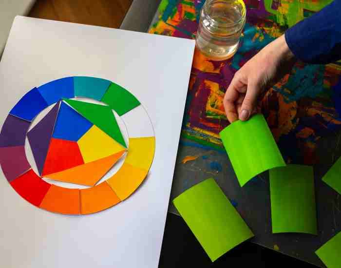
Now, if one were to extract any color from any other color, one would be using the basic colors model, which is red, blue, and yellow. These perhaps should be viewed as the base colors since they themselves cannot be created from any mixing of colors.
Further to the above logic, when two primary colors are mixed in the right proportions, it is possible that orange, green, and purple can be achieved. Essentially, equal portions of two primary colors make these secondary colors.
But this raises the question of what would happen assuming all three primary colors are added? In an ideal world, black would be the outcome, however interestingly enough, brown seems to be the end product. There seems to be more to the puzzle as not all the colors of the universe have been mixed. Complementary colors serve as a perfect analogy to illustrate why brown surfaced and where black is hidden.
The eye accommodates its gaze when a pair of complementary colors combine giving way to black or gray, among other colors. Observe how red and green coexist as pairs that form an astonishing grey along with blue and orange and yellow and purple. Equal proportions of color which seem to complement each other create dark shades of which the gray might be among the sake of example.
Nevertheless, getting a genuine black requires, first and foremost, more than simply blending two opposite shades equally. This entails quite some knowledge into the nuances of not only the hues used but also their saturation, and to some extent, the value. For instance, mixing a warm red with a cool blue will likely yield a shade of black which is richer than two blue shades of a warmer temperature range.
Also, besides the aforementioned contrasting colors, it is possible to form black through various other camps. In print, for example, the combination of cyan and magenta is capable of producing a deep rich black. Likewise, when mixing ultramarine blue and burnt umber, the end product in painting will have a soft black-blue-brown color.
Making Black: The Colorization That Goes Behind It
“Different Approaches to Being Able to achieve Black”
Have you ever thought of what subtractive color mixing really implies? That’s at the core of making a black shade and is a technique that is founded on color theory and on science as well.
When thinking about how to create black, one of the first things that comes into mind is blending two opposite shades together. The opposite shades, referred to as complementary, when mixed together lead to a greyish or black coloration, depending on the extent of blending. For example red and green, blue and orange, and yellow and purple are pairs of opposites that are found in nature. By blending these aforementioned colors equally, one is bound to have a variety of black shades.
The absorption of light is particularly important for the creation of black pigments. Every object in the universe emits visible light. Its surface, however, only emits certain wavelengths according to its structure. /reflects This is the reason behind why many black objects such as black stones or an animal or a person have black color. Since black objects do not reflect more than a tiny fraction of light that hits them, they are perceived by people to be black.The reason behind this is the absence of reflected light. In a sense, “what is not seen does not exist”; hence, blackness simply is the absence of light .
Research that is done by the University of Washington as part of its Department of Physics explains, “Carbon black or iron oxide-based black pigments have been found to comprise properties that are essential, principally because they are capable of absorbing the majority of the light spectrum which explains the black color”.
“Mixing Paints to Create Black Shades.” This paper shows that many blacks in reality are achieved from many other colors including but not limited to blue green red yellow and pink. Most print designs use a combination of red and blue. Magenta and cyan when used in printing achieve good results especially when combined because they create an intensity which results in a very black paint.
Achieving a true black for architectural work would require a lot more than that. Because achieving the right density and proportions of each color is equally as important as mixing the colors. It is not just a case of pallidly mixing the colors because that would lead to an unsatisfactory result. The end result of adding too much of one colour is a muddy mess which is not true black at all.
For example, one can mix ultramarine blue with a little burnt umber to create a rich black blue brownish blend when painting. Alizarin crimson can be added to a mixture of cadmium orange and phthalo green to create a complex black that has red and green undertones.
Studies indicate that the proper ratio of colors in a mixture is key to deriving black shades that are appealing to the eye. As an article in the Journal of Visual Arts Research points out, artists usually try various ratios approximating these colors until they get a blackish color that satisfies them.
So why does comprehending the question of what colors make black matter in several areas of life?
Knowing what colors make black is not merely an academic question; it has practical relevance in several areas including painting, graphic design and more for decorating purposes. To appreciate its importance, let us consider some practical examples.
Painting
In the realm of painting, the black color seems to play an important role when one wants to create some depth to the piece of art. Blends of different shades are also common in creating blacks that would serve the artists intended purpose when painting. For example, one of the most well known artists, Leonardo da Vinci, is known to have used burnt umber together with ivory black, for the purpose of getting blacks that were deep and soft in his works including the Mona Lisa.
Graphic Design
Graphic design is one area where practitioners use black as a base color when performing their tasks. From reflecting stylish logos to advertising simple yet striking commercials, black assists in creating great contrast in black visual compositions. For instance, in creating logos, Apple and Nike use black to show status and class whereas Coca-Cola and McDonald’s use black on their logos promoting and upholding class and history.
Renovations: Black
In interior decorating, black can also be used as a fun accent color to break up the monotony of any room. Black color interestingly does possess some commendable value, whenever a designer accentuates walls, selects the furniture or the decorations, knowing how to add black can go a long way for that room. For example, taking modern living rooms as a case in point, a lot of interior designers utilizing all the black colors available tend to ingrain a lot of elegance and a form of class in them while jam packing the living rooms with the black color amongst a set of accessorizing colors, for instance white or even gold.
To Comprehend: The Importance of Black in Different Nations, Cultures and Sectors:
Black is an important color in these nations, cultures and sectors as it cuts across from fashion, through to branding strategies.
Industry/Culture
Example
Fashion:
The fashion industry – In the world of fashion, the black color is a trademark of class, a fashion that?s elegant. Designers like C Chanel have literally turned the fashion world up-side down with the invention of the little black dress which remains one of the most fashionable and widely used dress for any woman irrespective of age around the globe. The use of black, however is also common in fashion catwalks as it aids greatly in providing a stark contrast in the garments and embellishments to even the most tricky details.
Branding
As far as branding efforts are concerned, black is of great importance as it assists companies in expressing their values and identity as well as their market. For example, Gucci and Chanel have incorporated the color black in their branding as a method of promoting their elitism. On the contrary, Apple and Samsung incorporate black in their designs as an aesthetic for modern consumers.
FAQs
Is it possible to combine every other color in the spectrum and arrive at black?
The answer is yes in theory but in practice, several factors such as the presence of impurities in pigments will make it hard to achieve a perfectly black shade. Territorially speaking, The amalgamation of all colors tends to yield a very dark brown instead of black. This has something to do with color mixing, which is accompanied by differences in pigment properties.
What do you get when you mix two complementary colors in a ratio that is not 50-50?
Greys or browns might form when mixing complementary colors in any other proportion other than equal amounts or 50-50. For example, mixing green and red in a ratio of 7:3 would result in a color which is towards green rather than a color that is exactly a blend of the two. This is all because each color does not get neutralized and as a result it impacts the shade. The primary impact of blend color mixtures is that the final color shifts across the spectrum which ruins the black color the artist or the creator was aiming for.
Conclusion
Summing up, I too believe and understand that black sticks to the color theory, especially in art. Let’s say grappling the science of pigment blending along with the functional light absorption will make each navy of black shine a little more.
Achieving navy blue for an artist could be complex at first but if approached with a scientific mindset, transforming grey or white into it becomes easy. Many artists take the color black too lightly when in real life it is the product of knowledge along with intricacies which are easily forgotten.
There are indeed many uses of the color black. It is a great opportunity to thank black for its versatility. Whether you’re a beginner or an experienced artist, feel free to experiment with black and see the endless possibilities it has to offer. We understand that color theory is a pretty broad topic and at times can get overwhelming, throughout this article, we hope that you enjoy delving deeper into the uses of the color black.
More Post
- What Colors Make Brown? Exploring the Rich Spectrum
- What colors make pink? Understanding the Art of Color Mixing
- What colors make purple? Exploring the Art and Science of Color Mixing
- What colors make orange? Exploring the Art of Color Mixing with Paints and Pigments
- What colors make blue? Explore the Art and Science of Color Mixing
;


