Our thrilling journey focusing on pink! We would like to share on how to make different batches of pink as well as why learning how to mix colors is important. Assembling pink from primary colors is not just creative but rather scientific by comprehending how colors can be combined together and how they can be viewed.
In this guide, we are going to touch on the basics of color theory and also give examples of mixing up processes as well as point out the different roles pink color plays in art works, design, as well as in day to day life. Whether you are a trained artist or a designer or someone seeking to undertake do it yourself kind of work knowing how to obtain a particular pink could be tremendously helpful.

What Are the Primary Colors and Their Role in Creating Pink?
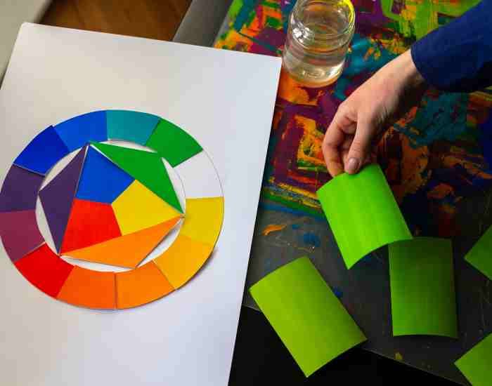
All other colors stem from the three primary colors. Red, blue, and yellow – these are also the colors representing the primary colors in the color theory in terms of painting and prints. These colors give rise to all other colors as no other colors can be derived from mixing them.
What colors are formed when primary colors are mixed together?
All these colors when mixed together give rise to secondary colors:
Red and blue mixed together will result in purple shade.
Blue and yellow mixed together give a green shade.
Yellow and red together form orange.
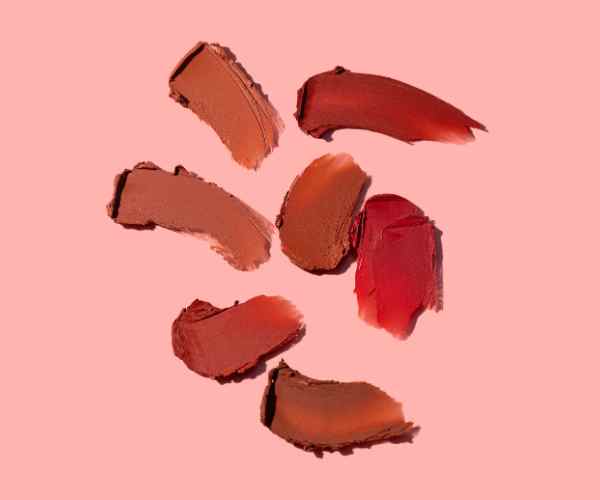
To form pink, which is a much lighter color of red, red is combined with white. Even though white may not be classified as a primary color, it has the potential to offer effective tints, in addition to aiding in the neutralization and lightening of different colors to give rise to pastel tones. A good example can be meshing bright red with a considerable amount of white paint to cover up a fresh look and get gentle pink or pastel pink. This type of pink can be referred to as baby pink.
Statistical Examples In Color Mixing
We might also note that simply blending red and white does not suffice to produce the right shade of pink. One must also take into account the specific red and white being used as well as how much of each is used. According to studies conducted on color psychology, it has been observed that colors can greatly influence both perception and mood which play an important role whenever one is designing and painting. For example, a study done by the University of Rochester concluded that having an environment that has a softer shade of pink would have a calming effect while hot pink would be too stimulating.
Also remember these ratios practically while trying to create the correct shade of pink:
Light Pink: 1 part of pure red to 3 parts of titanium white to create Light Pink
Blush Pink: 1 part red + 1 part magenta + 2 parts white
Salmon pink: Fonned thirty two percent (32%) using one part red, a low intensity of yellow and then white was potted on top.
Certainly these proportions are not mere guesswork they are a direct reflection of the subtractive colour. Mixing method, which is the exact relation pigment has with the absorption and reflection of particular wavelengths of light. It would be ideal to have lighter eye colors to achieve the exact pink intensity one desires.
Does white paint create a certain effect on the making of pink?
The mixing of color paints would not be complete without the use of white paint. More specifically, it has a key function when lighter shades, for example, pink, are to be made. Focused on this descriptive statement, white wash will tone down dark colors and brighten the color which is necessary to make different shades of pink.
Scientific Explanation and Practical Applications
Red color is known for its intensity. It is this quality that is synonymous with the color. When mixed with red, white virtually overshadows or turns red into a more dazzling one. Here’s why mixing these two has an amusing effect. White reflects all colors whereas red absorbs all other colors, absorbable colors including white.
The other thing that happens when these two are mixed is that, there are likely to be more proportions of shade realized than there originally were, although the brightness will however be greater than the intended shade and the saturation lesser than it.
In practical terms, the statement below does have a tangible application when an observation is made on how the different proportions of pink colors alter shades of pink:
Pastel Pink: Achieved by mixing one part of red paint with three parts of white paint. As a result, a calming pink tone of higher brightness and lower saturation is achieved.
Medium Pink: One part of red paint and one part of white is the key mix for this color. It is the color that is vibrant pink but has a good mixture of both the brightness and colour saturation.
Studies conducted in Yale University and other color psychological studies indicate that more calmer or lighter shades of pink create a peaceful feeling as well softer pinks make a accentuate attention. This is especially helpful to designs and artist who want their portrayals to show emotion.
How do you get other shades of pink through pink?
Simply put, getting other shades of pink does not only include altering how much red and white you use you can bring in an entire array of new colors for new shades of pink.
Combining with other colors
Peach Pink: In order to get this soothing shade mix red with a little orange and a lot of white. The addition of orange makes the pink less harsh.
Blush Pink: This nice and soft shade of pink can be achieved by mixing together the colors red, white, and just the slightest hint of blue. The touch of blue makes the tone a bit cooler perfect for a calm and soothing pink.
Magenta Pink: Take red as your base color then insert purple at a very minimal percentage (10% in this mixture) then top it with white. The result of this combination is the bright rich pink shade.
Additional Examples and Data
For designers whose aim is to alter emotions or reactions, understanding the use of these mixtures is vital. The interior designers for one, have painted rooms in peach pink to evoke warmth or hospitality which a research by the Interior Design Institute of America, explains, has been proven to increase dwell time in businesses by as much as 20%.
Also, these factors are crucial in determining sales of products in the case of fashion and cosmetics. According to Fashion Institute of Technology, hairstyling products that had blush pink in their logo sold more at 15% than those that had either bright or dark pink colors, reason being its acceptability and class attached to it.
Adding Pink Color to Different Media, Suitable Techniques
To hit the right shade of paint, one needs to understand the type of media they are using, be it oil, acrylic, or watercolor which is best for mixing as each differs. That is to say color combinations and their gradients are affected by the pigments each medium contains.
Step-by-Step Instruction for Different Media
- Acrylics: From the shade of red first add a little dab to your palette. Slowly, gradually add white acrylic paint until you get that small desired pink tone. Moving on, use a shade that is a bit lighter than the one you have as target in the end. This step is important due to the fact that acrylics dry out darker in color.
- Oils: Use titanium white with red oil paints and combine. Because oils have long periods before they dry, they normally combine perfectly and thus allow you to manipulate and fine-tune the color. Instead of risking the vibrancy of the color, use linseed oil to make the paint more thinning.
- Watercolors: Mix water with red watercolor to lessen the concentration, and the white gouache to gain both opacity and lightness. It’s important to bear in mind that watercolors dry out lighter and therefore expect a paler tone when dry than when damp.
To Make Sure All Shades Are Always Even
Try to mix more than required so that you do not end up running out of the shade. This is important as you don’t want to be in a position where you have to try to reconstruct the shade again.
Use a diary to keep the logs of the color ratios you had used in a particular project – this would serve as a great help whenever you are looking forward to recreating the particular project later in the future.
Regardless of the media you’re working with, always do a blending test by trying the shade on a spare piece of paper or fabric. That way you will get to know how it dries and if needed make any alterations.
How can you obtain a better shade of pink in digital design?
To achieve the desired shade of pink in digital design, RGB (red, green and blue) or HEX codes can be utilized. Knowledge of the color theory is helpful in obtaining the required shades always regardless of the electronic device used.
Using RGB and HEX Codes
When creating pink For web designers, a good start would be an RGB value of 255, 192 and 203. With this, the designers should be able to achieve soft, light pink. In some applications, the shade can be referred to as pink in web applications.
Conversationally, pink inflicts HEX Code #FFC0CB or #FF69B4 if used in a brighter shade. In programming and software development paints are brought into practice with the use of hexadecimal color codes that nearly appear in all pages of the web.
Maintaining Consistency
When you make all digital art in a single color profile called sRGB, you increase the chances of getting the desired color on every screen.
Using several devices, check if the pink changes on other screens. If it does, you may think of reducing the brightness or the saturation a bit.
Keep in mind the locations and backgrounds of your designs. The colors utilized in your design can be impacted significantly by the background.
How to acheive pink fabrics via mixing dyes?
When changing the color of fabrics by sinking them in water and other chemicals, there are two types of dyes that can be used: natural dyes and man-made dyes. Each dye has its own set of pros and cons.
- Natural colorants: Take out the stoned part of avocados or cut beat roots, the rest will be used for preparing a natural pink dye. Place the fabric keeping dye source under constant heat in water until you reach to the required shade.
- Synthetical Found: The use of synthetic fiber reactive colorants can be more pleasing for those who like to have a light pink. These synthetical colorants are absorbed into the structures of fabric fibers to be tightly bound, so the fabric will remain colorfast for a long time.
How to Get Perfect Results When Working with Fabrics Color Dyes
Fabrics should always be pre washed to get rid of finishes that may impede dye penetration.
To increase the dye bond with the material, a parent or mordant must be used to help to fix the dye. This is more important with organic colorants.
Always perform a color test by dyeing a small fabric sample to achieve the required result before doing larger pieces.
Real-Life Applications of Pink Color Mixing
Pink shades in an interior design scheme do not only serve a decorative purpose. They are able to influence the mood and atmosphere of a room. Each tone of pink depicts a certain emotion; hence, they can be used to create a certain style and feel in a space.
Using pink to enhance both mood and style A couple of common uses of light pink is in bedrooms and bathrooms, given that they are designed to promote calmness and peace. Pink rooms knock 30% off the stress levels of those who enter them when compared to darker shaded rooms as previously researched by the Environmental Psychology unit of the California University.
With the likes of hot pink, bold pinks tend to feature in play rooms or fashion boutiques. As a result of such practices these shades are believed to boost energy levels and promote creativity, aspects critical in the spaces they have been placed in.
Real-life Application of Pink in Interior Designs Residential: A New York City apartment has a living room with dusty rose walls and navy blue, metallics accents that make a warm and elegant space.
Commercial: The Miami Boutique Hotel’S lobby has been designed with blush pink accents, green and golden tones which help to market the hotel to the younger population due to its luxury class feel and trendiness.
How Is Pink In Fashion And Apparel Used Mostly? Pink Has Long Been A Fashion Color For Many, It Has Been Seen In Casual Wear Attire As Well As Couture While Adopting Various Styles And Fashion Trends.
How Female Fashion Designers Incorporate Pink Color Tones Into Their Designs
Baby pink: This color tone is old fashioned and usually associated with the spring collection, however its easy to combine and style with other colors. There are designers such as Marc jacobs, who has been able to incorporate this color into both women’s and men’s collections which further showcases that this color has no specific gender.
Dark Pink: This color tone is one of the more popular statement tones, as it can be quite bold. An example of a dark pink suit styling, was which was introduced in the Fall collection by Versace, which had the combination and traces of being both bold and business-like.
Baby and pastel pinks are ideal for many spring fashion trends but more muted pinks can change the composition quite considerably. Reports in the fashion industry show that the sale of pink clothes saw an increase of 20 percent in the spring compared to clothes of other colors, simply due to customers being more inclined and attracted to the warmer tone.
How Can The Color Pink Be Defined As In Decorations or Art Pieces?
Most of the time pink is seen as just a color in decorations and other art pieces, however it can be seen as tone that represents and speaks for itself in many ways.
Use of pink in Artistic Works, Modern Decor, and Other Forms of Art
Pink is a color that is frequently found in high end art, with example being people like Jeff Koons who used hot pink to compliment a piece focusing on contemporary media and xonism.
Pinks can be grown on decorative art as well, they can be used on things like home decor, while adding a softer touch or accenting features like cushions, wall art and curtains.
Pink hues have quite a pronounced impact and this impact can either be emotional or psychological in nature.
Soft Pink: color is often described to be soothing in nature and is very warming as well, hence, it finds itself being put to use in places where there is a need for calmness, which makes it perfect for hospitals or even wellness centers.
Bright Pink: It is used for brightening spaces that require more energy and life in them such as kid’s play areas and even elementary or creative stududios.
Frequently Asked Questions
What is the combination of color paints that make Hot Pink?
Hot Pink is made by starting out with a strong or light shade of red as a base and combining it with less of a magenta which enhances the red, then use some white to make it more vibrant or light. Roughly for every part of red used add in 0.16 of magenta and adjust white to how light i would want it to be, because of the specific amount of red there could be slight variations. In short, to get hot pink, all you need to do is mix a strong light red with either a magenta or white while keeping in mind the specific quantity. The exact proportions differ in accordance with the medium you use!
How Can You Create Pink Color Avoiding White Paint?
If there are no paints in white then lighten red with yellow or orange or mix the red color with a lighter shade. For example, mixing red with a tiny amount of light yellow can yield a lovely pastel pink hue. This is particularly helpful in mediums like watercolors or dyes where white is not added or preferred. This method is based on the principle of subtractive color mixing which combines colors by reflecting wavelengths of light.
What Mistakes Can Be Avoided When Mixing Pink Colors?
There are several errors you can make depositing afraid of the first red color used, ignore this when making pink. For instance, reds with an orange or purple hue when placed in a shade will affect a painted pink differently. Another mistake is the usage of incorrect ratios making either the pink too saturated or too pale. It is better to always start with less color and add more if needed. Not testing the color under the light it will be used in can also be a problem as colors can change under different light sources.
How does the material impact the overall pink tint?
The selection of the material determines the final pink color. That is, different materials absorb and reflect pigments in a material in different ways.
When it comes to textiles, a different type of dye or even dyeing concentration may be needed to obtain a particular shade of pink as it is with paint.
Digital formats will reproduce pink based on other digital models and the users monitor and other settings, which involves its brightness and its hue.
In paints, the shade of pink might also appear differently depending on the type of pigment in use, the opacity of the paint, and even the underlying surface color.
Conclusion
From fundamental color theory to applications of pink in various mediums and fields, we have ventured pink to its interesting spectrum. In addition, having an idea on how to manipulate and create various shades of pink covers endless possibilities in art and design, to mention but a few.
Get adventurous with the techniques you gather here and discover the various shades and moods that pink can provide. Don’t be reluctant to show your pink creations or share your experiences on mixing these hues.
If you wish to continue the discussion of color mixing or, on the other hand, wish to seek tailored advice from other color enthusiasts, please feel free to do so on our community forum or the comment section below.
For further reading and a deeper understanding of the topics covered in this post, consider these resources:
- “Color Theory: An Essential Guide to Color—From Basic Principles to Practical Applications” by Patti Mollica.
- “Interaction of Color” by Josef Albers.
- Various articles and papers from the Journal of Applied Color Psychology provide insights into the emotional and psychological effects of colors.
;