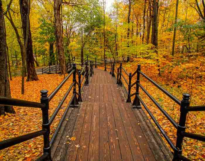
You may learn how to blend fall landscape colors to turn your garden into a stunning autumn scene by simply following this guide that breaks it down into steps, tips, and techniques. The ultimate goal of this is to effectively master fall colors, right from the rich reds and oranges to the yellow and purples that the end of the year entails.
Every great thing starts with understanding the basics, and in essence, a beautiful landscape in the fall commences with a basic understanding of The Color Wheel and Color Theory. Color theory can be defined as both a science and an art. It enables individuals to grasp how the human eye sees colors and whether colors can be combined into one hue, how the colors coordinate with each, and what messages a single color or a group of colors sends.
These include Blue, Red and Yellow. Red, yellow and blue are the primary colors of the color wheel which simply means they are the base from which all othe colors can be derived. In terms of your autumn palette, it is important to note that primary yellow, blue and red relate to each other because they are blended to form the secondary and tertiary colors which comprise the rich colors of fall.
The secondary colors arise from mixing the primary colors:
Red and yellow produce orange.
Yellow and blue make green,
blue and red give purple.
These combinations are only the beginning of a quest to creating a colorful Autumn scenery.
Complementary Colors: These are the colors that lie opposite to each other on the color wheel, when placed together they provide sharp contrast and visibility which enhances their brightness. This principle is useful in increasing the brightness of your landscape. For instance, in the winter months, clear, blue skies can make the vibrant orange tones of autumn leaves look even more pronounced against them.
Being able to visualize the color wheel and how complementary colors work together can help you improve the dynamics of your landscape and garden. This principle hence allows strategically arranging colors such that they complement one another, thereby enhancing the look of your landscape while making the fall colors more prominent and giving your garden a professional look.
Choosing Your Fall Color Palette: Tips and Ideas
Choosing the right fall color palette for your garden is like arranging the notes of a masterful composition; every nuance and tint matters. The aim is to maintain the existing colors of the garden to the fall colors and create a blending of the two seasons.
- Evaluate the palette of your Garden: Start by analyzing the colors in your garden at present. Concentrate on the scars of hardscaping, structures, and evergreens which are the fixed elements. All the elements you want to use fall colors for should support this feature so as to visually organize the old and the new elements that would be introduced.
- What is the mood you want to create: The word ‘autumn’ evokes thoughts of blanket wrapped up evenings by the fireplace. Identify what type of atmosphere you want to create do you want to go for an overpowering display of reds and oranges or an easier appeal with yellows, purples and blues. These will be your most relevant considerations because they will influence how your garden space feels.
- Refer to the wheel Use the color wheel for clarification purposes. If you would rather the scene be more dynamic and bold, select complementary colors, otherwise, use the analogous colors (colors that are side by side). Adding different tints and tones of these colors would increase intricacy and complexity.
- Incorporate Nature: Also remember to use tree branches, tree trunks, and foliage. These can add a different assortment of fall color and texture to your solitary garden. Tree trunks and branches can act as a neutral border that allows the colorful leaves and other foliage to as it were pop out.
Some Practical Steps to Paint Your Fall Layout
You will agree that making an autumn landscape painting is a little more than just getting the colors right, but also involves perfecting the techniques.
Getting the Right Brushes and Paints: For landscape painting, a filbert brush is a good option to consider. It has a rounded tip that can create soft edges which are ideal for the curves of tree trunks and leaves. There is no doubt, fall captures the visually appealing color however, acrylic paint is more so during the harsh drought periods as it is more flexible than other paints.
- Landscape in a Sketch: There after, it is good practice to sketch the layout before you paint. This will assist you to work out the composition and position of individual trees, branches, or even other foliage. Always remember the light source as it will influence the colors and shadows within the painting
- Painting the Background: In general, start from the sky and distant elements first. Setting the frame with such detailing and smoother leaves will allow the images within the foreground to be highlighted.
- Adding Tree Trunks and Branches: Paint tree trunks and tree branches with a mix of brown and gray with touches of white or yellow for sunlit areas. But try to keep it as naturalistic as possible, considering how the tree trunk flares towards the bottom and the branches thin towards the end.
- Bringing in Fall Colors: Alright, let’s move on the better part, the fall colors. Use a filbert brush to put on leaves of all the fall colors. When close to the viewer the leaves look bright while those further away are light. When leaves are coated on the branches, it’s also a good idea to change the amount of pressure used to press the brush onto the canvas since different sizes of leaves are more realistic.
- Adding Depth and Details: And last but not least, adding depth and detail to your work is crucial. Darkening certain portions while highlighting others helps in the illusion of shadow. A few details like a couple of leaves floating in the air or small branches growing through the trees can really enhance the overall quality of your autumn landscape.
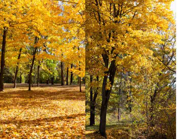
Using Plants and Trees for the Gardens’ Autumn Feel During autumn the gardens can be made to look very appealing and in harmony with the season with the addition of the right type of fall trees and plants . The quest to give your garden a beautiful autumn look or a fall landscape starts with choosing the right kind of seasonal plants to adorn your garden. Recommended Plants and Trees for a Beautiful Look in Fall Minnesota’s overall state tree is the quaking aspens that have breathtaking golden yellow leaves amidst soft white bark along the tree. When the sun shines light through the shaking willow leaves of aspens, the low angle light is perfectly stunning. Adding to the beauty of the trees are the dogwoods which provide extremely bright berries. They include deep purple and red flowers that are worth the space in the garden. Also, birds love them enhancing the essence of the entire garden area. Sedges are also an important plant and can be used on the floor since they are colored in brown and gold will enhance the texture of the 3d garden.
Guidelines for Putting Together These Plants
Layering for Depth: Device vegetation and trees in a manner that they sit at a variety of levels in terms of height and depth so as to create the layered planting look. This adds dimension and makes your garden look fuller than it is. For instance, taller trees such as aspen trees can be placed at the back, dogwoods can be positioned in the mid-section, and lower sedges can decorate the front.
Think about how much light plants get: Grow your plants where they will gain the required amount of light needed to exhibit their colors in their best. For instance, full sunlight makes aspen trees develop better and strengthen their gold coloration as days become shorter.
Create Natural Pathways: Make an arrangement of trees and plants planted one after the other in such a manner that they force your eyes and body to look and move around the garden. This may make the visit more interesting since the people will see each plant in the garden closely.
Advanced Techniques for Putting Together An Awesome Fall Tree Scene
When putting together a fall tree scene, aim at applying all the available colors and wide range techniques including advanced painting skills that will increase the level of realism and detail required to make the painting attract people.
Dabbing a technique with a filbert brush or even a sponge is quite useful for depicting trees in landscapes as it is an easy way to create tree Canopies. It gives a more realistic appearance to the painting as a number of shades can be utilized without it appearing unnatural as different shades can be blended in together. So, simply varying the pressure along with the amount of paint being used suffices the needs.
Using Berries For Emphasis
Red and Yellow Berries: Adding yellow and red berries on the landscape can also serve to be a great point of focus in a way that it relays the attention of the viewer across the area of the painting and its various elements. Such colors remind of rays of sun falling everywhere over the tree.
Strategic Accenting: Add such relatable elements in the landscape where one requires a person to look. Also to diversify the balance in the picture. For instance, don’t overwhelm a picture composed of green pumpkins with too many orange and red nodes, instead juxtapose many orange or red clusters there.
FAQs
How do I make my colors of the fall landscape look appropriate?
When talking about ensuring your colors of the fall landscape look natural, it’s a matter of paying attention to nature and having a basic understanding of the color wheel. Here are a few forays toward realism:
- Observation: First and foremost, check the real-life equivalents during the autumn season. See how colors tend to appear and change in relation to the available light or other colors.
- Source: If your garden is going to be painted, take photo references of autumn scenes if you have them. This can make you go about arranging things in the same places and more or less the same colors as they have been naturally arranged.
- Soft edges: While painting and while making a garden, rather than making everything the correct color, use soft edges and ornaments with multiple shades. Solid colors are very rare in nature; more likely, there is a smooth gradient between two colors.
- Mix it up. Include some of every fall color design, no matter how dark red or bright yellow it is, and even an orange. The more diversity there is, the more realistic and less fantasy-like your landscape will be.
When is the best time to paint the realistic look of fall into my painting?
The best times of day to capture the true colors of fall in your painting are during the golden hour, which occurs shortly after sunrise and before sunset. The angles at which sunlight hits the subject during the early morning and late afternoon are different. This boosts the amount of warm colors that are scattered and adds the length of the shadows created. A landscape painting featuring the golden yellows, fiery oranges, and rich reds of autumn can be even more appealing to the eye with the help of golden hour complementing hues.
Is it possible to combine watercolor and acrylic paint on a fall landscape?
You can mix and combine watercolor and acrylic paint for your fall landscape painting, however, it is important to know the outcomes that each medium will give. Acrylics are thick and dries fast which enables application of layers and textures while watercolors are thin and gives a more gentle and stream lined look. Combining both paints in the correct way would greatly help the final outcome. Here are some pointers:Use watercolor for the first few layers which is typical during fall and softens the creases. Once that is dry acrylic can be use for finer details and texture.
Combining Techniques: Including a watercolor base, which can serve as a first layer, in your piece, overdetailed with acrylics, can achieve an interesting quality. Just ensure that the watercolor part is cured thoroughly prior to applying the appliques.
Final Words
Gardening as well as painting, or augmenting your garden landscape with the colors of the fall requires a lot of creativity, knowledge of how to mix colors and respect of the environment. If you want to make a great impression during this cool months, follow these tips and techniques provided and you are sure to create the warm and vibrant autumn piece.
It is worthy to note that in order to capture the desired effect, particularly if it’s a fall landscape, whether in painting or gardening, one has to make use of various intricacies relating to the different shades of fall, textures and layers. Enjoy what the fall seasons brings and allow the landscape master in you to come out. This way not only will you enhance your creative pursuits but also appreciate the beauty of the fall season even more.