Welcome to the colorful world of color theory! This guide has been designed with absolute novices in mind and so it acts as a bridge that leads them to a place where colors melt, blend and contrast. Right from the color wheel, to the changing dynamics of color psychology and even how shapes and colors are the building blocks of various spheres like art and design, fashion and even everyday life, everything will be left fully explored.
Having integrated color theory both in their professional and day to day activities, I have seen how color changes the perception of everything and the impact it has on society. It could be choosing the ideal set of colors for a company’s logo, selecting the harmonic tone for a stunning art, or maybe even picking the clothes that one enjoys wearing those are just a few instances of where color theory can be applied.
This guide, however is not only about learning but it aims to motivate others too. By combining some of my own life experiences together with professional input and some imaging techniques, I will help you in this multi-colored universe. Treat this guide as your virtual art best friend who not only shares new art tips every week with you but a monthly graph that will fill enlighten you with colors.
The Foundations of Color Theory for Newbies
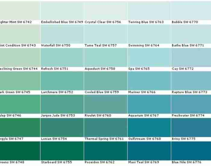
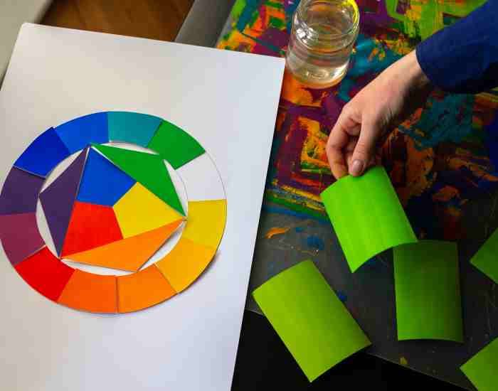
What do you understand by the term color wheel? How important are they? The color wheel bursts with a boom of color: it showcases the interdependence of red, yellow and blue which are the primary colors, the secondary colors which include orange, green, and violet, and the tertiary colors which result from the blending of the primary colors with the secondary colors. This circular presentation is important for those who wish to design or create a form of visual art. It’s not just looks, it is the grammar of the color.
Indeed, primary, secondary, and tertiary colors are explained in further detail. We can now take a closer look at the colors, how the selected primaries work together to provide a large number of hues and shades that add to the visual picture. Primary colors as expected, are the building blocks that make the great color universe. When these primaries are mixed in different ratios, we get the secondary and tertiary colors which allow for more creative and emotional expression with color.
Meaning Behind Colors Mythologies History
What do you think are the colours which we have around us and how do they interact with our surrounding. Anguish can be felt in color red and peace can be felt in color blue while joy can be represented in colors like yellow and orange which shows the power of colour psychology. We as human beings tend to have a certain interaction with certain colours making us feel happy, putting us in a state of calm or anxiety. It once again comes down to the fact how colours can be representation of a variety of feelings.
Crucial elements and the science behind Human Behaviour. In order to be able to capture attention or foster a certain interaction colors are a vital aspect in marketing strategies. It is remarkable how a subtle shift in a colour can have greatly noticeable impact on a person’s subconscious which many people are unaware.
The Psyche And Its Interaction With The Colour Wheel
The Interactiveness of primary colours with secondary colours. The Colour Wheel has many applications in the world of design and art. A proper understanding of primary and secondary colours can help you build a beautiful composition from scratch. Three colors which are close to each other are called triadic. While knowing how to combine these colours can drastically change the feel of the art. Using complementary and analogous colour schemes may give your art the edge or feel it was missing and help bring the art to life. It all depends on the depth of knowledge you have while interactively combining the primary and secondary colors.
From monochrome to complementary schemes – a colors schemes guide. All through time, artists and designers have sought after skills of grabbing one’s attention and creating balance through color schemes. This is achievable through a multifaceted use of color in designs and colors in a more simpler use on a_colour_ background. It could be as simple as a monochrome scheme that is not a double threat or as cosmological as a complex complementary scheme, it simply depends on how the idea is being created.
Color Theory in Art and Design
An eye-opening research reveals intensive usage of color through artworks. Throughout history, a king’s tale would most probably end with his portrait; together with his armies both in vivid color and full buzzing motion, all beautifully captured in a painting. They were able to do that because thanks to them and even now a large scientific body of work revolves around studying famous paintings and quotes. Such as numinous ones like a Van Gogh Starry Night that portrays a bright colorful sky and exciting stars dazzlingly twinkling throughout the painting. Together they have movement, intensity, and depth to them without even explicitly stating so.
Make sure to apply color theory correctly while creating your own pieces. Yes, color theory can be seen as rules but it’s also the way to use colors to engage and connect with the audience. A better way to start would be creating simple designs using the limited palette to understand the intricacies of each color and its saturation, value, and hue. This can be beneficial when creating more unified and diverse pieces in digital design, painting, or other visual forms mediums.
Using color theory correctly can make someone look stylish.
Gosh, There are some colors that complement the skin and others dull the skin, you don’t want that to happen. So wear appropriate clothing colors. remember that there is a warm side and cool side of colors. This means if you wanna get certain features to pop such as the skin, you can complement the tones with the corresponding clothing. For example: A person who has a cooler skin undertone would look attractive in blue, purple clothes while people who have a warm tone look beautiful in orange or yellow.
The importance of color trends in fashion. The fashion world as well has color trends predicted and set by the might of color theory as it influences consumers the most. By anticipating color trends, designers approach the creation of collections that aim to target not only the present market but the intended reaction as well. An instance of this is how color trends in fashion steer towards pantone’s Color of the Year which portrays the trend and the most appropriate colors for that certain time period.
Color Theory in Home Decoration
An ideal perspective can be attained with color. The color schemes of our homes are paramount in determining our state of mind at that moment and our mental stability in general. For example, the use of color theory enables one to pick out paint shades and ornaments for a particular space to create the kind of vibe that is most desirable. For example, soothing blue tones would be ideal for a resting area in order to encourage relaxation, while bright yellows would liven up a kitchen or dining area.
The influence of color in large versus small dimensions. Alongside the transformations of shape, the modulation of color may also augment or minimize the perception of space within a room. Soft pastel shades cool tones and increase the sense of space in the modest rooms. On the other hand, deep hues, particularly red, make large rooms feel more personal, limiting the structure’s volume. By using the principles of color theory, you can set the mood of any space and customize its appearance to suit your needs and requirements.
More Color Theory Concepts
For color to be present, how does the eye see color …: this is a brief over microscopic anatomy regarding vision perception of colors: color vision begins with the light focus on the human eye in order to perceive econometrics of colors around. When light strikes an object, its certain wavelengths are absorbed while the rest are reflected from it. These reflections come to our eyes and the neurons in the brain interpret different colors. This is a fascinating process, which enables us to see a variety of colors and tones. It is a complex action that creates the basis of every visual experience.
The importance of the light quality and direction in relation to color perception. The source and quality of light play a pivotal role in how colors are perceived. The color may look different depending on natural daylight, fluorescent lighting, or incandescent lighting. It is the responsibility of all artists and designers to know this principle as it affects the choice of colors for the work. For tones to have the intended effect on the viewer, there is need for an artist to consider the lighting in which the piece will be viewed.
The Color Temperature
The dichotomy of warm and cool colors: a panorama of understanding. The warm colors – reds, oranges and yellows are colors most associated with energy, passion, warmth and the sun/ fire, whereas the cool colors, greens, blues and purples give out calm, serene and fresh feelings with the latter being associated with water, sky and trees. With this understanding, artists and designers can strategically use warm and cool colors to add depth and emotion to their works.
How color temperature affects emotions and aesthetics. Color temperature determines the emotion of a piece and the appeal of that work. Warm colors tend to elicit feelings of majesty, and ease encouraging the viewer to engage, while cool colors are reassuring and even make spaces feel larger. For example, people often use a rule of thumb that states that if you warm a color palette, you make the atmosphere different, which changes the feelings evoked by the artwork. Thus, a room painted in cool blue colors is said to be spacious and soothing, while one with shades of deep red is said to be lively and inviting.
Frequently Asked Questions
How can I enhance my knowledge in color theory?
For this who are interested in becoming more knowledgeable about color theory, there are many books available on this topic. Some of the most famous art books include The Art of Color by Johannes Itten and Color and Light by James Gurney. You can also look at websites Color Matters and Adobe Color in order to begin learning color theory unfoundamentals and advanced concepts of it. Other than that, you can also seek out courses or other material that is found on sites like Coursera, Skillshare or Udemy. From these sites you will be able to enter more structured lessons introducing you to color theory all the way through telling you how that concept can be applied through different mediums like art and design.
What if I want to practice color theory but don’t have a background in art?
There are many ways to become a connoisseur of color theory, however it isn’t necessary to have a degree in art to appreciate color. Start with the basics, pay close attention to your surroundings and the different colors around you. When dressing or dressing your home start considering the probability of a color wheel or a color scheme together. Photography is another useful medium through which you can capture and make use of different color palettes.
Are the principles of color theory relevant to digital media?
Certainly! The color wheel is important for the internet as much as it is for physical mediums. In web building, knowledge of color scheme may aid in the user experience by directing and helping the right emotion to be expressed. In computer graphics and animation, it helps to achieve the desired visual balance and design aspects that appeal to the audience. Even in video game development, color is always important in building up an atmosphere, defining the personalities of the characters and even the structure of the game. Knowing color theory and doing it well will definitely make your designs reach out to people you want and make them feel what you intend.
What are some common errors made by novices in color theory?
One of the key mistakes that students make is ignoring the emotional effect color has, heading into visual layout with the wrong meaning. The other major flaw is using excessive amounts of color without much thought which only serves to create chaos. Beginners might also lack the ability to create sufficient contrast between elements in a design, making some of the elements indistinguishable. Consider these mistakes to rebuild your understanding, shift your perspective around color saturations, explore the emotions evoked by different colors, and develop color schemes that set out to achieve these goals. Always remember, it is necessary to analyze the situation in which your creation will be examined.
Conclusion
There is no single approach to color theory; it is about understanding a world filled with creative possibilities. If you love color, but you are a fashionista, a designer, or even an artist, it is critical that you know the key principles of color theory. This trip into color theory is about invention and appreciating the eccentric—take it in your stride, and without fear. Try out different combinations, disregard the conventional approach to color and let your imagination take control. The universe is indeed your template and now, with the wisdom you have just received, you are able to create it like no other person. Let the shades of your understanding be the theme, the piece, and the communication medium within the visual paraphernalia.
More Post
- How Do You Understand Warm and Cool Colors? How to Tell the Difference
- How to Mix Fall Landscape Colors: A Comprehensive Guide to Painting Your Garden with Autumn Hues
- The Enigmatic Spectrum: The Black and White of Acrylic Paint
- What is the Difference Between Tints, Tones, Shades, and Hues?
- How to Mix Different Shades of Purple Paint Color?