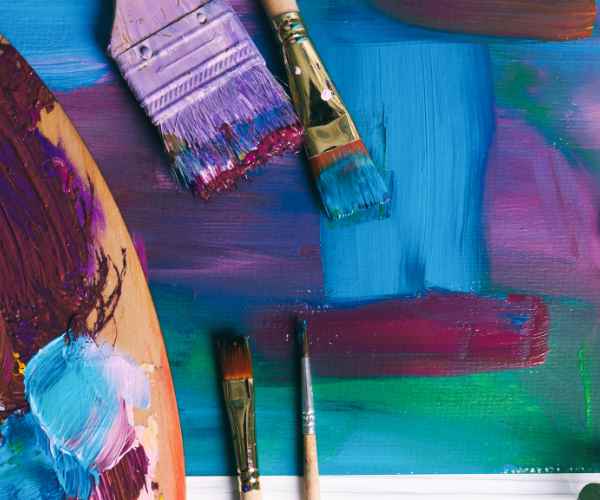
When I was about to start painting the beauty and the tranquility of the twilight classic in my painting, I ended up being held up by an unanticipated problem. I couldn’t find the right blue that best suited the moment. I was not looking for any ordinary blues. I was looking for a blue that would have such a story to tell even in silence — a blue that possessed the depth of the evening sky. So, this, in time, became a quest in itself, a saga of sorts, weaving a tapestry of shadows and shades until finally, I was able to derive the ideal tone from my palette that could overpower any of its contenders. That blue had a perfect touch of dusk in it.
This manual seeks to explain everything related to color mixtures and utilization, starting from the features of mixing paints and shades of blue to clouds and the ocean as well as of deep water. Any aspiring artist should have the knowledge, and guidance to taking on such an expedition as the reader clearly possesses. The principles of color theory, combined with the in-depth study of the great many types of paint, will show you how to make a new blue of any desired tint considering the limitations of that color. It is absolutely necessary to comprehend how the different tints of blue affect the mood of the entire work including the piece as a whole and the relationship between each individual blue separate. So remember, blue is more than just a color—it’s an emotion.
The Basics of Blue
Psychology of the Color Blue in Art
The color blue in its various shades from the pale hue to the deep blue has the potential to create an impression the tone of the artwork. For example, light blue colors that are often associated with the sky or water would create a relaxing feeling. On the other hand, dark blues such as navy or midnight blue usually have certain strength and depth, close sometimes to sadness. These different emotions felt when looking at shades of blue are indispensable in art, with regards to how the observer interprets and feels the painting.
A publication in the Journal of Experimental Psychology reported on a study in which participants who were looking at lighter shades of blue ranked themselves calmer and more creative compared to those looking at darker shades of blue, who instead ranked themselves feeling sad or introspective. This brings to light the extreme sensitivity of blue hues in terms of psychological perceptions and thus stresses the need for blue’s nuanced selection by artists. For instance, Van Gogh Starry Night is more of blue shadings where the sky is alive with color and motion that portrays the vivid imagery blue conveys in any form of art.
The Color Wheel and Blue
Every artist needs a color wheel, which provides the spatial sense of color and its harmony. At a primary level, blue is a primary color meaning it is a basic color for the rest of the colors. It’s association with secondaries (green and purple) on the color wheel and tertiaries (e.g.; turquoise and violet) allows range of shades and tints to be spawned.
Knowing the color wheel greatly maximizes an artist’s potential in mixing paint. For example, blue may be combined with the color orange in a way that diminishes the blueness entirely or any amount in between, resulting in a more sophisticated hue. This is essential when trying to obtain navy blue since it almost always requires the combination of blue with a touch of its opposite color to make it darker or some other dark shade without altering the navy blue strength.
An artwork conducted by a team of M.F.A. students claimed blue could be combined with other colors in naples yellow and white in various amounts and achieve fifty different colors that ranged from the pale colors of dawn skies to the foggy colors of the deep sea. This emphasizes the applicability of blue on the color wheel and the countless ways it can be applied for self expression in art.
The Painting Color Theory
It is important to emphasize the science of color mixing to any artist who wants to perfect the skills of painting, especially when it comes to the use of such a multifunctional and popular color as blue. Artistic inspiration should and can be easily achieved through the practical use of vibrant colors and numerous theories that govern color combinations. The current section therefore seeks to expand on the theoretical aspects of color and the practical blue paint color mixing techniques that have been widely and effectively used providing a detailed review sprinkled with figures, illustrations and expert commentary.
An Introduction to Color Theory
It assists the artist in the art of mixing paint in order to obtain the preferred or the required color and its variety of hues shades and tints. One of Ivan’s main highlights of color theory is the idea of complementary colors, which allows mixing two colors situated on opposite sides of the color wheel to produce different shades of the basic one.
For example, one must always bear in mind how orange, the complementary of blue, will affect any of the consequences every time a combination of different shades of blue is utilized. Studies show that the minute and relative introduction (around 5 – 10 % of the blue base) of cadmium orange or burnt sienna to blue paint changes its hue or tone quite a great deal, bringing about shades that reveal more characteristics than were previous apparent. This technique is especially useful for creating convincing shadows, for making cool shades warmer, or for giving more true-to-life colors to places with skies and waters, for instance.
The Journal of Visual Arts Practice also published a study which showed that the implementation of complementary colors into mixes by the artists expands the palette possibilities and increases the naturalness and salience of the pieces of work created. For instance, if blue-named ultramarine blue is mixed with a trace amount of orange, a shade of blue reminiscent of deep skies just after sunset can be achieved.
Blue Paint Mixing Techniques
All blue paints have some paint which you cannot avoid mixing, so it is essential that you understand what the properties of the base paints are. A good pair of blue hues to possess since they are amalgams of cobalt blue and ultramarine blue. If , for instance, you wanted to slightly change the blue palette from that which is warm to one that is cool or vice versa there is a shift that can be made by altering the hue using either cadmium orange or alizarin crimson.
How do You Go About Completing the Required Work:
Primary Blue, Cobalt Blue Or Ultramarine Blue. The mixture is so much more stable when these blues Are added. When combined with dioxazine purple, an ultramarine shade that is violet leaning can be more cool. If cobalt with some yellow or cadmium orange is used an undertone cobalt can be utilized.
- Creating Tints and Shades: To achieve shades, one has to subject the blue base colour to the white hue (like titanium white) which works well to make a depiction of skies and the ocean. On the other hand, black paint or burnt umber is able to deepen the richer tone of the hue which is fundamental in professing deep imagery of an ocean landscape or the dark décor of a night background. Always remember these colours should not be applied in plenty, a good rule of thumb is to begin with somewhere near a 1:10 ratio and alter it as per your requirements.
- Percentage Mixes: Keeping note of the weighted percentages or ratios of mixture of the paints can help you touch up the reapplication of the shade in a future painting. For example, one painting depicting a blue sky should include 90% of ultramarine plus 2% of cadmium orange and 8% of titanium white.
Case Studies and Examples:
- Sky Blue: The combination of 92% of Ultramarine Blue, 2% of Cadmium Orange and 6% of Titanium White is recommended particularly for the clear’s sky’s depiction during daytime’s landscape painting.
- Navy Blue: For creating a very eye catching scene during the night time or a depiction of the depth of the sea, addition of 5% burnt umber into 95% cobalt blue will create a strong navy blue color tone.
- Turquoise: A captivating shade of turquoise can be achieved by using 85% cobalt blue, 10% white, and 5% cadmium yellow, but yellow can easily be changed to control the greenish tint.
Practical Tips for Getting the Blue Color Right
It is an important creative skill that is about countless experiments, learning how to manipulate various properties of the different paints on the spectrum. In light of this, the range of base blues and mediums selected largely determines how the resulting artwork is. That is why this segment highlights practical tips as well as some lessons learnt in the practice as a painter to assist novice and advanced painters to handle color and media combinations whenever the need arises.
Your Base Blues Should Be Chosen Carefully
The palette of blue hues owes is richness to the quality and diversity of the base colors used, or in other words, the palette starts building with base colors. To begin mixing with the different shades of blue, cobalt blue, ultramarine blue, cerulean blue are the most diverse colors to use. Each of these three pigments is good on its own in that they are excellent for mixing with other shades from extremely light pastels to vibrant turquois.
- Cobalt Blue: One of the strongest colorants of light paints and one of the weakest for dark cobalt blue, its a warm blue which makes mixtures of warm and cool blues more disturbingly. As the color of cobalt blue is slightly warm, it can still be used to create clear bright skies or calm blue waters but most optimally shades of blue.
- Ultramarine Blue: This pigment is most sought after due to its tendency to granulate and provide a reddish undertone. Ultramarine blue can be easily adjusted in temperature as it can go a touch green which will cool it down or a tad of red which will warm it up.
- Cyan: Given that cyan is a primary color in the CMYK, it is vital when mixing colors like turquoise blue as it is brighter. It sits in-between yellow and blue on the colour wheel giving off a turquoise blend when mixed with yellow.
In my own practice I find that one is able to achieve such dramatic changes in the hue by only altering the color ratios and mixing with other colors, therefore demonstrating how important it is to experiment with different mixtures and proportions. For example if I mix 70% ultramarine blue with 30% cyan and mix that with a touch of titanium white about 5%, the end result becomes a perfectly vibrant colourful lustrous blue.
what is the grisaille painting?
Grisaille painting is an art technique that works in mere black and white and middle gray, so it is monochrome. It is highly rare and marvellous.
Textures and mediums may be experimented by the artists as they can produce stunning and innovative pieces.
Different painting mediums — acrylic paint, oil, watercolor — play a role not only in mixing but also in the blue tone’s final appearance and texture. There are many artists working trying to get their blue tones with different medium interactions with pigments.
- Acrylic Paint: Drying promptly the paint layers helps achieve smooth gradients or colourful textures. The use of medium’s viscosity and sheen aids an artist glazes with thick impasto. People’s craftsmanship finds ways around using a broad range. For instance, a sheer blue layer can suffice.
- Oil Paint: High quality rich Impasto can be achieved due to slow drying oil paintings as they allow thorough mixing when new shades of blue are added. This also aids in textures.
- Watercolor: This medium works rather well while painting skies predominantly because of its transparent property and smooth finishing. Wet on wet and salt textures can also yield soft clouds and rippling water effects that are somewhat difficult to achieve with other mediums.
In my case, the quest to deepen the richness of blue tones across different media has kept me occupied. For instance, a small thin cream made by mixing a bit of oil medium with Ultramarine Blue and white oil paint will give a light blue color that renders an ethereal visual quality that is associated with dawn.
Creative Projects that Requires Mixing Blue Shades
Involving oneself in painting projects that revolve around the blue family of colors is not just an opportunity which provides exposure to mixing of colors, but also a constructive way to apply and appreciate color theory in practical art. Blue as a color, encompasses an entire range from pale blues of the morning skies to the deep and dark blues of the ocean, the use of blue in art works is quite versatile. Below, find a curated selection of project ideas designed to enhance your skills in mixing blue shades, tailored for both beginners and more experienced artists.
Basic project concepts
Let us consider working through color mixer projects which apply blue specifically for those who are new to this area. These concepts are tailored to beginners while being complex enough to appreciate how various colors, or shades of blue can be mixed together and used in practice.
- Gradient sky canvas: Construct further an enormous canvas representing the sky during sunrise, mid-day and sunset. Employ measures of cobalt blue, ultramarine blue and white and look for proportions between the three of them to replicate time changes in the color of the sky. This project assists in appreciating the nature of light and its influence on color perception.
- Watercolor ocean scenes: Watercolor is a very good technique for exploring the three dimensional aspect and transparency of an artwork. Ocean scenes sung at different times of the day and in different atmospheric conditions are worth trying. One can manage this through mixing blues such as Cyan and Phthalo Blue with green and magenta. This project might make your intermixing of colors on the paper surface and the amount of water intended for the effect better.
- Abstract Blue Composition: The realm of abstract art is truly breathtaking because as its name indicates, the idea and concepts to be conveyed and expressed, is detached from reality. One can pick up oils or acrylics and solely work with the blue color in different saturations, introducing just little amounts of complementary hues. This is a brilliant exercise to practice color balance and to understand how one color makes the viewer feel or react.
Advanced Artistic Challenges
These tasks are geared towards artists who already know the major principles and rules and can be deemed as advanced , specifically those who wish to broaden their skills in different artistic areas. This demands the perception of versatile color application of mixing specifically tones of blue to a greater extent in paintings.
This project advances the gradient sky canvas. The task here is to depict the sky in its various forms. It involves the close observation of the sky from dawn till dusk into the dark night and recreating the linens of the blue sky in various shades. This involves studying the color temperature in relation to the time of the day and creating sunrises or sunsets with vivid shades from the lightest blue to the darkest indigo mixed with oranges, yellows and purples. This one is pretty good for focusing on colors and getting how they interrelate with light.
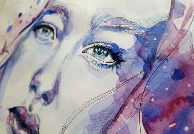
- Monochromatic Blue Portrait: Challenge yourself by creating a portrait using shades of blue. This project presumes an advanced deep understanding of value since an observer looking at different parts of the portrait will only see light and dark blues. Combining blues with blacks and whites, strive to create dozens of tones that will resemble the image but provide contrast enough for the distinguishing features of the portrait to remain clear.
- Sea Life Mural with Textural Effects: Explore the ocean depths with transcending underwater life in a large mural which deals with textures and movements of sea creatures. Add gels and mediums to your blues to depict the sleek skin of a dolphin or the rough engorged rocks of the sea bottom. This project does not challenge you in the art of colour mixing alone but also tries to test your textural simulation and movement depiction abilities.
FAQs
How do I fix a blue mixture that has gone too purple or green?
The blue paint mixtures tend to veer towards purple and green if the ratio of colors is imbalanced. This problem is usually caused by the involuntary use of red or yellow.
For Purple Tints: The dominance of red in the blue in question when you experience it appearing too purple is what you are witnessing. This can be moderated by the incorporation of slight amounts of green or yellow since they can assist in swinging the mix to blue. Color theory subscribes to the idea that red becomes neutralized by green because they are opposite ends of the spectrum on the color wheel.
For green hues, a greenish blue indicates excess yellow. To counterbalance the effects of yellow, add a bit of red or purple, as these colors will reduce the influence of yellow which is a tonal value of blue’s counterpart. A study published in the Journal of Color Science confirms that adding the complementary color in small increments is effective for neutralizing unwanted hues.
How Can I Transfer Blue Accents Existing In Nature Or Art?
Transferring blue accents present in nature or art is all about observation of the particular shade, its interaction with other colors, and the visual atmosphere in which it is located at the focal point. To illustrate, the hue of a bright sky blue is completely dissimilar in tone and shade as compared to blue wide waters. Here are steps to replicate these colors:
- Make out the Base Hue: You must first establish whether the base hue is leaning green, leaning purple, or remains true blue. This is the first thing you seek understanding of.
- Adjust with Complementary Colors: Use the color wheel as a guide in incorporating complementary colors in small quantities. For example, in order to get the deep shade of blue approximating that of the ocean, one may start with ultramarine blue as a base and then mix it with a little burnt umber or alizarin crimson so that the hue is a bit richer and darker in streaks.
- Use Real-Life References: It can be a work of art or even an artistic photograph of a natural scenery, in so doing, having it as an image in your mind can be a huge help in recoloring the pieces of art. There are also digital tools and apps that will allow you to measure and deconstruct the colors of your reference image as well and this will allow you to come up with a more realistic starting point for your mixes.
Conclusion
Blending blue paint colors is an exciting adventure filled with new ideas and inspiration. Looking at the panorama of options when it comes to blue paint colors — be it the light blue of the morning sky or a darker tone similar to that of the sea at dusk — the range of shadows that can be created is simply remarkable and can fit almost any character or feeling.
Gaining a grasp of color theory, complementary colors, and experimenting are important as the guide suggests. Arguably, it is these principles that help most artists to achieve the correct shades of blue so as to set the desired emotional impact.
As an artist, do not be afraid of mixing and creating new colors as both creative thinking and personal touch are as important as the technique depicted in the artwork. Everybody has their own experience and failure and success stories when painting blue which can be valuable to other students and make it an educational community.
While moving forward in your art career, do not hesitate to show your new ideas and items you have worked on. Artists form a multicultural and multi-experienced community whose collective experience is beneficial for both learners and experienced artists. Use the whole spectrum of blue to show your skills and inspire with your creativity.
More Post